

 Rafraîchir
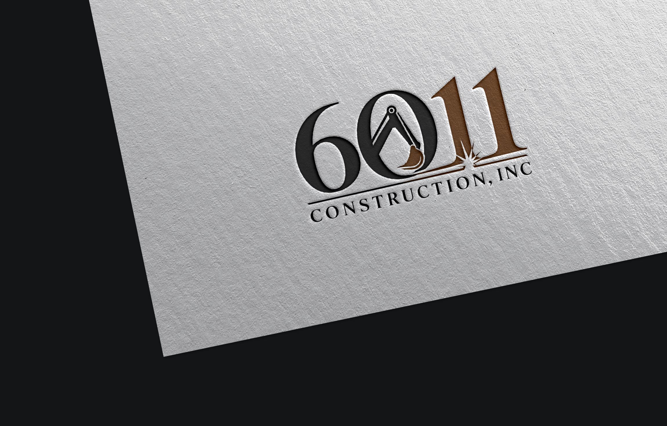
6011 Construction
Vous souhaitez remporter un projet comme celui-ci ?
Ce client a reçu 389 designs de logo de la part de 179 designers. Il a choisi ce design de logo de Ideas Expert comme design gagnant.
Inscrivez-vous Trouvez des Projets de Design
- Garanti
-
 US$250
-
 389 designs
-
 179 designers
Brief de Design de Logo
6011 Construction Inc. is a heavy equipment and metal fabrication company specializing in excavator work, grain bin construction and repair, and custom welding and fabrication. The name comes from the 6011 welding electrode. Looking for a simple, sleek, high-end industrial logo — one clean concept (typography, icon, or wordmark), not a literal illustration of every service. Refined and premium, not cartoonish or AI-generated looking. 2-3 colors max, and it needs to stay legible at small sizes and work as a single color for embroidery/vinyl.
Marché(s) Cible(s)
Agricultural and industrial businesses and landowners in the Southeast Arkansas region who need excavator work, grain bin construction/repair, or custom welding and fabrication services.
Secteur / Type d'entité
Construction / Heavy Equipment & Fabrication
Texte du logo
6011 Construction, INC
Styles de logo qui vous intéressent
Logo d'Enseigne
Logo contenu dans une forme



Logo pictural
Un objet réel (texte facultatif)



Styles de police à utiliser

Aspect
Chaque curseur illustre les caractéristiques de la marque client et le style que doit transmettre votre design de logo.
Élégant
Audacieux
Léger
Sérieux
Traditionnel
Moderne
Sympathique
Professionnelle
Féminin
Masculin
Coloré
Conservateur
Économique
Haut de gamme
Exigences
Doit avoir
- A simple, clean, high-end industrial logo — one clear concept only, not a literal illustration combining excavator, grain bin, and welding elements together.
Bien d'avoir
- A subtle nod to welding/fabrication (e.g., a spark, arc, or line element worked into the typography) or a bold “6011” numeral treatment as the focal point.
Ne doit pas comporter
- Cartoonish, overly literal, or generic AI-generated looking designs. No crowded logo trying to depict every service at once (excavator + grain bin + torch all together).