

 Rafraîchir
Logo & Favicon for Swiss Webagency
Vous souhaitez remporter un projet comme celui-ci ?
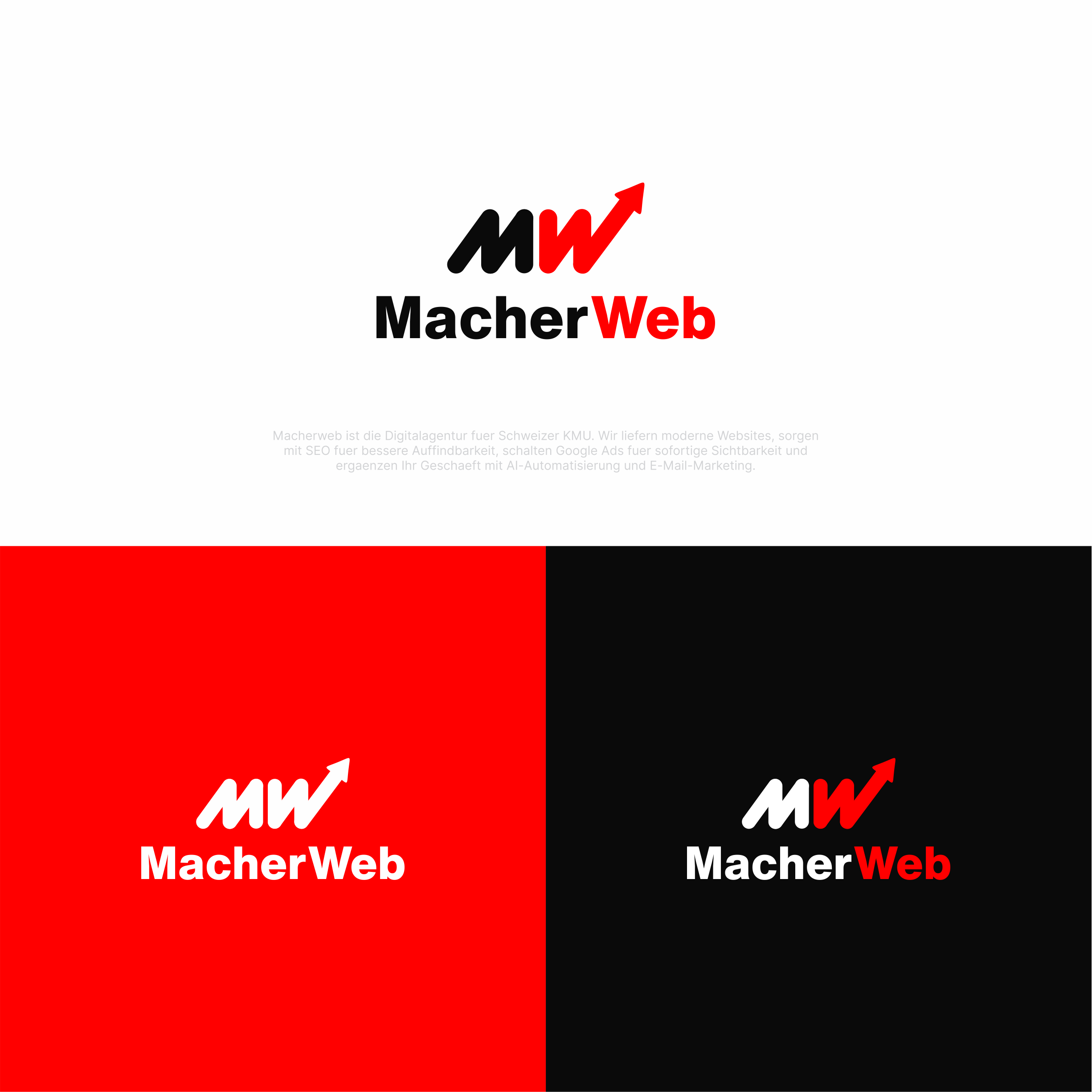
Ce client a reçu 466 designs de logo de la part de 195 designers. Il a choisi ce design de logo de melzh comme design gagnant.
Inscrivez-vous Trouvez des Projets de Design
- Garanti
-
 €110
€110
-
 466 designs
-
 195 designers
Brief de Design de Logo
1. The company in one line
website is: www.macherweb.ch
MacherWeb is a one-person web agency from Zürich, Switzerland. One craftsman ("a Macher") builds a tailor-made website for small local businesses in
7 days, for a fixed price — agency quality without the agency price tag.
"Macher" is German/Swiss for "a doer / a maker / someone who gets it done." That word IS the brand. The logo should feel like a maker's mark, not a
tech startup.
2. Who it's for
Owners of very small Swiss businesses (1–5 people): painters, hairdressers, trustees, small shops. Practical, down-to-earth people. Not designers,
not tech people. They value: clarity, honesty, speed, a handshake, one person they can call.
3. Brand personality
- Craftsman, not corporate. Solid, reliable, hands-on.
- Swiss understatement. Confident but never loud or hype-y.
- Simple and direct. One price, one person, one promise.
- Modern but grounded. Uses AI tools, but the feeling is workshop, not Silicon Valley.
Three words: solid · honest · sharp.
4. What I need
1. A primary logo (wordmark "MacherWeb" + icon mark)
2. A standalone icon / brand mark (the "M/W" symbol on its own)
3. A favicon version (works at 16×16 px)
The name is always written MacherWeb — one word, capital M and capital W, no space.
5. The icon idea (starting point — open to better)
There's an existing direction worth building on: an interlocked "M" and "W" that share their middle strokes, forming a single zig-zag / chevron mark
inside a rounded square. It reads as "MW" and also like a clean upward zig-zag (forward motion, "building up").
You're welcome to refine this, simplify it, or propose a stronger take — but the mark should:
- read clearly as M + W (or at least a confident, ownable monogram)
- still be recognisable at 16 px (favicon)
- work in a single flat colour as well as full colour
6. Colours
- Primary red: #FF0000 (pure, bold red — this is the signature colour, use it prominently)
- Near-black: #0A0A0A
- White: #FFFFFF
Red + black + white only. No gradients, no extra accent colours, no drop shadows. Flat and clean.
7. Type feeling (for the wordmark)
A bold, geometric or grotesk sans-serif. Strong, modern, engineered, Swiss. Think Helvetica/Inter/Suisse family energy — clean and no-nonsense. Avoid
anything thin, script, handwritten, playful, or serif.
8. Hard do's and don'ts
Do
- Keep it simple, flat, and bold
- Make it scale from billboard down to a 16 px browser tab
- Use the rounded-square "app icon" shape for the favicon
Don't
- ❌ No clichés: no globe, no < /> brackets, no computer mouse, no rocket, no swoosh, no "WWW", no spinning gear
- ❌ No gradients, glow, 3D, or shadows
- ❌ No more than 3 colours
- ❌ Don't make it look like a generic "tech startup" — it's a local craftsman's mark
9. Deliverables & formats
- Vector source: SVG + AI/EPS
- Logo: full colour, all-black, all-white (reversed) versions
- Favicon: SVG plus PNG at 512, 192, 48, 32, 16 px
- Horizontal lockup (icon left, wordmark right) and stacked version
- Clear-space and minimum-size guidance
Marché(s) Cible(s)
Owners of very small Swiss businesses (1–5 people): painters, hairdressers, trustees, small shops. Practical, down-to-earth people. Not designers, not tech people. They value: clarity, honesty, speed, a handshake, one person they can call.
Secteur / Type d'entité
Web Design Agency
Texte du logo
MacherWeb
Styles de logo qui vous intéressent
Logo de figurine
Logo avec illustration ou personnage
Couleurs
Le designer choisit les couleurs à utiliser dans le design.
Aspect
Chaque curseur illustre les caractéristiques de la marque client et le style que doit transmettre votre design de logo.