Single Artwork Design – “TIME”
Vous souhaitez remporter un projet comme celui-ci ?
Ce client a reçu 59 designs graphiques de la part de 21 designers. Il a choisi ce design graphique de BojesDesign comme design gagnant.
Inscrivez-vous Trouvez des Projets de Design-
 US$190
-
 59 designs
-
 21 designers
Brief de Design Graphique
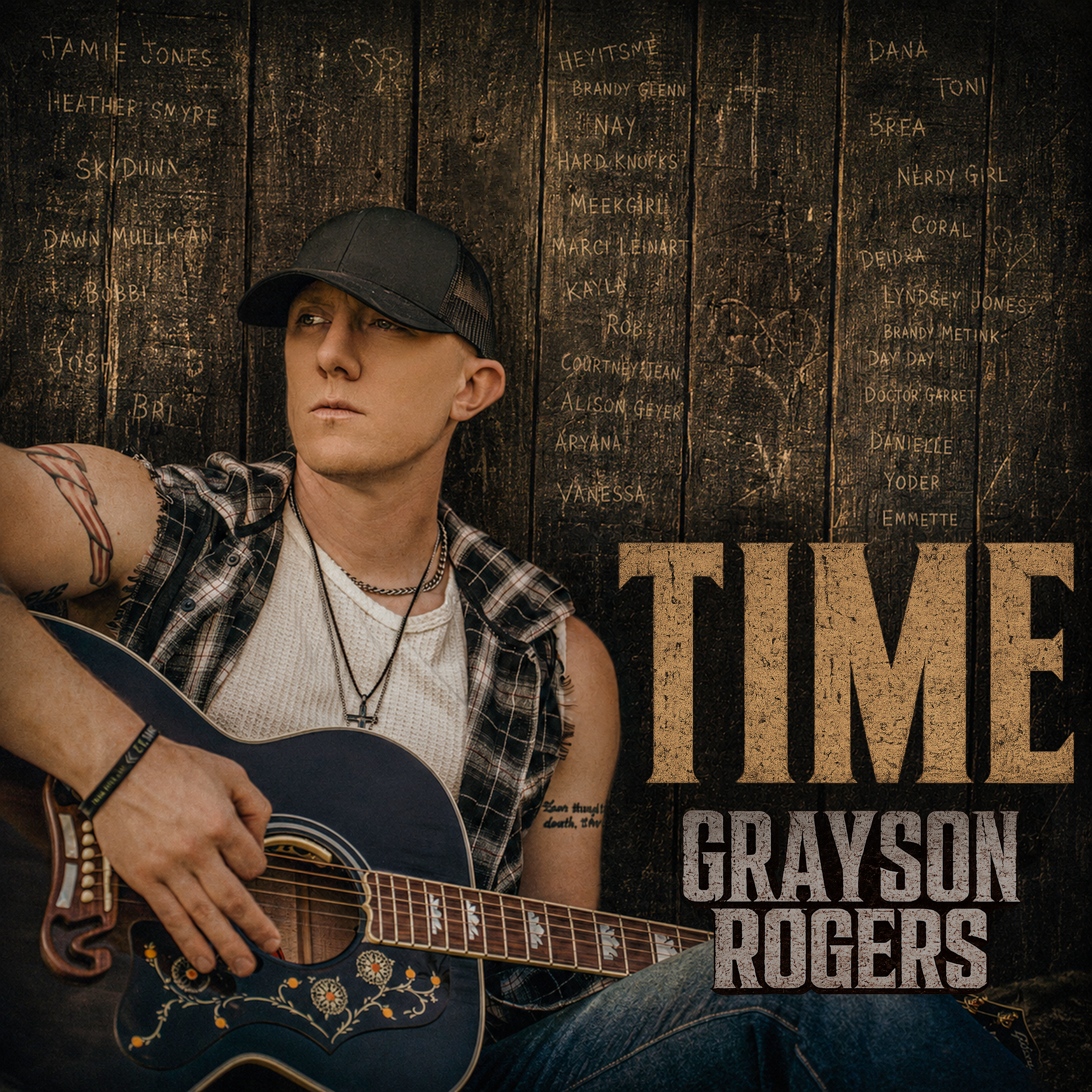
We are creating cover artwork for Grayson Rogers’ upcoming single, “TIME.”
The song carries themes of:
reflection, growth, struggle, memories, the passage of time, life leaving marks on people over the years
The artwork should feel emotional, authentic, rugged, and cinematic — rooted in a modern country / Americana style.
The attached image of Grayson with the guitar will serve as the primary photo for the artwork.
Overall Visual Direction
The design should feel:
moody but warm
rustic and authentic
masculine and reflective
timeless rather than trendy
slightly gritty, but still emotional
Think:
weathered wood, faded memories, old stories carved into places over time.
Avoid anything overly polished, glossy, pop-inspired, or artificial.
Primary Image:
Use the attached photo of Grayson Rogers seated with the guitar against the black wood fence.
The fence texture is extremely important to the concept.
The photo should maintain a cinematic feel with natural shadows and contrast.
Text Layout
Artist Name: “GRAYSON ROGERS” should be prominent and clearly visible on the artwork.
I've attached previous artwork for inspiration.
Song Title: “TIME”
The title should feel powerful but simple.
Suggested styling:
slightly smaller than artist name
strong typography
subtle distressing or texture
integrated naturally into the artwork
Avoid overly decorative fonts.
Sponsor Name Integration (VERY IMPORTANT)
A list of supporter/sponsor names must appear within the artwork.
However:
The names CANNOT look like sponsor credits, a list, promotional text
readable overlays. Instead, they should appear as though they were scratched, etched, faded, and naturally carved into the wooden fence over many years.
The effect should feel subtle and environmental.
The names should be faded, low contrast, partially blended into the wood grain, imperfect, worn down over time, different sizes and placements, naturally integrated into the fence texture
The names should feel like old graffiti, carved initials, knife scratches or
weathered markings left over the years
The goal is someone notices them only after looking closely. They should NEVER dominate the artwork.
Sponsor Names to Include
Jamie Jones
Heather Smyre
SkyDunn
Dawn Mullican
Bobbi
Josh
Bri
HeyItsMe
Brandy Glenn
Nay
Hard Knocks
MeekGirl
Marci Leinart
Kayla
Rob
CourtneyJean
Alison Geyer
Aryana
Vanessa
Dana
Toni
Brea
Nerdy Girl
Coral
Deidra
Lyndsey Jones
Brandy Metink
Day Day
Doctor Garret
Danielle
Yoder
Emmette
PSD or AI preferred
Technical Specs
3000 x 3000 px
RGB color
High resolution
Optimized for streaming platforms
Final Goal
The artwork should feel emotionally authentic and visually premium while subtly hiding supporter names inside the environment itself.
The sponsor names should feel like marks left behind over time, not advertisements.
Attahments: "Time Cover Art Pic" to be used with this design. Two other previous artwork files for inspiration, but not to be copied.