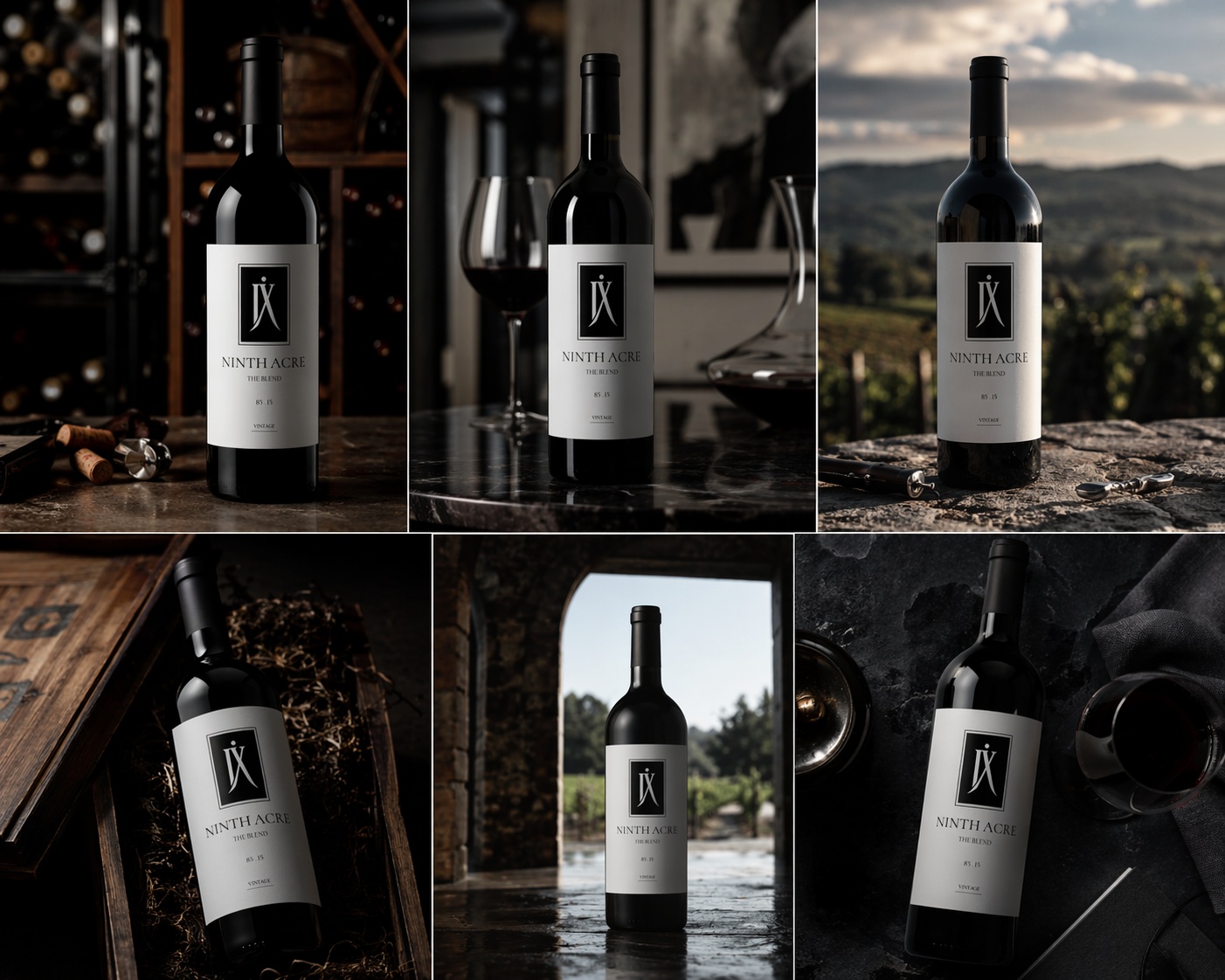
Ninth Acre Wine Labels
Vous souhaitez remporter un projet comme celui-ci ?
Ce client a reçu 43 designs étiquette de la part de 17 designers. Il a choisi ce design étiquette de Atik Ul Hoque comme design gagnant.
Inscrivez-vous Trouvez des Projets de Design- Garanti
-
 US$150
-
 43 designs
-
 17 designers
Brief de Design Étiquette
Ninth Acre is an ultra-premium, allocation-only Napa Valley wine brand being built with one objective: to become a long-term cult collectible.
This is not a retail wine.
This is not a lifestyle brand.
This is not driven by marketing trends.
Production is intentionally limited. Access is controlled through private membership. Every decision—from vineyard sourcing to packaging—is made with long-term brand equity in mind.
We are looking for a label system that reflects that level of discipline.
Design a cult-level wine label system for Ninth Acre that communicates rarity, restraint, and authority at a glance.
This is not a lifestyle brand.
This is not decorative Napa.
This must feel like it belongs next to Scarecrow, Harlan, Promontory—and still stand apart.
Brand Positioning
Ultra-premium, allocation-only Napa wine
Private membership model (not retail-driven)
Production capped intentionally (scarcity is real, not marketing)
Designed to become a long-term collectible
Tone:
Controlled
Intentional
Confident
Understated power
If it feels “designed” or “trying”—it’s wrong.
Core Product Structure
You are designing a system, not a single label.
Foundation Wines:
Cabernet Sauvignon (primary SKU)
Signature Blend
Extensions (future / limited):
Limited Edition Blend (art-driven)
Reserve (ultra minimal, elevated version)
Creative Direction (Critical)
We are pursuing cult minimalism with tension.
Think:
Silence > noise
Precision > decoration
Material > graphics
This should feel:
Like it was inevitable, not created
Recognizable from across the room
Memorable after one exposure
Design Constraints
These are non-negotiable:
Bottle: Saverglass Monviso (tall, powerful silhouette)
Glass: Deep antique green (near black)
Capsule: Matte black (baseline)
Front must work with:
Direct glass etching (ghost etch) OR
Minimal premium paper label
No loud colors.
No trendy typography.
No illustrative storytelling.
Brand Elements to Use
Primary mark: IX (Roman numeral 9)
Brand name: NINTH ACRE
Vintage (subtle, not dominant)
Optional concept element:
Varietal composition expressed as a refined system (e.g., “85 · 15” or structured numeric expression)
Design Goals
Your design should achieve:
Instant Recognition
Must be identifiable from 10 feet away
Tactile Value
Feels expensive before you touch it
Even better once you do
Aging Power
This must still look relevant in 20 years
System Cohesion
Cabernet and Blend must feel like a family
Not two separate brands
What We Are NOT Looking For
Avoid immediately:
Gold foil overload
Script fonts / calligraphy
Illustrated vineyards / animals / crests
Trendy “modern winery” aesthetics
Busy compositions
Obvious luxury clichés
If it looks like:
A Napa tasting room brand → reject
A startup wine brand → reject
Something you'd see on a grocery shelf → reject
Creative Territories to Explore
Designers should explore distinct directions, not minor variations:
Pure Etch Minimalism
IX only
Extremely subtle, almost invisible
Power through absence
Architectural Typography
Strong, controlled use of NINTH ACRE
Spatial tension, alignment-driven
Symbol + System
IX + numeric composition (85 / 15, etc.)
Feels like a formula, not decoration
Material-Driven Label
Paper, emboss, deboss, letterpress
Texture carries the design
Marché(s) Cible(s)
Ultra-high-net-worth individuals, collectors, and allocation-driven wine buyers. Men and women 35–65 Entrepreneurs, executives, investors Already purchasing cult Napa wines ($250–$1,000+ per bottle) Psychographics: Value scarcity over availability Prefer private access over retail Buy for status, cellar, and long-term collection Appreciate restraint, not flash If it appeals to mass retail, it’s wrong.
Secteur / Type d'entité
Luxury Wine / Fine Wine / Ultra-Premium Consumer Goods
Aspect
Chaque curseur illustre les caractéristiques de la marque client et le style que doit transmettre votre design de logo.
Élégant
Audacieux
Léger
Sérieux
Traditionnel
Moderne
Sympathique
Professionnelle
Féminin
Masculin
Coloré
Conservateur
Économique
Haut de gamme
Exigences
Doit avoir
- 1. Scarecrow Why it matters: True cult positioning Feels rare, quiet, and collector-driven What to take: Effortless authority Doesn’t try to look expensive—it just is Strong identity without noise What to avoid: Do not replicate illustration or vintage storytelling style 2. Promontory (Harlan Family) Why it matters: Masterclass in restraint and architectural design What to take: Minimalism with structure Precision typography and spacing Confidence through reduction What to avoid: Don’t make it cold or overly corporate 3. Harlan Estate Why it matters: One of the most iconic luxury wine labels ever What to take: Timelessness Balance of tradition + authority Label presence without excess What to avoid: Avoid classic/heritage clichés (crests, shields, etc.) 4. Opus One Why it matters: Instantly recognizable globally Clean, iconic silhouette and branding system What to take: Immediate recognition from distance Cohesive system across vintages What to avoid: Don’t go mainstream or overly commercial 5. Screaming Eagle Why it matters: Pure scarcity-driven brand power What to take: Understated exclusivity Nothing feels added for effect What to avoid: Do not introduce illustration or narrative-driven visuals