Refine minimalist premium logo for MUZET (symbol + typography)
Vous souhaitez remporter un projet comme celui-ci ?
Ce client a reçu 247 designs de logo de la part de 114 designers. Il a choisi ce design de logo de MST PINKY KHATUN comme design gagnant.
Inscrivez-vous Trouvez des Projets de Design-
 US$150
-
 247 designs
-
 114 designers
Brief de Design de Logo
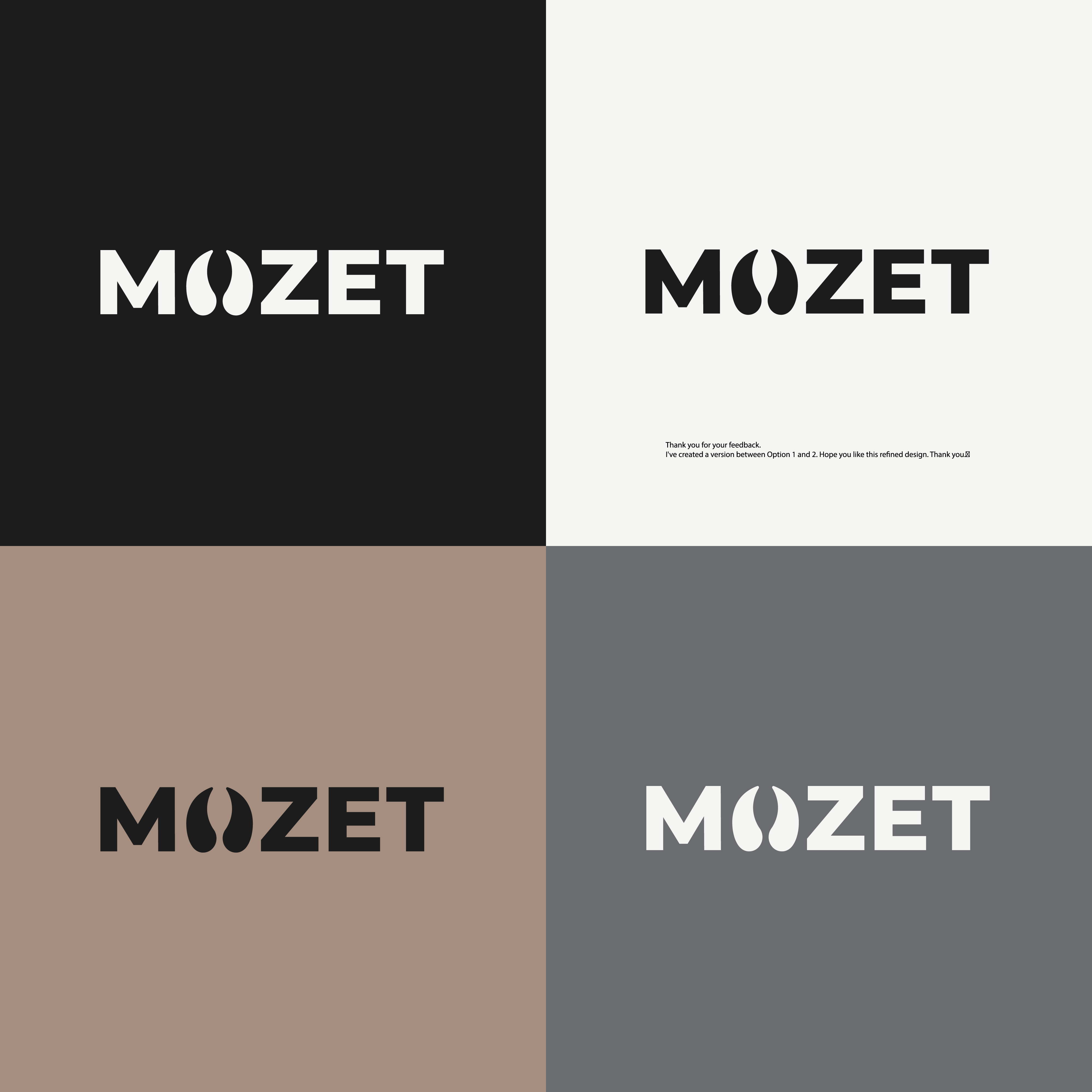
I am looking to refine and improve an existing logo for my brand **Muzet**.
The current logo has a strong concept, but the execution feels too light and not distinctive enough.
---
**Concept**
The logo includes a symbol integrated in the letter “U”.
This symbol represents a **track / footprint**, connected to the idea: *design that leaves a mark*.
The concept should be preserved, but refined.
---
**Typography**
The current font is too thin and fashion-oriented (similar to magazine/Vogue style).
I am looking for:
– more weight and presence
– a clean, minimalist expression
– something timeless and grounded (not trend-based)
---
**Symbol**
The symbol should:
– feel intentional and balanced
– have a clear identity
– remain simple and refined (not illustrative)
– be strong enough to stand on its own as an icon
---
**Overall direction**
The logo should feel:
– calm
– confident
– premium
– with more visual weight
---
**Colors**
A color palette is attached and should be used as direction.
The colors should feel:
– earthy
– natural
– understated and exclusive
Please avoid:
– bright gold
– gradients
– shiny or artificial effects
The logo must also work well in black and single color.
Texte du logo
MUZET