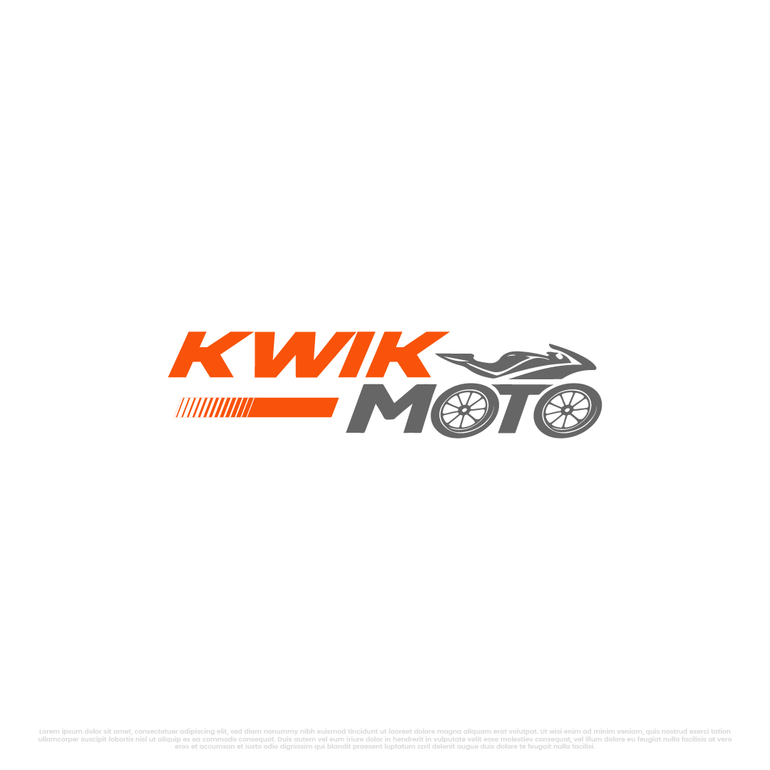
KwikMoto logo (PREFERABLY IN TWO LINES)
Vous souhaitez remporter un projet comme celui-ci ?
Ce client a reçu 242 designs de logo de la part de 121 designers. Il a choisi ce design de logo de Kayla Studio comme design gagnant.
Inscrivez-vous Trouvez des Projets de Design-
 US$150
-
 242 designs
-
 121 designers
Brief de Design de Logo
The word is KwikMoto — one word, capital K and M.
There are two critical creative elements that MUST be in the logo:
1. The two O's in M-O-T-O must be designed as motorcycle wheels.
The letter O appears twice in "Moto" — next to the M and next to the T. Both O's should be stylized as motorcycle wheels with spokes or a hub design. They should feel like natural parts of the word — same visual weight, same baseline, same spacing as the other letters. NOT bolted-on circles that look out of place. The wheels should be clean, modern, and instantly recognizable as motorcycle wheels at any size.
2. The "KWIK" portion must incorporate an electricity/lightning element.
"Kwik" means FAST. The letters K-W-I-K should somehow convey speed and electric energy. This could be a lightning bolt integrated into the K, a spark between letters, a speed-line effect, an electric arc, or the dot of the "i" as a spark. Be creative — but it must feel electric and fast, not generic.
Additionally, the overall logo should subtly convey green energy and empowerment. This can come through color choice (green as an accent), a leaf-like element, a sun ray, or the overall feeling of the design. Don't overdo it — the primary story is "fast electric motorcycle." The green/empowerment feeling should be secondary.
COLOR REQUIREMENTS:
The logo must be bright, vibrant, and high-energy. No muted or corporate colors. Think African sun, electric energy, and open roads.
Required palette to work with (choose 2-3 as primary):
Electric Orange: #E85D04
Solar Yellow / Gold: #F59E0B or #FACC15
Energy Green: #22C55E or #10B981
Lime accent: #A3E635
Supporting (optional for contrast):
Deep Dark (for backgrounds): #0A0A0A or #1A1A2E
Clean White: #FFFFFF
The logo must work beautifully on both dark and light backgrounds. The orange and yellow should dominate. Green should appear as an accent — maybe in the wheel spokes, a leaf, or a subtle glow.
STYLE DIRECTION:
Modern, bold, and confident — not cute or playful
The font should be heavy/bold/black weight — this is a powerful brand, not a delicate one
Clean geometry — the wheel O's should feel precise, not hand-drawn
The logo should work at very small sizes (app icon, favicon) and very large sizes (vehicle wrap, billboard)
It should feel like a tech startup, not a traditional African brand — no tribal patterns, no safari imagery
Think Tesla meets M-Pesa — premium technology for the mass market
DO NOT:
Use clip art or stock icons
Make the wheels look like car wheels — they must be motorcycle/bicycle wheels (thin spokes radiating from a center hub)
Put a motorcycle illustration in the logo — the wheels-as-letters ARE the motorcycle reference
Use gradients in the primary mark (flat colors only — gradients OK for secondary/web versions)
Use more than 3 colors in the primary logo
Make the O-wheels different sizes — they must be identical
DELIVERABLES NEEDED:
Primary logo — Full "KwikMoto" wordmark with wheel-O's and electric-K elements
Dark background version — White/orange text on dark background
Light background version — Dark/orange text on white background
Icon mark only — A standalone square icon for app/favicon (could be the lightning bolt + one wheel, or the K with a spark + wheel, or creative interpretation)
Monochrome versions — All white, all black
File formats: AI (vector source), SVG, PNG (transparent, multiple sizes), EPS, PDF
WHAT A WINNING DESIGN LOOKS LIKE:
When someone sees this logo, they should instantly think: "fast," "electric," "motorcycle," and "bright energy." The O-wheels should make people smile when they notice the cleverness. The lightning/spark in KWIK should feel natural, not forced. The colors should pop off any surface. A boda boda rider in Kampala should feel proud to have this on their bike. An investor in Silicon Valley should feel this is a serious, well-branded company.
ABOUT OUR AUDIENCE:
Boda boda motorcycle taxi riders in East Africa (working-class, aspirational, proud)
Silicon Valley and climate-tech investors
UN agencies and development finance institutions
Government policymakers
The logo must resonate with ALL of these audiences — street-level credibility AND boardroom professionalism.
Texte du logo
KwikMoto
Aspect
Chaque curseur illustre les caractéristiques de la marque client et le style que doit transmettre votre design de logo.