 Rafraîchir
Online training business needs website hero image design
Vous souhaitez remporter un projet comme celui-ci ?
Ce client a reçu 62 designs graphiques de la part de 8 designers. Il a choisi ce design graphique de pb comme design gagnant.
Inscrivez-vous Trouvez des Projets de Design
- Garanti
-
 C$110
C$110
-
 62 designs
-
 8 designers
Brief de Design Graphique
---
## Brand Foundation
Before reviewing individual briefs, designers should understand the PMShortcuts brand context.
### About PMShortcuts
PM Shortcuts provides online training courses that teach project managers how to master the tools they use every day — Claude AI, Smartsheet, Jira, Confluence, and more.
The name "PM Shortcuts" reflects our core promise: we help project professionals find the faster, smarter path to tool proficiency. Not cutting corners — finding the direct route to competence so they can focus on higher-value work.
**Target audience:** Junior to intermediate project managers who are self-starters. They're not looking for theory or certifications — they want practical skills they can apply Monday morning.
### Brand Personality
- Professional but approachable
- Modern and forward-thinking
- Efficient / streamlined
- Trustworthy and credible
- Confident without being arrogant
### Color Palette
| Role | Color | Hex | Usage |
|------|-------|-----|-------|
| **Primary** | Navy | #1a365d | Headers, primary text, key CTAs |
| **Accent** | Blue | #3182ce | Links, secondary buttons, accents |
| **Functional** | Green | #38a169 | Success states, positive indicators |
| **Functional** | Amber | #d69e2e | Warnings, attention, highlights |
| **Functional** | Red | #e53e3e | Errors, critical alerts |
| **Background** | Light Gray | #f7fafc | Section backgrounds |
| **Background** | White | #ffffff | Primary backgrounds, cards |
### Design Principles
- **Clean** — Minimal visual clutter, generous whitespace
- **Professional** — Business education aesthetic, not playful or casual
- **Trustworthy** — Modern SaaS look, established brand feel
- **Mobile-first** — All images must work at mobile sizes
- **Fast-loading** — Optimize for web performance
### Brands We Admire
**For atmosphere and restraint:**
- **Linear** (linear.app) — Subtle gradients and abstract motion that feel premium without trying too hard
- **Stripe** — Confident use of color, geometric depth, sophisticated without being cold
- **Anthropic** — Thoughtful, muted, intelligent. Never loud.
**For the "precision tool" feeling:**
- **Arc'teryx** — Technical product imagery that conveys capability through restraint
- **Porsche** — Engineering elegance. Nothing wasted.
**For forward momentum:**
- **McLaren** — Aerodynamic thinking applied to visual design
- **Rapha** — Movement and purpose, premium without flash
---
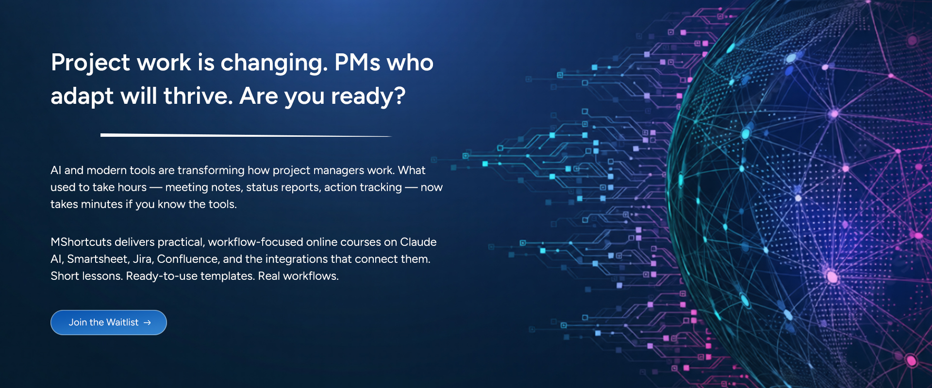
## Brief #1: Hero Section Background Image
**Asset:** Homepage Hero Background
**Priority:** High — First visual visitors see
---
### Context & Placement
The hero section is the first thing visitors see when landing on pmshortcuts.com. It spans the full viewport width and contains:
**Text overlay (white/light text):**
- **Headline:** "Project work is changing. PMs who adapt will thrive. Are you ready?"
- **Subheadline:** AI and modern tools are transforming how project managers work. What used to take hours — meeting notes, status reports, action tracking — now takes minutes if you know the tools.
- **Supporting copy:** PMShortcuts delivers practical, workflow-focused online courses on Claude AI, Smartsheet, Jira, Confluence, and the integrations that connect them. Short lessons. Ready-to-use templates. Real workflows.
- **CTA Button:** "Join the Waitlist"
The image must *support* this text, not compete with it. The left side of the image will be text-heavy and needs sufficient contrast for readability.
---
### Layout Behavior
The hero uses a **fixed height with responsive breakpoints** — not proportional scaling. This ensures predictable text placement and consistent visual rhythm across devices.
| Breakpoint | Viewport Width | Hero Height | Behavior |
|------------|----------------|-------------|----------|
| Desktop | 1024px+ | 500px fixed | Full-width, image covers container |
| Tablet | 768–1023px | 450px fixed | Full-width, image covers container |
| Mobile | < 768px | 400px minimum, content-driven | Height expands if text requires it |
**Technical implementation:** The image will be applied as a CSS `background-image` with `background-size: cover` and `background-position: center`. This means the image will be cropped to fill the container — it won't letterbox or distort.
**Composition implications:**
- Keep key visual elements in the **center 60%** of the frame (both horizontally and vertically)
- Avoid placing important details at extreme edges — they will be cropped on smaller viewports
- The left third of the image will be obscured by text overlay — design that area to be darker/simpler
- Visual interest can live in the right half, but nothing critical should depend on it being fully visible
---
### Dimensions & Format
| Deliverable | Asset Dimensions | Display Context | Format |
|-------------|------------------|-----------------|--------|
| Desktop | 1920 × 800px | 1440px+ viewport, 500px tall | WebP + PNG fallback |
| Tablet | 1200 × 600px | 768–1024px viewport, 450px tall | WebP + PNG fallback |
| Mobile | 800 × 500px | 375–428px viewport, 400px+ tall | WebP + PNG fallback |
| Source file | Native resolution | — | Figma, PSD, or AI |
**Note:** Assets are sized at approximately 2x for retina display clarity. The visible portion will be cropped from the center — design accordingly.
**File size target:** Under 150KB for desktop WebP (performance critical)
---
### Visual Direction
**Primary concept: Forward momentum meets precision**
The hero should evoke the feeling of *acceleration toward competence* — the core PMShortcuts promise. Not frantic speed, but confident forward motion. The direct route, not the scenic one.
**Themes to explore (in priority order):**
1. **Trajectory / Pathfinding** — Abstract representations of routes, vectors, or streamlined movement. The "shortcut" concept rendered visually. Think aerodynamic flow lines, not literal roads or arrows.
2. **Modern technology with depth** — Subtle suggestions of digital infrastructure, data flow, or connected systems. Abstract enough to feel timeless, specific enough to feel intentional.
3. **Clarity emerging from complexity** — The sense that chaos is being organized, that the right path is becoming visible. Relevant to our audience who feel overwhelmed by tool proliferation.
**Visual approaches to consider:**
- **Abstract geometric:** Flowing lines, subtle grid patterns, or vector fields suggesting motion and structure. Navy-to-blue gradients with geometric overlays.
- **Atmospheric depth:** Layered gradients creating a sense of dimension. Think mist clearing to reveal a path, or light breaking through.
- **Minimalist with texture:** Clean gradient foundations with subtle noise, grain, or fine line work adding visual interest without distraction.
---
### What to Avoid
- ❌ Stock photography of any kind — especially people at computers, handshakes, or "collaboration"
- ❌ Literal representations of AI (robots, circuit boards, glowing brains, neural networks)
- ❌ Busy patterns that compete with text overlay
- ❌ Corporate blue gradients that feel like every consulting firm website
- ❌ Tech clichés: floating screens, holographic interfaces, "the matrix"
- ❌ Anything that feels like 2015 startup aesthetic (geometric low-poly, extreme gradients)
- ❌ Playful or whimsical elements
---
### Technical Requirements
- Must maintain legibility of white text overlay (consider darker treatment on left side where text lives)
- Should work with a subtle CSS overlay/gradient if needed for additional text contrast
- Must feel cohesive across all three breakpoints despite cropping differences
- Mobile crop should preserve the essential character of the image — don't place the "soul" of the design where it gets cut
---
### Success Criteria
The hero image succeeds if:
1. A visitor immediately gets a sense of "professional, modern, trustworthy"
2. The text overlay is effortlessly readable without additional darkening overlays
3. It feels distinctly PMShortcuts — not interchangeable with generic SaaS sites
4. It ages well — won't look dated in 2 years
5. It loads fast without compromising visual impact
6. Must have cohesion with the PM Shortcuts logo in the website header (see https://pmshortcuts.com)
---
### Deliverables Checklist
| File | Dimensions | Format | Notes |
|------|------------|--------|-------|
| `hero-background-desktop.webp` | 1920 × 800px | WebP | Primary |
| `hero-background-desktop.png` | 1920 × 800px | PNG | Fallback |
| `hero-background-tablet.webp` | 1200 × 600px | WebP | Primary |
| `hero-background-tablet.png` | 1200 × 600px | PNG | Fallback |
| `hero-background-mobile.webp` | 800 × 500px | WebP | Primary |
| `hero-background-mobile.png` | 800 × 500px | PNG | Fallback |
| Source file | Native | Figma/PSD/AI | Editable layers |
---