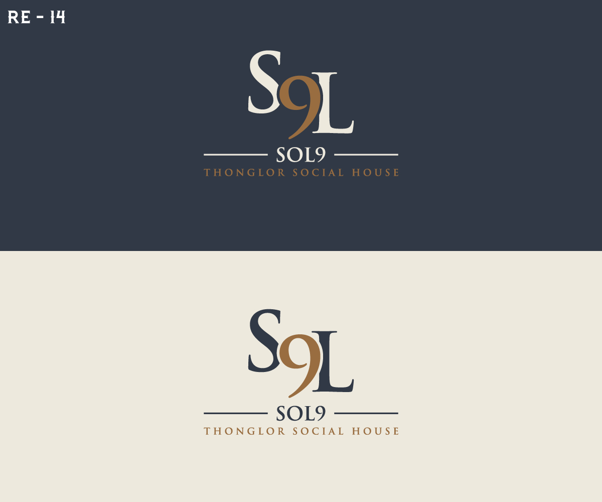
Sol9 wine & sourdough pizza bar Logo
Vous souhaitez remporter un projet comme celui-ci ?
Ce client a reçu 190 designs de logo de la part de 87 designers. Il a choisi ce design de logo de RS_Design comme design gagnant.
Inscrivez-vous Trouvez des Projets de Design-
 US$150
-
 190 designs
-
 87 designers
Brief de Design de Logo
We are seeking a refined, typography-led logo for SOL 9, an upper-end, premium-casual wine and pizza bar. The brand sits at the intersection of fire, craft, and urban hospitality, confident, warm, and grown-up, without feeling flashy or themed.
The logo must feel timeless and architectural, designed to live in physical space as much as digital. It should work flawlessly in black-and-white first, with colour applied selectively as a premium layer.
This is not a budget or casual-fast-food brand. It is a bar-forward, elevated hospitality concept designed for longevity and future scale.
Logo text
- SOL 9
Background and meaning
-“SOL” draws from ideas of sun, heat, fire, warmth, and energy.
The number 9 represents completeness, balance, and good fortune, adding confidence and memorability.
Together, the name should feel powerful, grounded, and warm, balanced by the refinement of wine and bar culture.
Preferred style and approach
-We are leaning toward a typography-led wordmark, with the option of a very subtle, architectural symbol if it adds value.
Conceptually, we are open to a minimal semi-circular or arched form that could abstractly reference:
-The sun or sunset
-The mouth of a pizza oven
-Architectural warmth and structure
If used, this element must be:
-Minimal and restrained
-Abstract rather than literal
-Secondary to the wordmark
-Able to stand alone in select applications (stamp, glassware, signage)
Please avoid anything illustrative, playful, or overly literal (no flames, pizzas, or icons).
Colour direction and discipline (very important)
We prefer warm, natural, earthy tones aligned with wine, fire, and materials.
Directionally:
-Warm off-white / bone / stone
-Deep navy or charcoal (preferred over pure black)
-Muted olive or deep green (used sparingly)
-Subtle bronze or copper accents
Critical rule:
Bronze is a highlight, not the base.
If bronze becomes dominant, it risks feeling hotel-ish, themed, overly masculine, or dated. Used selectively, it becomes timeless.
The logo should be designed primarily in black or off-white, with bronze reserved for premium applications only (foil, embossing, etching, signage).
Brand personality
-Upper-end urban hospitality
-High energy but refined
-Premium without being formal
-Confident, warm, and timeless
-Designed to age well, not chase trends
Reference direction
Rather than specific brands, we are drawn to logos that feel:
-Confident and timeless
-Architectural and well-proportioned
-Strong in monochrome
-Suitable for signage, menus, and glassware
Applications the logo must scale across
-Exterior and interior signage
-Menus and menu covers
-Glassware
-Packaging
-Social media
-Future locations
option with a tagline
"Wine and Sourdough Pizza Bar"
Marché(s) Cible(s)
Hospitality industry
Secteur / Type d'entité
Hospitality
Texte du logo
SOL 9
Aspect
Chaque curseur illustre les caractéristiques de la marque client et le style que doit transmettre votre design de logo.
Élégant
Audacieux
Léger
Sérieux
Traditionnel
Moderne
Sympathique
Professionnelle
Féminin
Masculin
Coloré
Conservateur
Économique
Haut de gamme
Exigences
Doit avoir
- SOL9