Software tool training company offering online courses needs a logo design
Vous souhaitez remporter un projet comme celui-ci ?
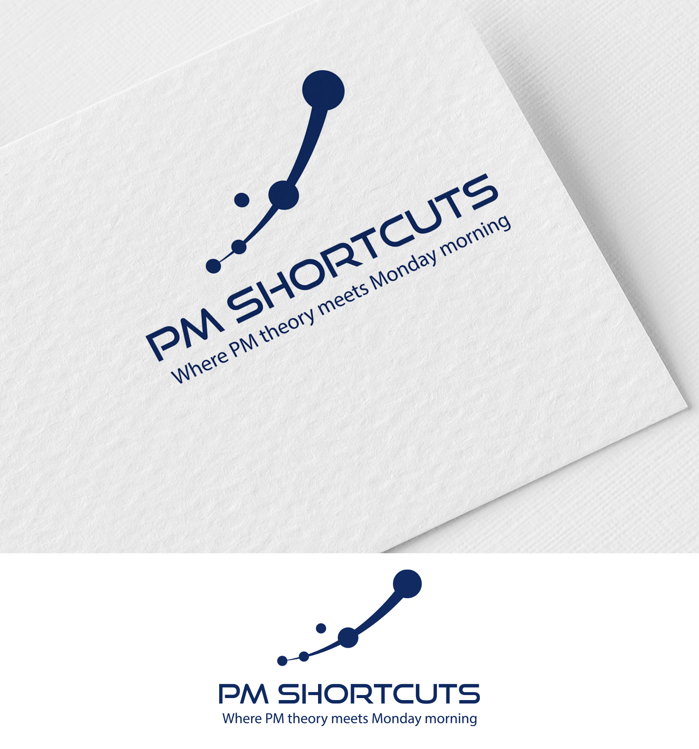
Ce client a reçu 113 designs de logo de la part de 50 designers. Il a choisi ce design de logo de Mehedi100 comme design gagnant.
Inscrivez-vous Trouvez des Projets de Design- Garanti
-
 C$150
C$150
-
 113 designs
-
 50 designers
Brief de Design de Logo
LOGO DESIGN BRIEF: PM Shortcuts
Company: PM Shortcuts
Location: Vancouver, Canada (global online audience)
Industry: Professional development / Online education
Website: pmshortcuts.com
About the Brand
PM Shortcuts provides online training courses that teach project managers how to master the tools they use every day — Claude AI, Smartsheet, Jira, Confluence, and more.
The name "PM Shortcuts" reflects our core promise: we help project professionals find the faster, smarter path to tool proficiency. Not cutting corners — finding the direct route to competence so they can focus on higher-value work.
Our audience: Junior to intermediate project managers who are self-starters. They're not looking for theory or certifications — they want practical skills they can apply Monday morning.
Brand personality:
- Professional but approachable
- Modern and forward-thinking
- Efficient / streamlined
- Trustworthy and credible
- Confident without being arrogant
Logo Requirements:
- Primary logo for PM Shortcuts (company brand)
Must work across:
- Website header (light and dark backgrounds)
- Social media profiles (LinkedIn, YouTube)
- Course thumbnail overlays
- Email signatures
- Favicon (simplified mark)
Deliverables needed:
- Primary horizontal logo (wordmark + icon)
- Stacked version (icon above wordmark)
- Icon/mark only (for favicon, social profiles)
- SVG and PNG formats (transparent background)
- Light and dark background versions
Visual Direction
Our website color palette is currently:
Primary: Navy #1a365d
Secondary/Accent: Blue #3182ce
Background: White #ffffff
Alternate background: Light Gray #f7fafc
Note: The logo should work primarily in Navy and Blue. Green (#38a169), Amber (#d69e2e), and Red (#e53e3e) are reserved for UI states but we may consider them for branding.
Inspiration themes (in priority order):
Forward momentum / velocity — The idea of acceleration, getting ahead, not just keeping up. Think aerodynamic shapes, motion implied through design.
Precision / efficiency — Clean lines, nothing wasted. The shortest distance between two points.
Modern technology — Contemporary feel appropriate for AI and digital tools, not dated "tech" clichés.
Visual metaphors to explore:
- Paths, routes, or trajectories (the "shortcut" concept)
- Subtle speed/motion indicators
- Abstract representations of growth or progression
Avoid:
- Literal keyboard shortcut symbols (Ctrl, Command keys)
- Clipart-style icons (graduation caps, lightbulbs, gears); we used a gear on the current website, but they’re over-used and feel a bit dated. They do have meaning in our context though.
- Overly complex illustrations that won't scale
- Anything that feels like "corporate training" or traditional education
- Playful or whimsical aesthetics
Competitive Context
We're positioning against:
- Traditional PM certification bodies (PMI, PRINCE2) — we're more practical and modern
- Generic online course platforms (Udemy, Coursera) — we're specialized and focused
- Tool vendors' own training — we're independent and workflow-focused
Brands we admire (for tone, not to copy):
Anthropic: First course focus, aligned with their thoughtful/responsible approach to AI, most advance and best AI tool on the market
Stripe: Clean design, developer credibility, scales elegantly, documentation-obsessed — matches our systematic approach
Notion: On our course roadmap, blends simplicity with depth, appeals to self-starters who build their own systems
Linear: Modern project management tool with obsessive attention to design and speed — the "shortcut" ethos in product form
Atlassian: Jira and Confluence are on your course list, enterprise-grade but practitioner-focused, workflow-centric
Apple: Simplicity that hides complexity, ecosystem integration with tools that just work and work together, premium positioning without apology, design as differentiation, high quality products and customer support. Their entire ethos is "tools for people who make things." Creative professionals, knowledge workers, people who care about their craft.
McLaren: Precision engineering, marginal gains, F1 heritage, performance without unnecessary flash, love the McLaren orange
Tour de France: McLaren and the tour are both are about precision, preparation, and performance under pressure. But Tour de France adds the endurance and cumulative progress dimension that F1 doesn't have. It's a Team Sport Disguised as an Individual One; there’s a Marginal Gains Philosophy British Cycling and Team Sky famously won through aggregating 1% improvements — better sleep, better nutrition, better aerodynamics, better equipment. Our microlearning approach is the same: small, focused lessons that compound into proficiency. No single shortcut wins the race; the system does. Stages, Not Sprints 21 stages over 23 days. You can't win it on Day 1. You manage energy, pick your moments, and play the long game. That's project delivery — and it's our course structure too. Foundations → Practitioner → Integrator. Progressive mastery, not overnight transformation. Tools and Technology Matter Bikes, gear ratios, aerodynamics, power meters, nutrition timing — the best riders obsess over their equipment. Our entire business is built on the premise that which tools you use and how well you use them creates competitive advantage. Suffering in Service of Something Bigger There's a grit to it. Self-starters who push through the learning curve because they see what's on the other side. Not glamorous, but deeply satisfying. Sorry, we’re big Tour and F1 fans, so this was a bit longer.
Porsche: Engineering excellence, professional's choice, timeless design that evolves without chasing trends
BMW: "Ultimate Driving Machine" positioning — tool mastery, performance-focused, appeals to professionals
Aston Martin: Understated confidence, British craftsmanship, sophisticated without shouting
Lucid: Engineering-first EV, luxury through technology and performance, less hype-driven than competitors
Tesla: Innovation leader, changed the industry, polarizing but undeniably transformative — we appreciate disruptors who deliver
Arc'teryx: Premium but functional, no wasted elements, professional-grade gear for serious practitioners
Patagonia: Credibility through quality and purpose, built to last, substance over marketing
Black Diamond: Precision equipment for people whose tools matter — climbers, backcountry skiers, professionals
Rapha: Connection to our Tour de France mention, premium performance gear, understated elegance
Peak Design: Thoughtful engineering, solves real workflow problems, appeals to professionals who care about their tools
Additional Notes
The logo should feel credible to a business audience — this is professional development, not consumer entertainment
Clean and modern over trendy — this needs to age well
Must be legible at small sizes (social profile, favicon)
Texte du logo
Where PM theory meets Monday morning