Book cover
Vous souhaitez remporter un projet comme celui-ci ?
Ce client a reçu 59 designs couverture livre de la part de 10 designers. Il a choisi ce design de couverture de livre de Harold C comme design gagnant.
Inscrivez-vous Trouvez des Projets de Design-
 US$200
-
 59 designs
-
 10 designers
Brief de Design de Couverture de Livre
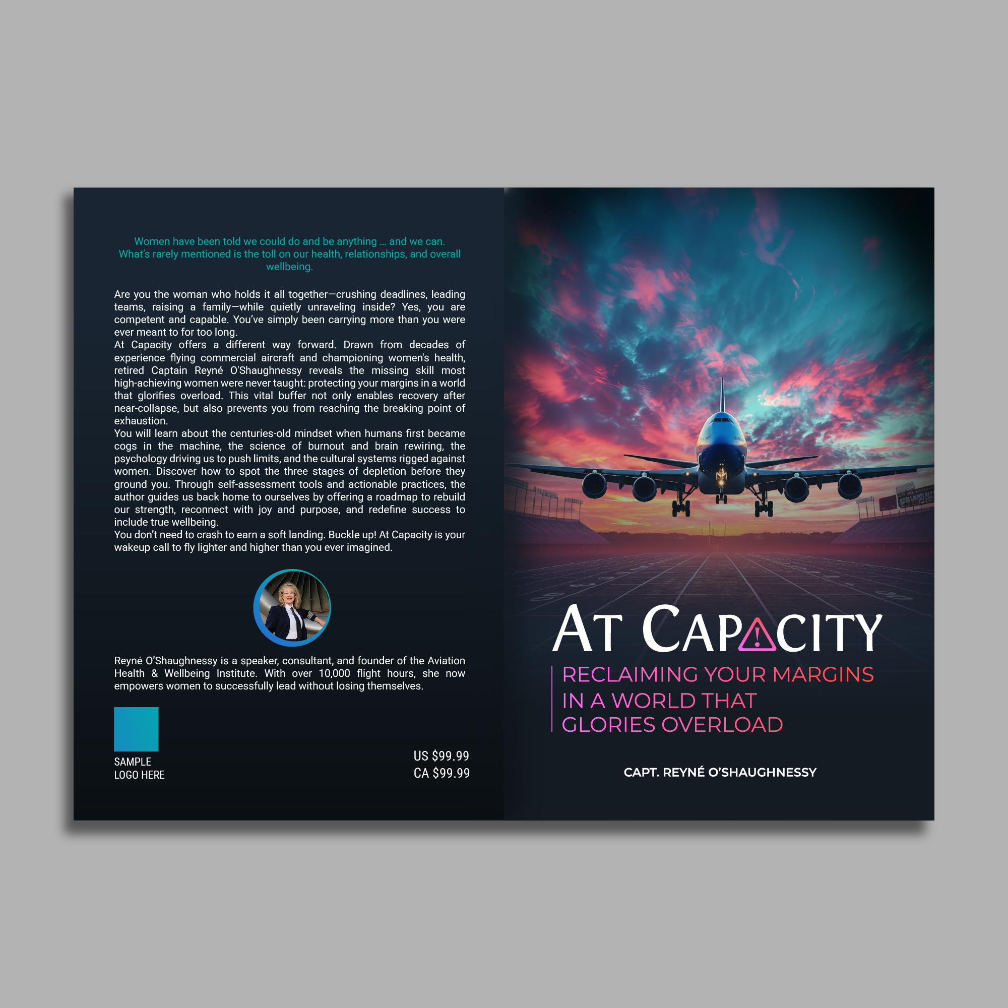
I need a cover for a my 3rd book that kinda goes with my brand (my previous book. The name of my first book - "This Is Your Capatin Speaking" What You Should Know About Your Pilot's Mental Health". In the same style I need my third book - AT CAPACITY" to stand out. I need a bolder, less whimsy cover, less playful. So can we use some of the same elements to stay consistent in this book cover. Perhaps use text to envoke emotions. This is the back cover so far (see below attachemnent)
Mises à jour
Hello,
Subject: Cover Direction & Brand Consistency
Hi everyone,
Here’s my honest take: I don’t think the current execution fully reflects my brand yet. What I’m wondering is whether we can bring more continuity across my books—borrowing elements from my first and second covers to inform this third one. Think of how authors like Stephen King maintain a recognizable style across their work. That consistency builds trust and signals authority before a reader even opens the book. Design choices like this matter more than we realize.
I’ve attached a cover I came across on Amazon that reminded me of Option 5 and feels aligned with where you’re headed. One thought: could we experiment with introducing a crack—or cracks—into the word CAPACITY itself? Maybe put the title "AT CAPACITY" at the edge of the cover vertically?
Curious to hear your thoughts and how you see this evolving.
P.s. Is there away to attach an idea?
Added Tuesday, 27 January 2026
Texte du logo
AT CAPACITY: Reclaiming Your Margins in a World that Glories Overload