Sub-logo for Compounding Pharmacy
Vous souhaitez remporter un projet comme celui-ci ?
Ce client a reçu 290 designs de logo de la part de 124 designers. Il a choisi ce design de logo de SANJU1 comme design gagnant.
Inscrivez-vous Trouvez des Projets de Design- Garanti
-
 US$150
-
 290 designs
-
 124 designers
Brief de Design de Logo
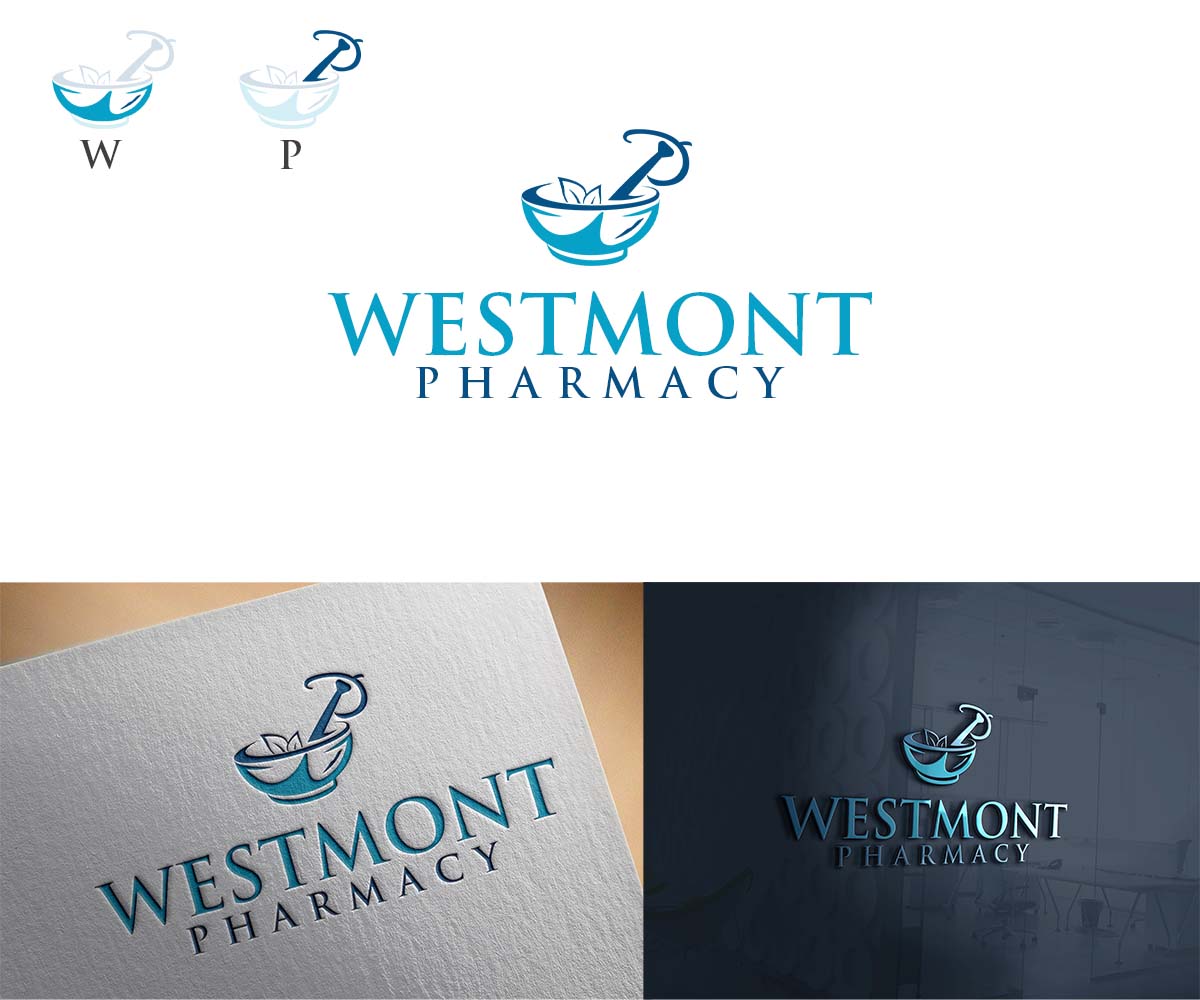
We are an independent pharmacy called Westmont Pharmacy looking for a custom sub-logo to represent our compounding services.
Concept:
Create a mortar & pestle where:
• The mortar forms a “W”
• The pestle forms a “P”
Include visual cues of compounding (capsules opening, powder pouring, small lab glassware, etc.).
Two versions needed:
1. Minimal version – clean, simple, works for stickers and bags
2. Bold version – eye-catching for storefront window signage
Style & colors:
• Blue & white brand colors
• Mortar/pestle in beige or warm stone tone
• Professional, modern, medical (not cartoon, not vintage)
What to Avoid
• Generic stock mortar & pestle icons
• Overly complex or busy designs
• Pink / playful medical styles
• Anything that looks like a supplement brand
• Using the full company tagline (only “Westmont Pharmacy”)
Deliverables:
Vector files + PNG (transparent), color & black/white versions.
Some AI ideas below
Texte du logo
Westmont Pharmacy