Range of 4 soft drink labels
Vous souhaitez remporter un projet comme celui-ci ?
Ce client a reçu 32 designs étiquette de la part de 9 designers. Il a choisi ce design étiquette de Daud Nadeem comme design gagnant.
Inscrivez-vous Trouvez des Projets de Design- Garanti
-
 €170
€170
-
 32 designs
-
 9 designers
Brief de Design Étiquette
The goal is to create a coherent sub-range, immediately identifiable as part of my beer universe, while assuming a lighter, more joyful and accessible personality.
common DNA of the 4 labels
Graphic style: modern, flat design enriched with light textures (grain, paper, micro-imperfections) to evoke the world of crafts.
Typography: a strong, legible, contemporary main typeface (sans-serif or grotesque), complemented by a more expressive or handwritten secondary typeface for the fun side.
Composition: clear structure, with a central axis or a block composition, similar to that of the beer range (same margins, same hierarchy logic).
Illustration: stylized, abstract or semi-figurative motifs (bubbles, plants, bursts, waves), avoiding realism to remain graphic and timeless.
Tone: joyful, refreshing, embracing pleasure without being childish.
Consistency: same label formats, same logic for name placement, same visual rhythm.
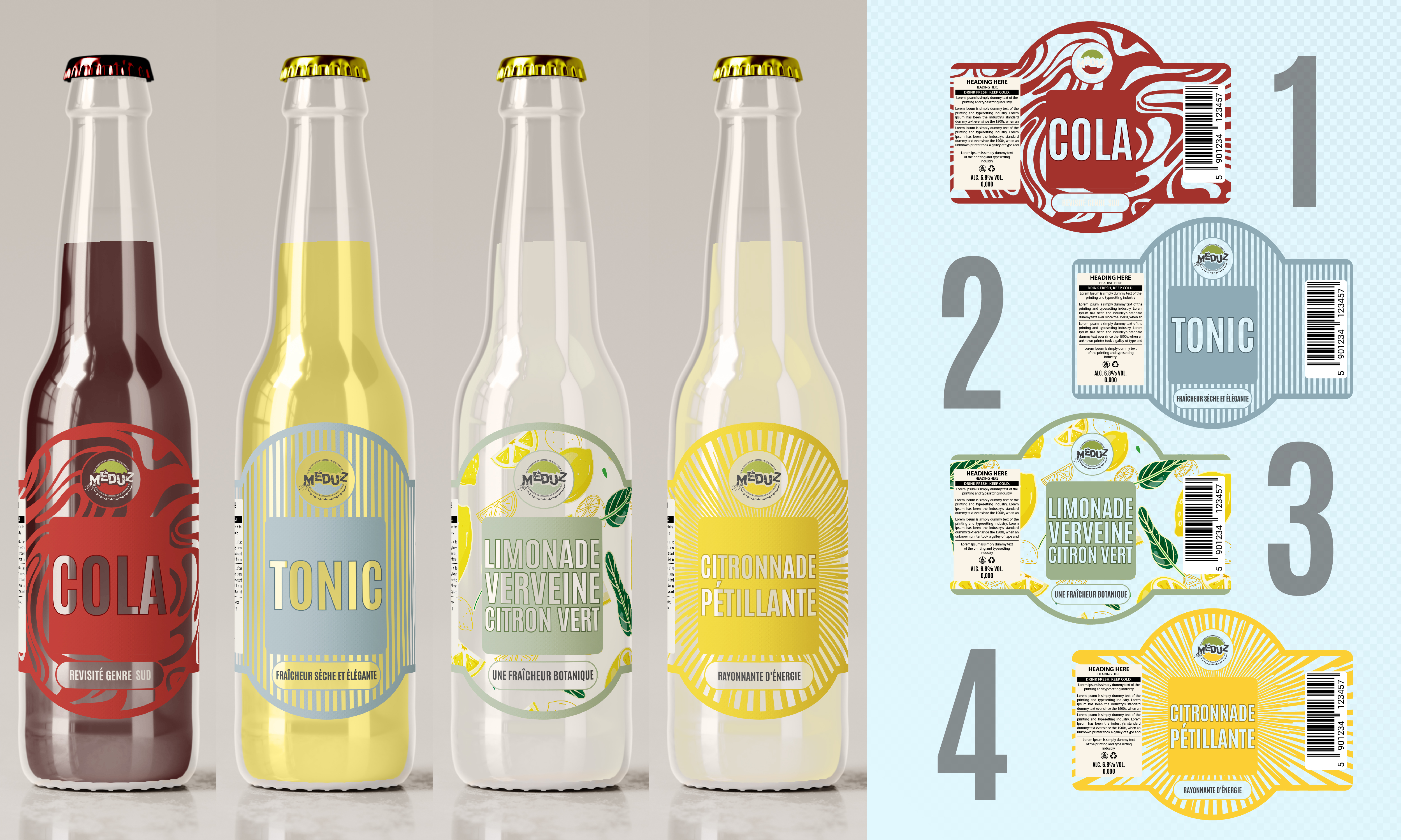
1. Cola – The iconic revisited
Color codes
Dominant deep red
Cream/ivory accents
Touches of black or dark brown for depth
Graphic intention
A cola that respects classic conventions but with a contemporary, artisanal touch. The red color is vibrant but slightly desaturated to avoid an industrial look.
Design
Textured red background, reminiscent of paper or ink.
Dynamic graphic patterns (curves, soft lightning bolts, stylized bubbles).
Robust, rounded typography with character.
A sensation of indulgence, roundness and energy.
Emotion
Confidence, pleasure, modernized nostalgia.
2. Tonic – Dry and elegant freshness
Color codes
Light blue, blue-grey or mineral blue
Off-white
Touches of silver or very light grey
Graphic intention
A clean, lively and elegant tonic, which evokes bitterness, freshness and finesse, without falling into cold luxury.
Design
A more airy composition than other soft drinks.
Patterns of fine bubbles, vertical lines or geometric shapes evoking tonicity.
Thinner or slightly condensed typography.
An immediate feeling of freshness.
Emotion
Freshness, precision, accessible sophistication.
3. Lemon-verbena lemonade – The refreshing botanical
Color codes
Pale yellow
Verbena green / sage green
Soft white
Graphic intention
Highlighting the natural and plant-based aspect, without falling into the organic cliché. A fresh, herbaceous, elegant drink.
Design
Stylized illustrations of verbena leaves and lemon peel.
Organic patterns, flowing lines.
Warm and contemporary typography.
A soft, luminous, slightly powdery palette.
Emotion
Nature, freshness, balance, craftsmanship.
4. Sparkling Lemonade – Sunshine and Energy
Color codes
Bright yellow dominant
Bright white
Touches of more acidic yellow or lime
Graphic intention
An ultra-fresh, cheerful and thirst-quenching lemonade that immediately catches the eye.
Design
Dynamic bubble patterns, bursts, circles.
A more rhythmic composition, almost in motion.
Expressive typography, slightly more playful.
Strong contrasts for an immediate visual impact.
Emotion
Sunshine, fun, a burst of freshness.
Consistency with the beer range (see www.meduz.fr)
To ensure harmony with my existing range:
Same layout logic.
Same family of typefaces (dink / frail).
Same level of texture and detail.
Soft drinks appear as a lighter and more joyful version of the beer universe, not as a separate range.
Aspect
Chaque curseur illustre les caractéristiques de la marque client et le style que doit transmettre votre design de logo.