Modernize My Logo
Vous souhaitez remporter un projet comme celui-ci ?
Ce client a reçu 310 designs de logo de la part de 143 designers. Il a choisi ce design de logo de HaveTake comme design gagnant.
Inscrivez-vous Trouvez des Projets de Design-
 C$340
C$340
-
 310 designs
-
 143 designers
Brief de Design de Logo
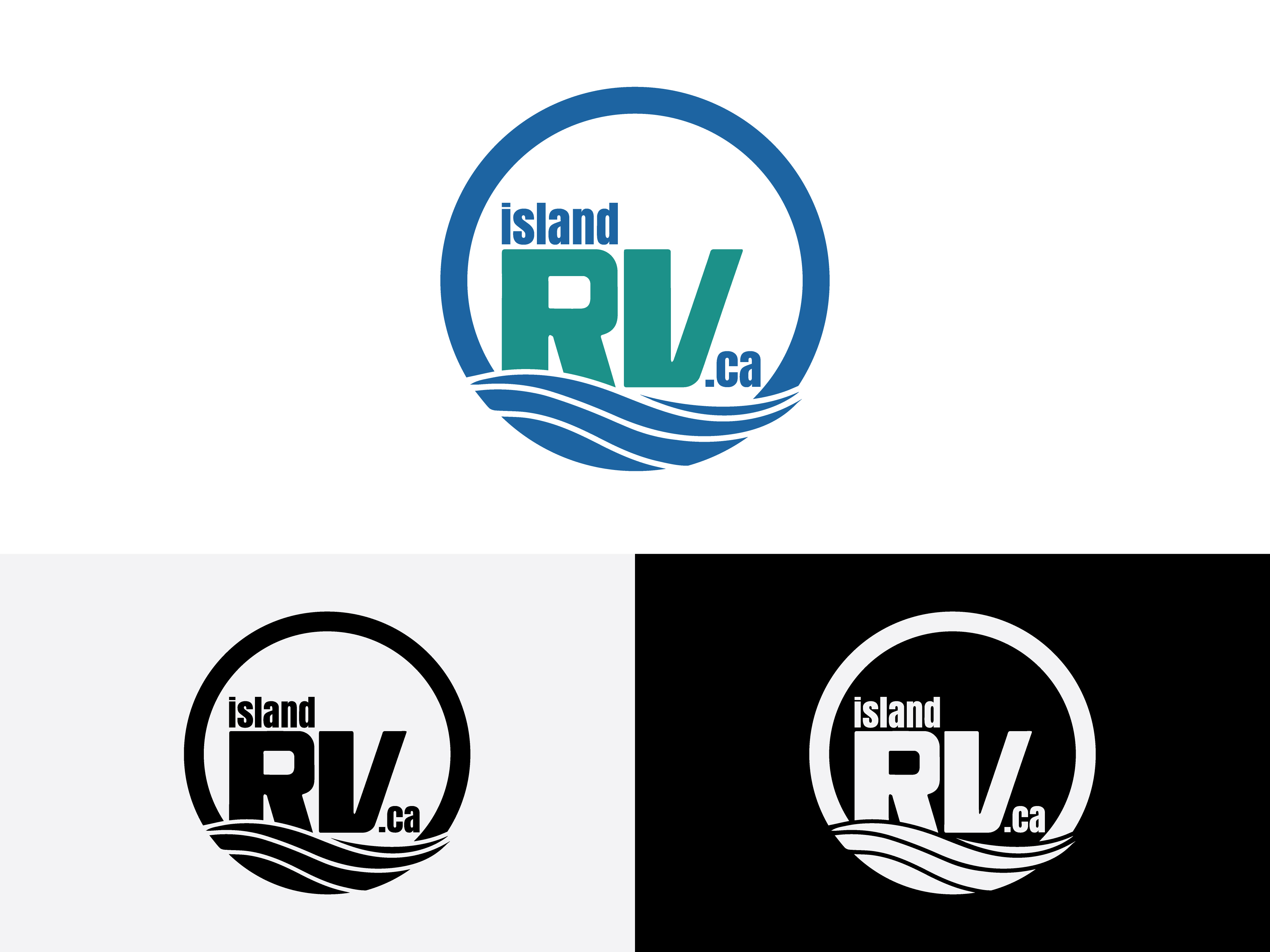
Back story: I have already started to modernize our logo, but it's missing something and I want it to look more professional, symmetrical and cohesive than the one I updated.
Our original logo was teal and royal blue. We want it to be monochrome (Black or White).
I have transitioned our logo from saying "Island RV Rentals" to ("Island" + "RV" + ".ca"). There are some similarly named company's on the island that we live and operate on, so we wanted to move in a direction that emphasized where to find us, our website. Our operation has progressed from purely being a rental company, now to a sales and rental company.
I have been happy with the waves in our logo, as well as the custom designed font for "RV".
I feel the logo can be improved in these ways:
-Improved Symmetry
-Improved font and placement for "island" + ".ca" (I do prefer lowercase as well)
-Improved design, styling and cohesiveness to the newly added arc
Texte du logo
island RV .ca