ACREO - Align Community Research Enablement Organization
Vous souhaitez remporter un projet comme celui-ci ?
Ce client a reçu 537 designs de logo de la part de 170 designers. Il a choisi ce design de logo de COLOUR CREATIVE comme design gagnant.
Inscrivez-vous Trouvez des Projets de Design-
 C$350
C$350
-
 537 designs
-
 170 designers
Brief de Design de Logo
About the organization
ACREO (Align Community Research Enablement Organization) is a community research enablement organization. We support community-based doctors offices (medical clinics) to offer their patients (our community members) access to research studies that have medications and devices that are well known, but not easily accessed either for an affordable amount of money or not yet available to Canadian's yet!
We work alongside clinical teams, sponsors, and ethics boards to enable research where care happens, outside of traditional academic centres - hospitals!
Logo direction - About me!
I am a female, women, identifying as she/her and bring a very happy, exciting, femininely, organized, detailed, and high quality of care and attention to my work and operations. I am looking for a log to demonstrate this passion, and our desire to connect our community to these exciting opportunities that can increase their life span, but further their quality of life. Bringing our community closer together!
It does need to feel appropriate for healthcare and research, but the energy should be there that reflect ME and what I am all about!
Mises à jour
Need a couple of days before selecting a winner
Thank you to all designers for the first round of submissions. I’d like to provide clearer guidance to help refine the next phase of designs.
What is working:
• Clean, minimal concepts that feel professional, credible, and institutional
• Logos that rely on structure and restraint rather than decorative symbols
• Wordmark-led designs that feel appropriate for research, ethics, and sponsor-facing environments
• Clear articulation of the organization name and purpose
What is not working:
• Designs that feel dated, generic, or overly “healthcare cliché”
• Decorative or illustrative symbols without clear meaning
• Typography that feels too heavy, rigid, or harsh — I’m looking for something more refined and modern
• Overuse of bright red/blue or standard healthcare colour schemes
Design direction moving forward:
• The logo should feel quietly confident, modern, and systems-driven
• Minimalism is preferred, but with warmth and sophistication and a modern flair
• Typography is very important — I am open to exploring different typefaces and typographic balance
• Colour is flexible; I’m drawn to grounded, earthy palettes (olive or muted greens, charcoal, deep grey or blue-grey, soft whites/creams), with the option for very controlled accent colours (e.g., mustard, deep plum, or subtle bold tones used sparingly)
Brand positioning:
ACREO (Align Community Research Enablement Organization) exists to provide the stable, trusted framework that enables community-based research to happen where care actually takes place. The brand should feel credible, modern, and enduring — not loud or trend-driven.
I’m looking for refinement, cohesion, and a sense of thoughtful confidence rather than more concepts that feel busy or generic. Thank you, and I look forward to seeing how the next round evolves with this guidance.
Added Wednesday, 14 January 2026
Marché(s) Cible(s)
Community doctors and the public - our community
Texte du logo
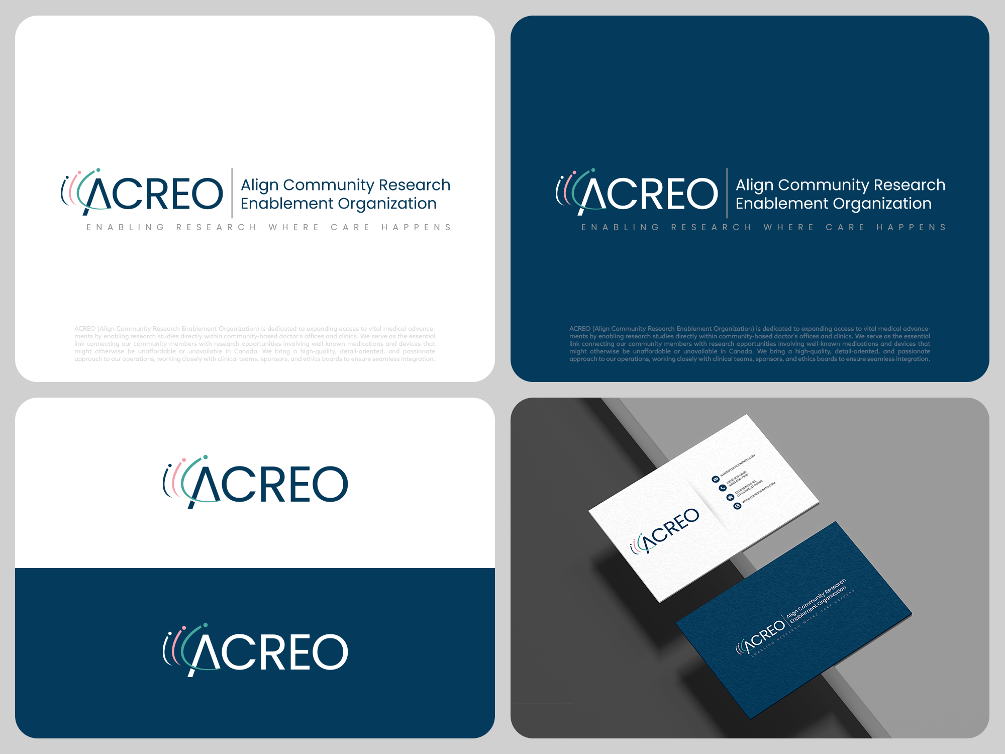
Primary text: ACREO Optional descriptor: Align Community Research Enablement Organization Optional tagline: Enabling Research Where Care Happens
Aspect
Chaque curseur illustre les caractéristiques de la marque client et le style que doit transmettre votre design de logo.