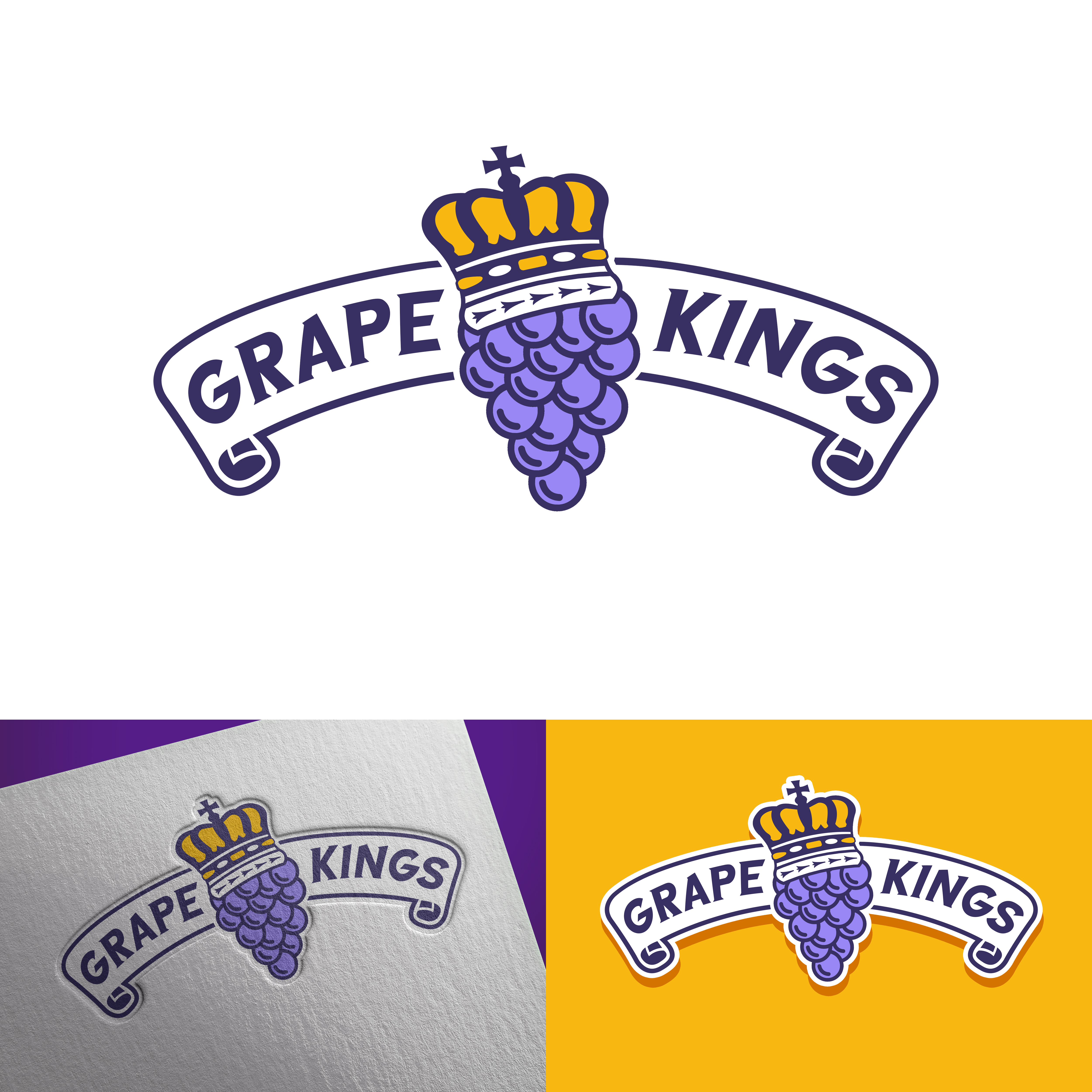
Niagara Grape Kings
Vous souhaitez remporter un projet comme celui-ci ?
Ce client a reçu 14 designs de logo de la part de 4 designers. Il a choisi ce design de logo de Alaeisnz comme design gagnant.
Inscrivez-vous Trouvez des Projets de Design-
 C$120
C$120
-
 14 designs
-
 4 designers
Brief de Design de Logo
The first image I attached is the logo I need changed. It doesnt need to be a major overhaul or get too far away but that was the original concept. I like the Script over the crown but the crown needs to be modified along with the font style. The second image i attached was a crown from the province of ontario, Id like the top of that crown to be encorporated, the cross at the top is significant to the province. The colours are purple, gold and white. More of the athletic gold than vegas or something else. Ive also attached an attempted logo concept of mine, its a bunch of grapes with a crown on it. I could never get it how I imagined it, the crown seemed too large. maybe it needed to be slightly off to the side. I attached a couple other concepts I was trying to pull from. These are for a hockey team, not that it makes much difference, but you seemed to really capture the feel of the last project. I was hoping for what felt like a classic hockey logo. vintage. but not too dated. Let me know if you feel like taking on the project and how much you want for the job. thanks for your time.
Mises à jour
Designs look the same