Professional Logo & Brand Kit for Etho Partners (Business Acquisition Firm)
Vous souhaitez remporter un projet comme celui-ci ?
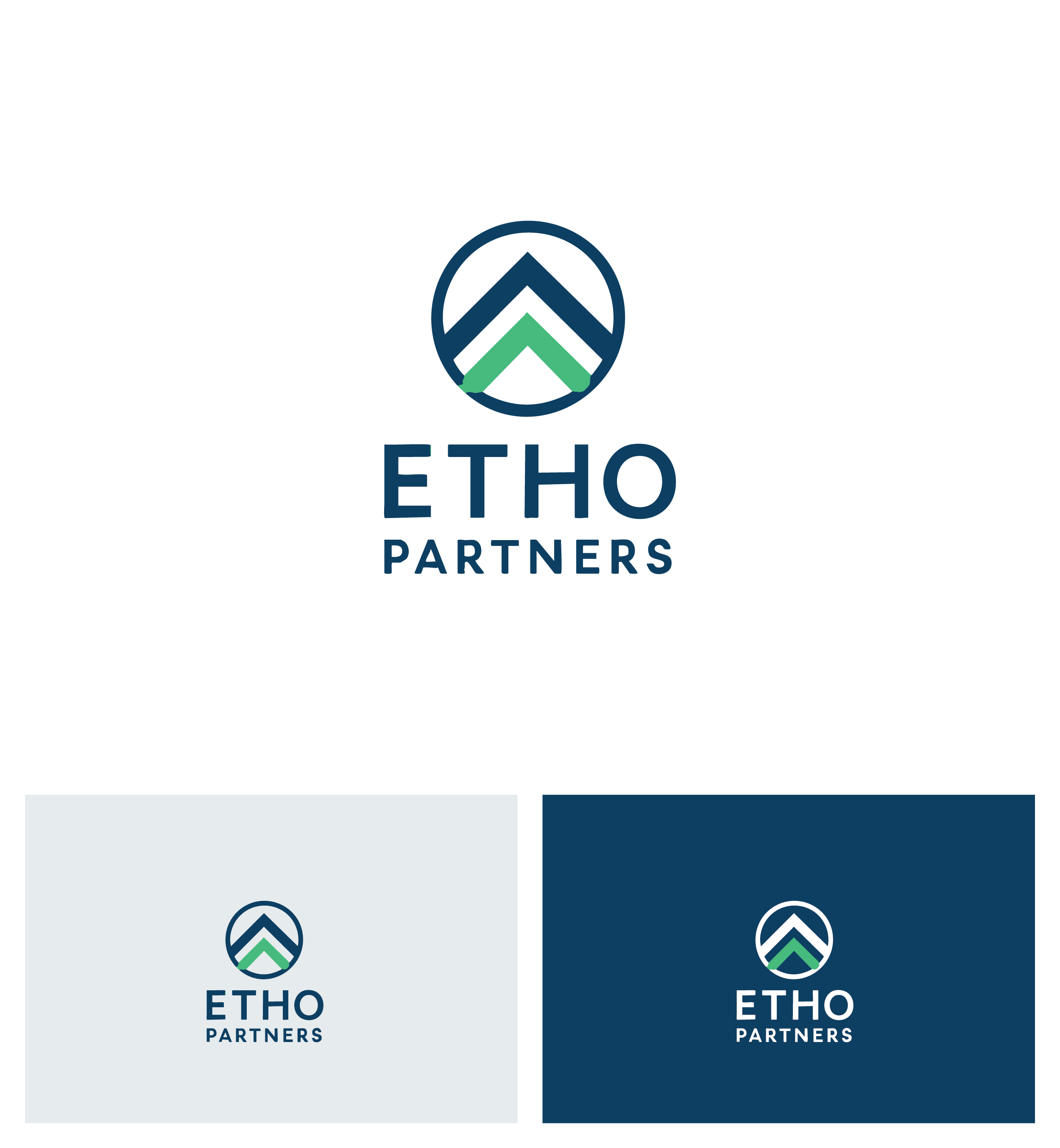
Ce client a reçu 172 designs de logo de la part de 79 designers. Il a choisi ce design de logo de Afsana_Hoque comme design gagnant.
Inscrivez-vous Trouvez des Projets de Design-
 C$150
C$150
-
 172 designs
-
 79 designers
Brief de Design de Logo
Etho Partners is looking for a clean, modern, and professional logo along with a simple brand kit. We specialize in the thoughtful acquisition and long-term stewardship of small- to medium-sized businesses. Our clients are business owners preparing for retirement or transition, so the brand must communicate trust, legacy, stability, and approachability. We are NOT a private equity firm — we are people-centric, relationship driven, and legacy focused. This philosophy should be reflected in our visual identity. Check out our website: ethopartners.com
What We Need
- Primary logo
- Secondary/horizontal logo
- Icon/symbol version
- Black/white variants
- Basic brand kit (color palette + font recommendations)
About Etho Partners
Etho Partners acquires businesses from owners who are ready for retirement or a change in direction. We ensure a smooth and respectful transition that protects the business’s legacy, people, and performance. We preserve and grow what the owner built while providing a fair and seamless ownership change.
Preferred Colors
- Navy or deep blue (trust, stability)
- Greens (growth, stewardship)
- Charcoal / grey / white neutrals
(Avoid bright or neon colors.)
Typography
- Modern serif or sans-serif
- Clean, confident, and easy to read
- No decorative or overly stylized fonts
Where the Logo Will Be Used
- Website
- Documents and presentations
- Business cards
- Social media profiles (LinkedIn, etc)
File Requirements
- Vector files (AI/EPS)
- PNG + SVG
- Color codes (Hex/RGB/CMYK)
Marché(s) Cible(s)
Business Owners (typically 50+) looking to retire or change direction and Advisors / Brokers who refer owners
Secteur / Type d'entité
Business Acquisition
Texte du logo
Etho Partners
Styles de police à utiliser
Couleurs
Couleurs choisies par le client et à utiliser dans le design de logo:
Aspect
Chaque curseur illustre les caractéristiques de la marque client et le style que doit transmettre votre design de logo.
Élégant
Audacieux
Léger
Sérieux
Traditionnel
Moderne
Sympathique
Professionnelle
Féminin
Masculin
Coloré
Conservateur
Économique
Haut de gamme
Exigences
Doit avoir
- Design Direction - Style: Clean, minimal, modern, and timeless - Tone: Professional, trustworthy, people-focused - Preferred structure: Wordmark + simple symbol - Symbol ideas (subtle, not literal): Growth / continuity Path / bridge / forward motion Stewardship / stability
Ne doit pas comporter
- Avoid: overly busy, flashy, or childish designs