Rebrand Logo Design for a Land Surveying Company!
Vous souhaitez remporter un projet comme celui-ci ?
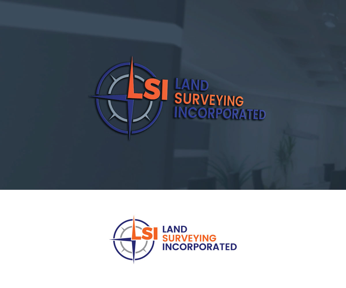
Ce client a reçu 245 designs de logo de la part de 111 designers. Il a choisi ce design de logo de Srk pix!14 comme design gagnant.
Inscrivez-vous Trouvez des Projets de Design- Garanti
-
 US$150
-
 245 designs
-
 111 designers
Brief de Design de Logo
We are Land Surveying Incorporated (LSI), a professional surveying company with over 30 years of experience in Wyoming, Montana, and Nebraska. Our clients are general contractors, homeowners, oil & gas developers, and large-scale construction firms. We want our logo to reflect accuracy, technology, and trust.
Logo Direction:
Focus on precision and data-driven surveying.
Clean, geometric look — think blueprint lines, survey markers, or grids.
Consider incorporating a survey tripod, compass, or subtle measuring element (without making it too busy).
Main lettering: LSI as the focal point, with “Land Surveying Incorporated” spelled out underneath or beside in a smaller font.
Typeface: Bold, professional, and modern.
Color palette: Navy blue + gray (trust & stability), with a sharp accent color such as surveyor-orange.
Do’s:
Keep it professional and sharp.
Convey trust, accuracy, and expertise.
Make sure the logo works in both color and black & white.
Don’ts:
Avoid overly playful or cartoonish styles.
Avoid cluttered or overly detailed icons.
Also, create a Wordmark that can also be broken apart to a stand alone of just an icon to be used for simplified branding on marketing material and a social media profile picture
Texte du logo
LSI - Land Surveying Incorporated