

 Rafraîchir
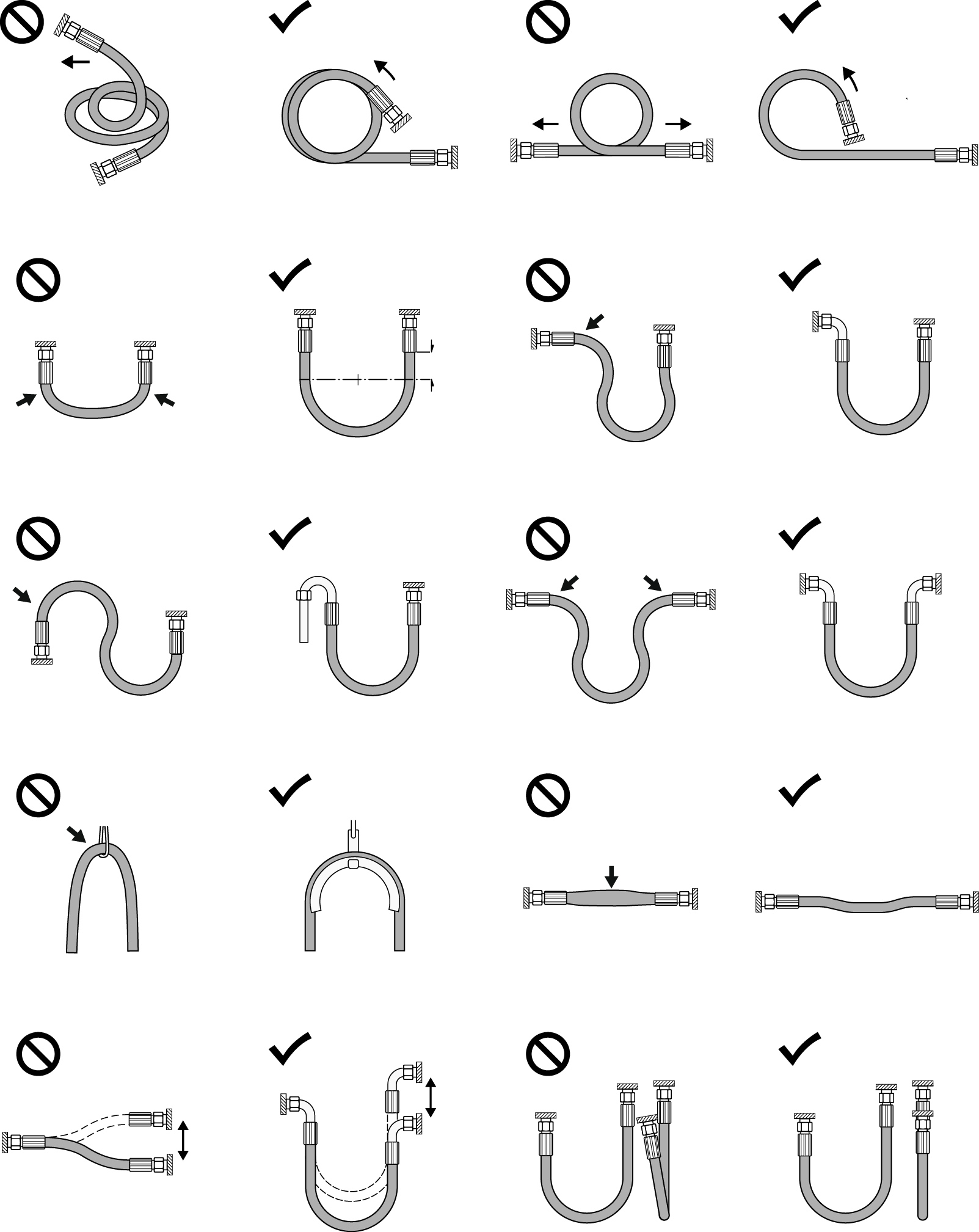
Redesign of Icons for Hose Installations
Vous souhaitez remporter un projet comme celui-ci ?
Ce client a reçu 22 designs graphiques de la part de 10 designers. Il a choisi ce design graphique de Alike comme design gagnant.
Inscrivez-vous Trouvez des Projets de Design
-
 €70
-
 22 designs
-
 10 designers
Brief de Design Graphique
Source Material:
There are currently 23 hand-drawn icons from the 1980s. These illustrate GO (correct application) and NO-GO (incorrect application) situations in hose installation.
Objective:
Redesign the icons in a modern, clear, and consistent style. The hoses and their end fittings should visually follow the appearance of Style_1 and Style_2.
Scope:
Redesign 23 icons based on the existing drawings.
Reproduce the shapes as shown in the reference images 011 to 112.
Ensure a uniform look & feel (line thickness, proportions, grayscale tones).
File Formats:
Delivery in .png (high resolution, transparent background) and .svg (scalable, editable).
Additional Requirements:
Omit the GO and NO-GO marks (checkmarks and prohibition symbols).
Colors: grayscale only.
Icon sizes: square format, PNG export at 400x400 px.
Background: white, without borders.
Deadline: 2 weeks.
File naming system: e.g., 011.png → new_011.png.


