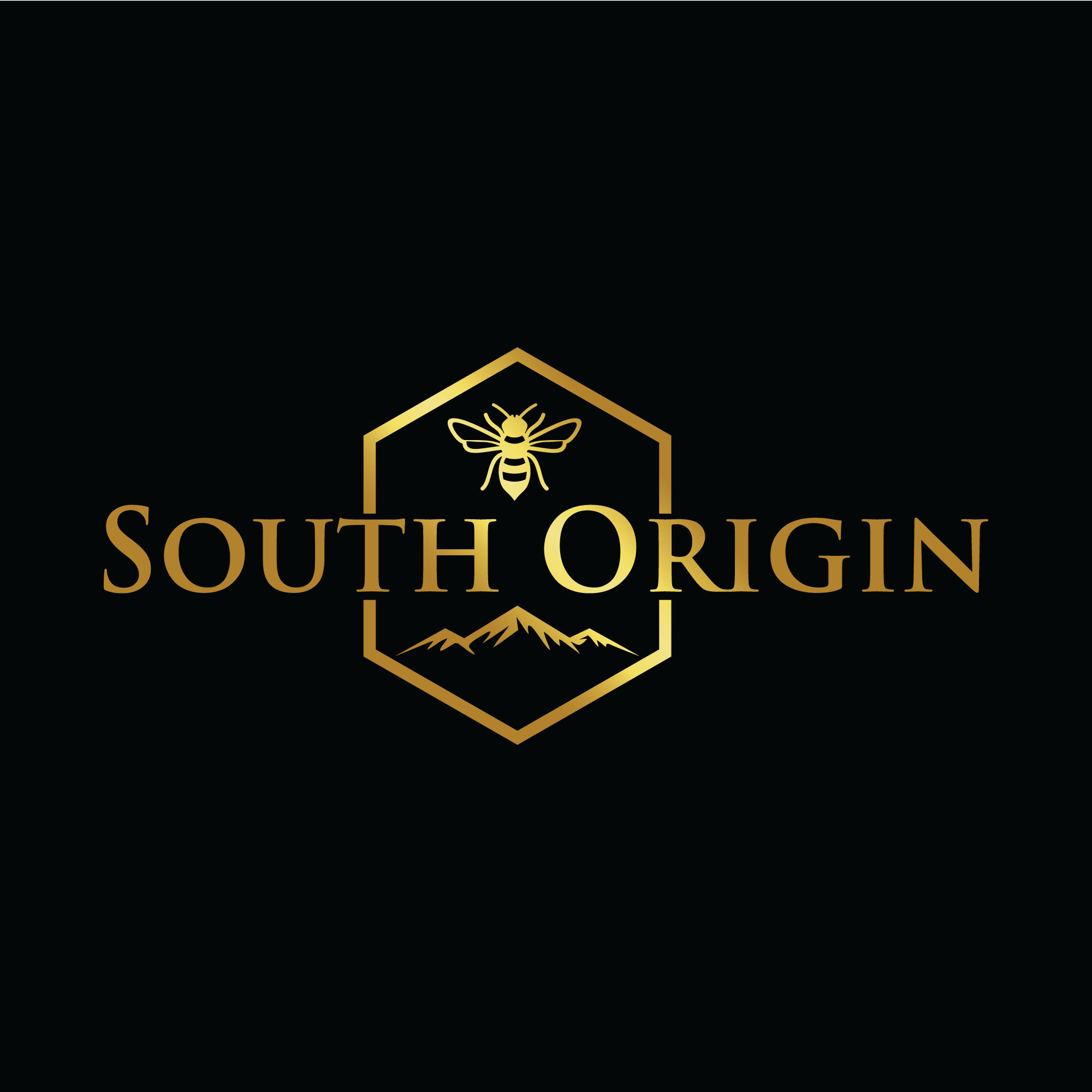
South Origin — Manuka Honey Logo (Nature-Origin style, EN/CN bilingual)
Vous souhaitez remporter un projet comme celui-ci ?
Ce client a reçu 34 designs de logo de la part de 11 designers. Il a choisi ce design de logo de Helen. comme design gagnant.
Inscrivez-vous Trouvez des Projets de Design- Garanti
-
 NZ$150
-
 34 designs
-
 11 designers
Brief de Design de Logo
About the brand
South Origin is a New Zealand-based Mānuka honey brand exporting to China. We want a nature-origin look and feel that communicates purity, trust and provenance (forests, bees, mountains, clean water).
Audience & use
Premium FMCG consumers in NZ & China. The logo must work on jar labels (250g/500g, round lid), shipping boxes, website header, social avatar and small favicons.
What we want
• Primary wordmark: “South Origin”.
• Optional CN companion wordmark: “南源” (please provide a bilingual lockup version).
• A simple, memorable symbol (optional): abstract bee/hexagon/honey drop/leaf/hill—subtle and refined, not cartoonish.
• Style: minimal, organic, calm; avoid medical/clinical crosses or national flags.
• Must be highly legible at small sizes and look good in 1-color/white-on-dark.
Deliverables (required)
• Vector logo (AI/EPS/SVG) + editable text.
• RGB/CMYK/HEX & Pantone swatches; black/white/mono versions.
• Horizontal/vertical lockups; icon-only mark; clear space & minimum size notes.
• Social avatar 1024×1024, website favicon 32×32/48×48.
• Basic 6–12 page mini-guide (usage, spacing, do/don’t).
• Confirmation of original work and full copyright/transfer for global trademark use.
References (for direction, not copy)
Nature-origin NZ landscapes, subtle honeycomb textures, premium food/health brands with clean typography.
Timeline & rounds
3–4 initial routes → pick 1–2 to refine → finalize. Please include 2–3 revision rounds in your quote.
Marché(s) Cible(s)
South Origin is a New Zealand brand focused on Mānuka honey as the hero product and bee propolis plus selected NZ nutraceuticals as extensions. Our primary market is China—health-conscious consumers aged 25–55 in Tier-1/2 cities, premium gift buyers, parents, and white-collar professionals. Key channels include cross-border e-commerce, import specialty stores, pharmacies/health stores, and corporate gifting. Positioning: natural origin, premium yet approachable, trustworthy and compliant
Secteur / Type d'entité
Food manufacturing and health product manufacturing industries
Texte du logo
Primary: South Origin ;Chinese companion (optional): 南源 Descriptor for product lockup (optional): Mānuka Honey
Styles de logo qui vous intéressent
Logo pictural
Un objet réel (texte facultatif)
Logo mot symbole
Logo (texte seulement)
Styles de police à utiliser
Aspect
Chaque curseur illustre les caractéristiques de la marque client et le style que doit transmettre votre design de logo.
Élégant
Audacieux
Léger
Sérieux
Traditionnel
Moderne
Sympathique
Professionnelle
Féminin
Masculin
Coloré
Conservateur
Économique
Haut de gamme
Exigences
Doit avoir
- MUST HAVES • Hexagon (honeycomb cue): use a flat-top hexagon as a core container or as subtle geometry/negative space. Clean, balanced, not heavy. • Bee motif: refined silhouette or line-based/geometry bee. Minimal, non-cartoon, no cute eyes. Wing details should remain legible at small sizes. • One-color master: logo must work in pure black or white (no gradients for the master mark). Color version may use Forest Green #2E5E4E and Honey Gold #D4A017 accents. • Lockups: deliver icon-only (bee+hex), English wordmark “South Origin”, and bilingual lockup with “南源”. • Small-size proof: show readability at 16px favicon and ≈20mm cap print. • Keep typography clear and premium; avoid medical crosses, flags, or stock/clip-art shapes.
Ne doit pas comporter
- NICE TO HAVES NEW ZEALAND CUES (abstract, respectful) • Manuka flower/leaf (Leptospermum scoparium) as a clean line icon or subtle pattern. • Landscapes: alpine ridge / rolling hills / fjord lines as minimal outlines within or around the hex. • Fern leaf (generic, non-branded) as a light accent shape. • Southern Cross star cluster as tiny dots/diamonds (avoid flag-like render). • Optional koru-inspired spiral kept abstract and culturally respectful (no direct traditional patterns). HONEY CUES (minimal, premium) • Honeycomb micro-pattern (flat-top hex) or a single hex with negative-space bee. • Honey drop / meniscus curve as a simple geometric droplet. • Bee wings simplified into 2–3 arcs (no cartoon eyes), readable at small sizes. • Honey dipper silhouette used sparingly as a secondary icon/badge. GENERAL • Keep all cues subtle and integrated with the hex+bee concept; legibility first. • Use our palette (Forest Green / Honey Gold) for accents; master mark must work in pure 1-color. • Show small-size proofs (favicon 16–32 px; cap print ≈20–30 mm). • Avoid: flag replicas, medical crosses, clip-art, or culturally specific motifs without abstraction.