Landlord Tenant Website Redesign
Vous souhaitez remporter un projet comme celui-ci ?
Ce client a reçu 124 web designs de la part de 29 designers. Il a choisi ce web design de Blue Sparrow comme design gagnant.
Inscrivez-vous Trouvez des Projets de Design- Garanti
-
 US$610
-
 124 designs
-
 29 designers
Brief de Web Design
Full Redesign Brief for The Brinton Firm
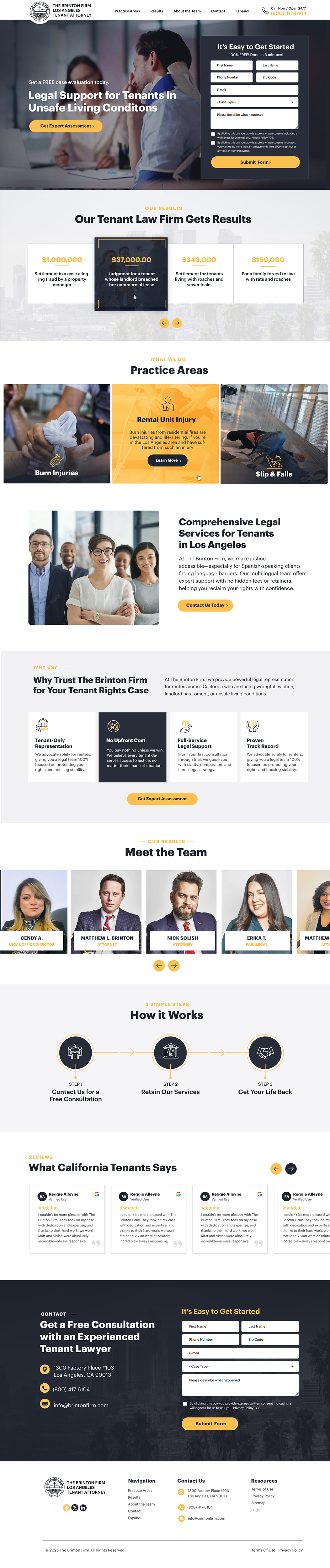
The Brinton Firm is a tenant rights law firm in Southern California that represents tenants only (never landlords). Our clients are residential renters, families, immigrants, Spanish-speaking tenants, and small business owners who are often in stressful housing situations—unsafe living conditions (mold, pests, fire/water damage, structural issues), landlord harassment, wrongful eviction, or injuries caused by negligence. Many of our clients feel powerless, so the website must reassure them that we are approachable, empathetic, and here to protect them, while also showing the firm’s power, results, and authority.
We want this redesign to keep the current branding and colors but present them in a modern, clean, professional layout.
🎨 Primary Color: Deep Navy Blue (#000080)
🎨 Accent Color: Gold/Mustard (#DAA520 or similar, sampled from the existing site)
🎨 Neutrals: White (#FFFFFF) and Dark Gray (#333333)
Use gold sparingly for highlights, calls-to-action, or important elements. Navy and white should remain the strong base.
Tone & Style
The firm wants to come across as the “LA Dodgers of Law” — a collaborative, championship-level team with proven results. The site should balance strength and authority (results, experience, big wins) with empathy and accessibility (tenant-focused, approachable, no upfront fees).
Design Direction
📱 Clean, modern, mobile-first layout
🔠 Large, bold typography for results and calls-to-action
📷 Authentic photography/imagery that shows real people and communities, not cold stock law images
👥 Highlight the team, not just one attorney—this is a collaborative firm
🏆 Showcase results, testimonials, and settlements prominently to build trust and credibility
📞 Clear calls-to-action throughout (consultation forms, phone numbers, “Get Help Now” buttons)
🗂️ Organized navigation: Practice Areas, Results, About the Team, Contact, Español
What We Like (Inspiration)
⭐ Morgan & Morgan (forthepeople.com): Bold messaging, strong results upfront, clear forms
⭐ Jacoby & Meyers (jacobyandmeyers.com): Empathetic tone, clear “How It Works,” easy navigation, results + testimonials
✨ Both sites combine powerful credibility with accessibility, which is exactly the balance we want
Do’s and Don’ts
✅ Do emphasize results, team strength, and client empowerment
✅ Do create a clear, modern look with bold typography and clean hierarchy
✅ Do balance professionalism with warmth and accessibility
❌ Don’t use cliché law firm stock images (gavels, scales of justice, courthouse pillars)
❌ Don’t make the design feel overly corporate, cold, or intimidating
Page Requirements for Redesign
🏠 Homepage — strong hero with tagline and call-to-action, highlight firm results, showcase team, include testimonials, clear paths to practice areas and contact.
⚖️ Service Page (Practice Area template) — explain specific services (e.g., landlord harassment, unsafe housing, wrongful eviction), with space for results and FAQs.
📰 Blog Page — clean, easy-to-read design with categories and featured articles; this will be used for tenant rights education and SEO content.
Overall Goal
The redesigned website should make tenants feel safe, supported, and ready to take action, while positioning The Brinton Firm as a powerful, championship-level law team with proven results.
Mises à jour
Please make sure you use the primary blue color which is #282d3a
The Gold color to use is this: #fcbe51
Please make sure you use these specific colors.
Added Monday, 25 August 2025
Low design quality
Slow in providing feedback
Need extra days to review
Went on vacation/holiday
The client needs 2-3 more weeks.
Gathering more feedback
Sick
Need to extend the project.
Went on vacation/holiday
Sick
Marché(s) Cible(s)
Legal Landlord Tenant
Secteur / Type d'entité
Legal
Code
Codé - Design et Code demandé
Nombre de Pages Demandé
1 page
Styles de police à utiliser
Couleurs
Couleurs choisies par le client et à utiliser dans le design de logo:
Aspect
Chaque curseur illustre les caractéristiques de la marque client et le style que doit transmettre votre design de logo.
Élégant
Audacieux
Léger
Sérieux
Traditionnel
Moderne
Sympathique
Professionnelle
Féminin
Masculin
Coloré
Conservateur
Économique
Haut de gamme
Exigences
Doit avoir
- 🎯 Strategic Goals Position the firm as approachable yet authoritative: empathy for tenants while projecting strength and proven results. Ensure clients feel safe, supported, and empowered to take action. Highlight that the firm is a championship-level team, not just one attorney. 🎨 Branding & Visual Identity Keep existing colors but modernize presentation: Deep Navy Blue (#000080) — primary base. Gold/Mustard (#DAA520) — sparingly for highlights/CTAs. White (#FFFFFF) & Dark Gray (#333333) — neutrals. Avoid cliché stock law images (gavels, scales, courthouse pillars). Use authentic, human-centered imagery (real communities, tenants, approachable team). Bold typography, clean hierarchy, mobile-first layout. 🧭 Navigation & Structure Clear, intuitive navigation with sections: Homepage Practice Areas (service templates) Results (case wins, settlements, testimonials) About the Team Blog / Tenant Rights Education Contact Español (full Spanish version or at minimum core pages translated). 📄 Page-Specific Requirements Homepage Strong hero tagline + “Get Help Now” CTA. Highlight major results/settlements. Showcase the team (collaborative, not just one figurehead). Trust signals: testimonials, awards, affiliations. Clear paths to practice areas and contact. Service Page Template For each practice area (e.g., landlord harassment, unsafe housing, wrongful eviction). Explain issues in plain, empathetic language. Include results/examples and FAQs. Prominent consultation CTA. Blog Page Clean, scannable design. Organized categories (tenant rights, eviction, landlord harassment, etc.). Featured posts to support SEO. 📞 Calls-to-Action & Conversion Persistent CTAs (sticky phone button or header link). Consultation forms on key pages. Easy-to-find phone number and “Get Help Now” buttons. Multilingual contact options (English + Spanish). 🏆 Trust & Credibility Prominent results/wins with numbers and specifics. Client testimonials with names/photos where possible. Team profiles emphasizing collaboration and expertise. Clear messaging: “We represent tenants only, never landlords.” 🚫 Don’ts Don’t use intimidating, cold, corporate design. Don’t rely on generic stock imagery. Don’t hide results/testimonials in secondary places — they must be upfront.
Ne doit pas comporter
- 🚫 Don’ts Don’t use intimidating, cold, corporate design. Don’t rely on generic stock imagery. Don’t hide results/testimonials in secondary places — they must be upfront.