DOUBLE DOWN Logo design music management company
Vous souhaitez remporter un projet comme celui-ci ?
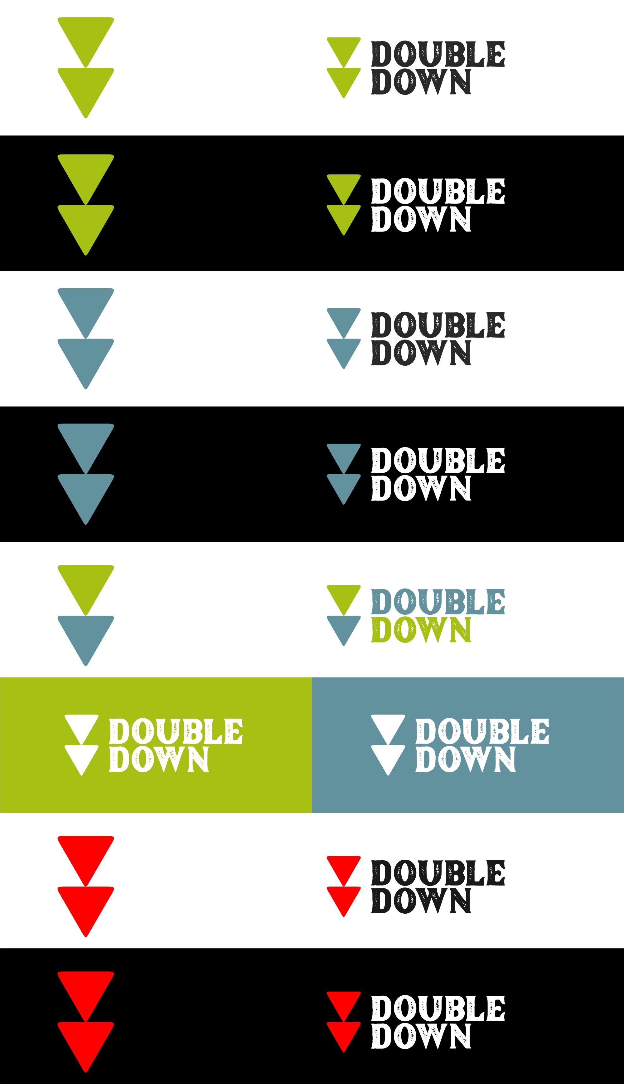
Ce client a reçu 531 designs de logo de la part de 178 designers. Il a choisi ce design de logo de agustian spades comme design gagnant.
Inscrivez-vous Trouvez des Projets de Design- Garanti
-
 US$150
-
 531 designs
-
 178 designers
Brief de Design de Logo
This company represents creators of all sorts from songwriters and record producers to recording artists. The term Double Down is all about going all in, betting on yourself and willing to risk it all for what you believe in. I do NOT want anything to do with gambling in the logo. I do NOT want anything specifically about music in the logo. Something that would look awesome on a T Shirt, but also when shrunk down small could read clearly on the spine of a CD or back of a record. I would like to keep it classy, modern, but with a something unique to take it 15 degrees from the center of basic. Make it iconic so it's bigger than the artists it represents. (Color palette reference below for design)
Mises à jour
Hi all, thank you so much for your initial designs. I wanted to give some overall feedback here...it seems many people are not reading the brief. Please do reference the things that are important, in particular things I dont want including anything to do directly with music, music notes, records, etc. I would like to go a bit further describing things that I like and dont...It should be cool, maybe reference some of the early 90's grunge type logos (as referenced in the attachment). It should NOT look like a lawyer, or CPA firm or Sports Medicine Company. please DO use the color palette I attached...they are there intentionally. I am also going to upload one sketch of an idea I kind of like, but it is basic and pedestrian so would be open to seeing new versions of this.
Added Thursday, 21 August 2025
Hi everyone
Thanks for submitting
I would really like to try my best to land a design that works here - there have been submissions that are super cool but nothing fully resonating with me - i want to stay away from feeling corporate / too hi fi and serious feeling and really try to feel like something culturally important and memorable. It’s important to have some iconography that can stand alone. A unique NON stock font and both black and white and color variations. Again, please no music company and no gambling references
Thank you
Added Thursday, 09 October 2025
Marché(s) Cible(s)
16-50
Secteur / Type d'entité
Music
Texte du logo
Double Down
Styles de logo qui vous intéressent
Logo pictural
Un objet réel (texte facultatif)
Logo abstrait
Conceptuel / symbolique (texte facultatif)
Logo mot symbole
Logo (texte seulement)
Logo de Lettermark
Acronyme ou logo texte (texte seulement)
Couleurs
Couleurs choisies par le client et à utiliser dans le design de logo:
Aspect
Chaque curseur illustre les caractéristiques de la marque client et le style que doit transmettre votre design de logo.
Élégant
Audacieux
Léger
Sérieux
Traditionnel
Moderne
Sympathique
Professionnelle
Féminin
Masculin
Coloré
Conservateur
Économique
Haut de gamme
Exigences
Doit avoir
- The word and an image a strong icon and use of the color palette reference in the attachments
Bien d'avoir
- Would be great to look awesome as just an icon as well as the full icon/words
Ne doit pas comporter
- Anything directly music - music notes and sheet music, records, tapes etc