Website Design for new skincare product launch/rebranding
Vous souhaitez remporter un projet comme celui-ci ?
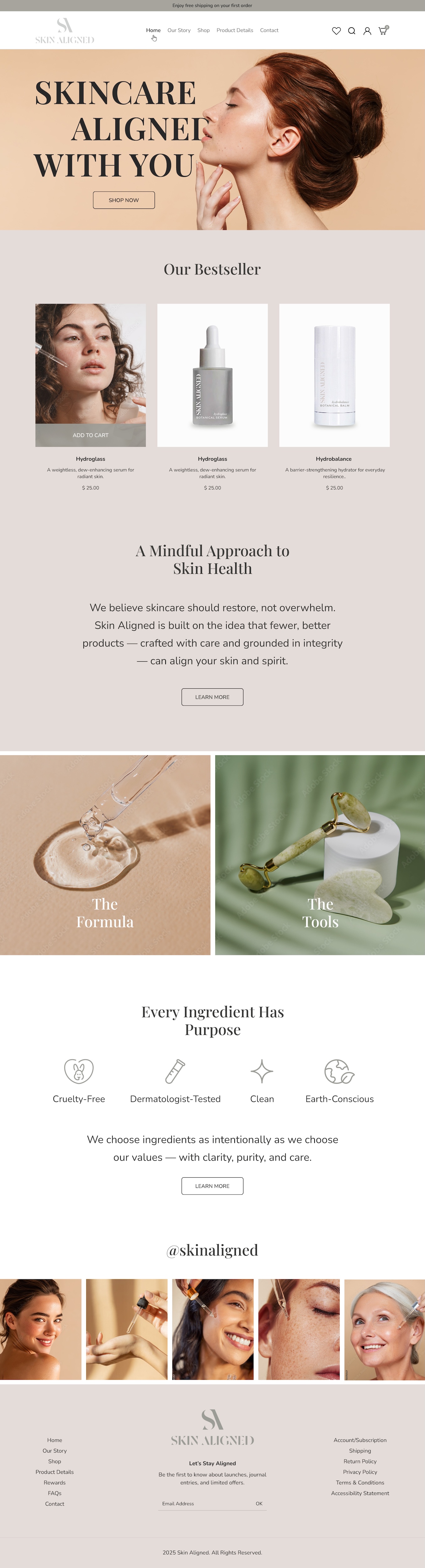
Ce client a reçu 39 web designs de la part de 11 designers. Il a choisi ce web design de pb comme design gagnant.
Inscrivez-vous Trouvez des Projets de Design- Garanti
-
 US$230
-
 39 designs
-
 11 designers
Brief de Web Design
The Skin Aligned website is currently live and built through Showit.com. While the existing site has served as a strong starting point, I’m now looking to elevate the overall experience with a complete redesign that reflects the growth and vision of the brand. This will be a full visual and functional revamp — not just a refresh — with the goal of creating a more elevated, intuitive, and conversion-focused platform. I’m looking for a designer who can not only reimagine the layout and visuals, but also collaborate on optimizing the user journey and site structure for both storytelling and sales.
Marché(s) Cible(s)
Age 25- 45 (core), with secondary appeal to 18-55. Primarily women, but gender inclusive. Wellness/Holistic Beauty/Organic Ingredients, Botanical.
Secteur / Type d'entité
Beauty, aesthetics, wellness.
Nombre de Pages Demandé
5+ page
Styles de police à utiliser
Autres polices appréciées:
- Gravesned Sans Family
Couleurs
Le designer choisit les couleurs à utiliser dans le design.
Aspect
Chaque curseur illustre les caractéristiques de la marque client et le style que doit transmettre votre design de logo.
Élégant
Audacieux
Léger
Sérieux
Traditionnel
Moderne
Sympathique
Professionnelle
Féminin
Masculin
Coloré
Conservateur
Économique
Haut de gamme
Exigences
Doit avoir
- Include standard pages (Home, Our Story/Values, Shop, Product Detail with ingredients/description/etc., Contact) and any other recommended sections to optimize conversion. Minimal, clean, calming visual. Seamlessly integrate with Shopify for all product sales.
Bien d'avoir
- Company colors are attached in images, along with first two products that are launching. One called Hyrdoglass, and one called Hydrobalance. Fonts and shapes need to align accordingly. Feel elevated, neutral, and luxe while maintaining a grounded, earthy minimalism. Visual inspiration includes brands like Crown Affair, Agent Nateur, and ANfisa — minimal yet high-end, with thoughtful use of whitespace, typography, and subtle movement. Would LOVE to have movement (short clip GIF) on either the home page or ingredient page, reference ANfisa website (homepage or CeraBind Technology™ Tab)
Ne doit pas comporter
- dark colors, complex design elements, too many different fonts. For ingredients, stick to botanical images and information only, with no mentions of CBD or use of leaf imagery.