Executive Logo for National Shared Services Company (Colorado-Based Roots)
Vous souhaitez remporter un projet comme celui-ci ?
Ce client a reçu 208 designs de logo de la part de 75 designers. Il a choisi ce design de logo de SaraArts comme design gagnant.
Inscrivez-vous Trouvez des Projets de Design- Garanti
-
 US$150
-
 208 designs
-
 75 designers
Brief de Design de Logo
We're establishing "5280 Works," a new collaborative group formed by three Smash My Trash owner groups in Colorado. Our goal is to create shared services that will drive efficiencies, standardization, and ultimately increase the overall value of our operations compared to functioning as independent franchises, built to scale nationally. We want the logo to project credibility, clarity, and executive presence, while being flexible enough to appeal across industries. The brand must feel national and future-focused — not overly geographic or local. The word “Works” is meant to imply action, systems, and reliable functionality. The logo should feel like it belongs to a trusted platform, partner, or operations firm — not a tech startup or trendy product.
We've been exploring logo concepts (via AI) and have a strong preference for a specific direction we'd like you to refine and develop into a professional, scalable design. We envision a logo (included) that incorporates the unique "W" from "Works" as a stylized representation of Colorado's mountain peaks. HOWEVER, please don't limit your creativity to the image we included or how things should be laid out -- it was just an interesting concept and the only one that resonated from a few AI generated images . Also, please do not include LLC in the logo itself.
Key elements and preferences for the logo:
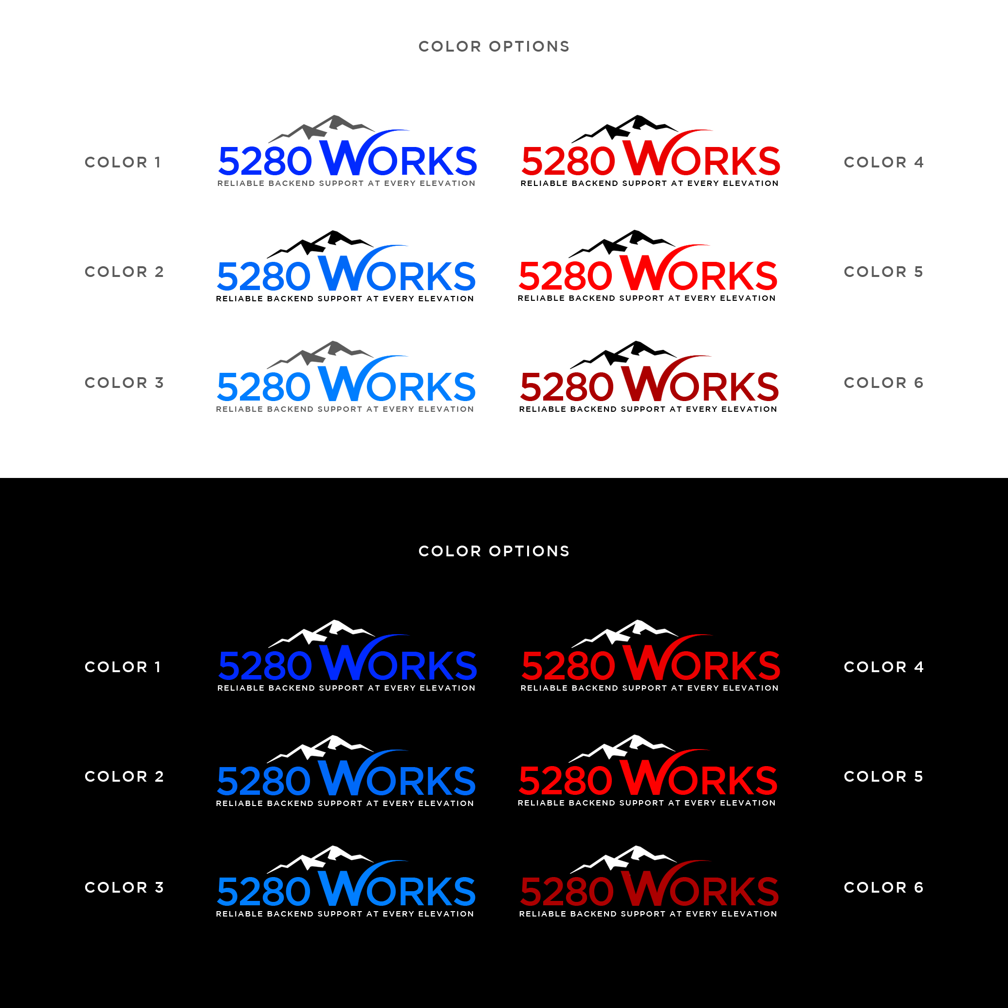
-Integration of "W" and Mountains: The core idea is to have the letter "W" in "WORKS" subtly or distinctly designed to look like mountain peaks. This connects to our Colorado roots (5280 feet, Denver's elevation) and our tagline "We Support Your Backend At Every Elevation," signifying our ability to handle complex tasks at any level.
-Color Palette: We're open to variations, but generally prefer a modern and professional color scheme. Blues, charcoals, whites, and perhaps some grays or other colors that evoke a sense of reliability, technology, and the Colorado landscape would be ideal. Avoid loud or playful colors.
-Overall Aesthetic: The logo & fonts should feel clean, modern, professional, trustworthy and ultimately timeless. It should convey innovation, efficiency, and a robust support system. Avoid overly complex or cluttered designs.
-Readability: The text "5280 WORKS" and the tagline "We Support Your Backend At Every Elevation" must be clear and easily readable at various sizes, where 5280 WORKS can be used with or without the tagline.
-Creativity: We're open to alternatives to the W being tied to Mountains, we're just sharing we liked that version we uploaded as it seemed to connect the dots.
At a high level, we’re looking for something that:
-Feels at home on a pitch deck or email signature
-Is scalable across web, print, and apparel
-Has a strong first impression, but also holds subtle meaning for those who know the origin of “5280”.
We are looking for you to bring this vision to life, ensuring the logo is unique, memorable, and effectively communicates our brand identity.
Texte du logo
5280 WORKS (Tagline: "Reliable backend support at every elevation")
Aspect
Chaque curseur illustre les caractéristiques de la marque client et le style que doit transmettre votre design de logo.