

 Rafraîchir
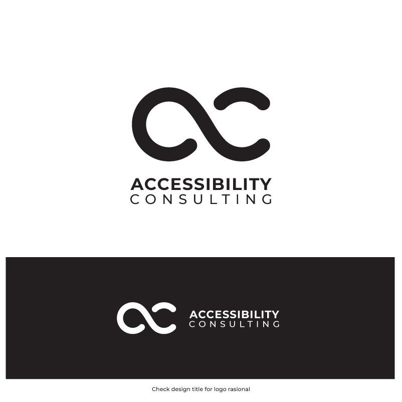
New logo for the Accessibility Consulting business
Vous souhaitez remporter un projet comme celui-ci ?
Ce client a reçu 463 designs de logo de la part de 213 designers. Il a choisi ce design de logo de Ben9Graphic comme design gagnant.
Inscrivez-vous Trouvez des Projets de Design
- Garanti
-
 US$150
-
 463 designs
-
 213 designers
Brief de Design de Logo
When creating a logo for an accessibility services and consulting business, it's crucial to convey professionalism, inclusivity, and a commitment to universal access. Here are some suggestions, keeping accessibility principles in mind:
Core concepts
Bridge/Pathways: Symbolize connecting people with accessible solutions and removing barriers.
Open Doors/Spaces: Represent access, welcoming environments, and breaking down limitations.
Interlocking Shapes: Evoke unity, collaboration, and the interconnectedness of different abilities.
Avoid Stylized Human Figures
Positive & Dynamic Imagery: Avoid static or overtly disability-focused visuals. Instead, focus on movement, progress, and a sense of overcoming challenges.
Symbolism
Use letters A and C if letters are suggested.
I like low-poly type images.
I like uber-simple and modern logos.
Color palette
Use blue (#0157A1) and/or gray (#E8E8E8) - and black (or two colors as it currently is) for the business name.
Avoid combinations that are difficult for people with color blindness to distinguish (e.g., red-green, green-brown, red-blue).
Typography
Choose clear and legible fonts that are easy to read at various sizes. Sans-serif fonts are generally recommended as they tend to be easier to read on screens.
Avoid script-style or novelty typefaces that may be difficult to decipher, especially for those with visual impairments.
Consider fonts known for their accessibility, like Helvetica, Arial, Tahoma, Verdana, Calibri, Times New Roman, Century Gothic, Roboto, Garamond, Lexend, Open Sans, OpenDyslexic, PT Sans, Atkinson Hyperlegible, and Baskerville.
If using text, ensure a sufficient contrast ratio of at least 4.5:1 for normal-sized text and 3:1 for large text.
Simplicity and versatility
Keep the design minimalistic and easily recognizable, avoiding overly intricate details.
The logo should be versatile and function well across various platforms and sizes, from small avatars to large signage.
Ensure that essential details remain clear and recognizable even at smaller sizes.
Marché(s) Cible(s)
Agencies and web professionals
Secteur / Type d'entité
Accessibility, inclusivity, consulting
Texte du logo
Accessibility Consulting
Styles de logo qui vous intéressent
Logo abstrait
Conceptuel / symbolique (texte facultatif)
Logo de Lettermark
Acronyme ou logo texte (texte seulement)

Styles de police à utiliser

Couleurs
Couleurs choisies par le client et à utiliser dans le design de logo:
Aspect
Chaque curseur illustre les caractéristiques de la marque client et le style que doit transmettre votre design de logo.
Élégant
Audacieux
Léger
Sérieux
Traditionnel
Moderne
Sympathique
Professionnelle
Féminin
Masculin
Coloré
Conservateur
Économique
Haut de gamme
Exigences
Doit avoir
- blue (#0157A1)
Bien d'avoir
- and/or gray (#E8E8E8)


