Logo Refresh for a Superalloy Recycling Co – Keep Core, Modernise Design
Vous souhaitez remporter un projet comme celui-ci ?
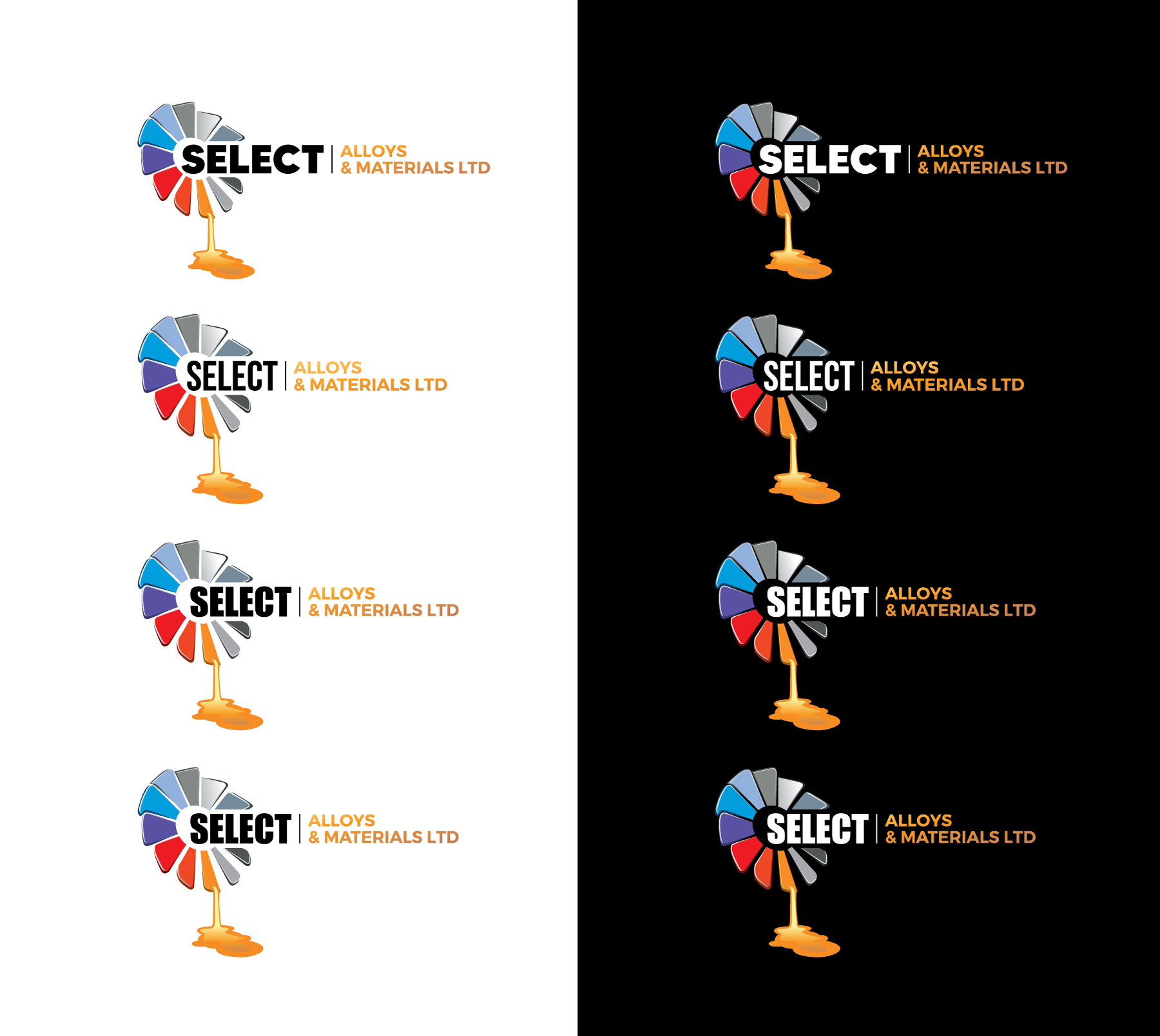
Ce client a reçu 882 designs de logo de la part de 255 designers. Il a choisi ce design de logo de WB NAG comme design gagnant.
Inscrivez-vous Trouvez des Projets de Design- Garanti
- Projet Lié 1
-
 £670
£670
-
 882 designs
-
 255 designers
Brief de Design de Logo
We want a refreshed version of our existing logo — not a complete change, but a modern update that keeps our recognisable logo which is a ring of angled, colourful rectangular shapes arranged in a circle with a hollow centre — one blade appears to be melting and dripping effect. The logo should feel fresher, more polished, and less flat/cartoon-like, with subtle depth or shading.
We’d like the updated icon to replace the “O” in “Alloys” within the text. The word “Select” should stand out more than the rest, with “Alloys & Materials Ltd” in a smaller or lighter style. We’d like to keep our current colour palette (mix of blues, greys, reds, and orange) but are open to text colours that complement the icon.
We’d love to see creative layout ideas, like using coloured dashes instead of a plain black line, or the drip from the icon falling into a letter in “Materials” to link the design elements.
The new design will be used for our website, paperwork, signage, uniforms, and marketing, so it must be clean, professional, and versatile.
Marché(s) Cible(s)
Remelting companies
Secteur / Type d'entité
Superalloy recycling
Texte du logo
Select Alloys & Materials
Styles de logo qui vous intéressent
Logo pictural
Un objet réel (texte facultatif)
Logo abstrait
Conceptuel / symbolique (texte facultatif)
Styles de police à utiliser
Couleurs
Le designer choisit les couleurs à utiliser dans le design.
Aspect
Chaque curseur illustre les caractéristiques de la marque client et le style que doit transmettre votre design de logo.
Élégant
Audacieux
Léger
Sérieux
Traditionnel
Moderne
Sympathique
Professionnelle
Féminin
Masculin
Coloré
Conservateur
Économique
Haut de gamme
Exigences
Doit avoir
- Keep the circular fan like icon and melting drip effect. • Icon replaces the “O” in “Alloys.” • Emphasis on “Select” in the text. • Include “Ltd” in the design. • Current colour palette for the icon.
Bien d'avoir
- • Drip falling into a letter in “Materials.” • Coloured dashes that match the logo colours instead of a black line. • Subtle shading/gradient for a modern feel.
Ne doit pas comporter
- • Completely new icon concept. • Flat or cartoonish style. • Overly busy, cluttered design.
Fichiers
Télécharger tous les fichiers - 0,1 MB
Paiements
Total
£670
Date limite du projet
11 juil. 2025 12:10:25 UTCOptions du projet
Projet(s) Lié(s)
- offrant un design de carte de visite de £29 au gagnant