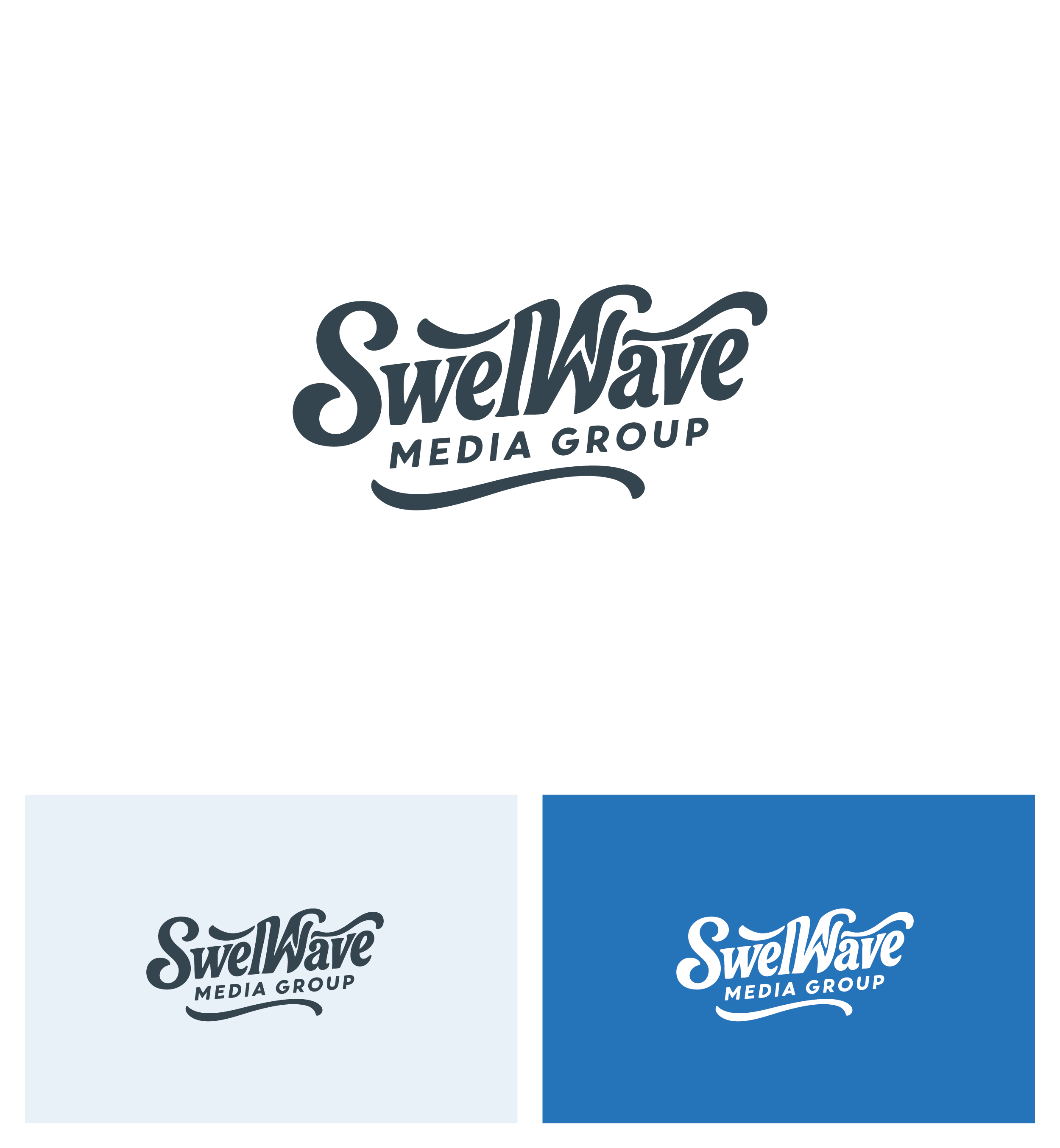
SwellWave Media Group Logo
Vous souhaitez remporter un projet comme celui-ci ?
Ce client a reçu 169 designs de logo de la part de 75 designers. Il a choisi ce design de logo de Afsana_Hoque comme design gagnant.
Inscrivez-vous Trouvez des Projets de Design-
 US$150
-
 169 designs
-
 75 designers
Brief de Design de Logo
SwellWave Media Logo Design Description
The SwellWave Media logo should embody boldness, movement, and modern creativity — reflecting a media company that creates cultural waves, not just content.
Core Concepts to Convey:
Wave + Sound: Integrate elements of both ocean swell and audio waveform to represent movement, energy, and media.
Premium & Clean: The logo should be minimalist yet striking — no clutter, no clichés.
Future-facing: It should feel sleek, modern, and slightly edgy — appealing to founders, creators, and forward-thinking brands.
Design Elements:
1. Symbol/Mark:
A custom wave icon that fuses the shape of an ocean swell with a sound waveform or equalizer line.
Optional: Include a subtle "S" shape inside the wave to nod to “SwellWave.”
2. Typography:
Use bold sans-serif font (e.g., Neue Haas Grotesk, Monument Extended, or GT America).
Clean and geometric — conveying strength and clarity.
Avoid overused startup fonts (no Futura, no Gotham).
3. Color Palette:
Primary: Deep Navy or Charcoal (trust, power)
Accent: Aqua Blue or Electric Cyan (innovation, wave energy)
Optional Neutrals: Light gray, off-white, or metallic silver for contrast
4. Style:
Versatile in both horizontal and stacked formats
Flat design (no 3D or gradients), optimized for both screen and print
Looks great in black-and-white as well as color
💡 Logo Should Feel Like:
The Nike Swoosh of media — instantly recognizable and energetic
The Red Bull of waves and sound
Something you'd proudly wear on a hoodie or slap on the back of a laptop
Texte du logo
SwellWave Media Group
Aspect
Chaque curseur illustre les caractéristiques de la marque client et le style que doit transmettre votre design de logo.