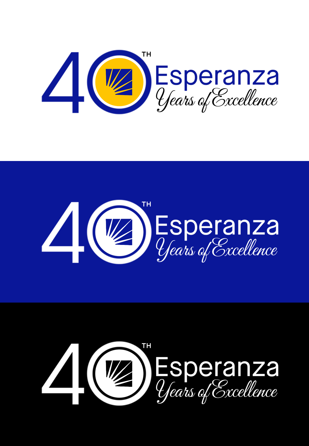
Esperanza 40th Anniversary Logo

Vous souhaitez remporter un projet comme celui-ci ?
Ce client a reçu 101 designs de logo de la part de 43 designers. Il a choisi ce design de logo de SaraArts comme design gagnant.
Inscrivez-vous Trouvez des Projets de DesignBrief de Design de Logo
To design our 40th anniversary logo using Esperanza’s existing logo as the foundation. This logo will be featured across the organization’s digital and print communications, including gala invitations, envelopes, and related materials.
Key Messages: 40 Years of Excellence
NEW DESIGN NEEDS TO BE DIFFERENT FROM THE ONES ATTACHED, EXCEPT FOR THE ESPERANZA PART OF THE LOGO.
We do not want graphics around our logo that resemble stock images or generic templates. The design should feel unique, intentional, and aligned with our brand identity.
Our organization’s name is Esperanza, which means “hope.” The elements of our brand logo and color palette carry deep meaning:
Sunburst: Symbolizes hope, growth, and new beginnings—echoing the meaning of “Esperanza.” It also represents enlightenment and guidance, illuminating the path toward a better future.
Royal Blue: Represents depth, wisdom, and trust. It reflects Esperanza’s core values of integrity and excellence, symbolizing the deep roots of faith and the strong, reliable support we provide to the communities we serve.
Yellow: Symbolizes warmth, optimism, and energy. It aligns with our mission to build a community of opportunity where all people can aspire to live, grow, and thrive.
We are looking for a 4o year anniversary and high-quality logo concept that incorporates our existing Esperanza logo while exploring new, creative elements. This logo will be used across various platforms, including for our annual gala, so elegance and adaptability are important.
What Must Stay the Same:
The “Esperanza” name (font and color) must not be altered.
We will provide the Photoshop file containing the Esperanza wordmark to ensure consistency.
What Can Change:
You may explore new designs that either include or exclude the sun icon currently part of our logo and reflect the 40th years anniversary and include "40 Years of Excellence".
We are open to creative reinterpretations as long as the Esperanza name remains untouched.
What We’re Looking For:
A beautiful, distinctive, and non-generic logo design for our 40th anniversary!
Concepts that are:
Elegant and professional (suitable forevents, flyers, merch, a gala)
With or without a Latin flair
Clean and easy to read
Designs that respect and complement our brand guidelines (see attached)
Deliverables:
Final files must be delivered in original editable format (e.g., AI, PSD)
Color variations required:
Two colors
All yellow
All blue
All white
Attachments:
Our brand guidelines, 30th anniversary logo, other old ideas
The Photoshop file containing the "Esperanza" portion
Previous logo examples (for reference only—we are looking for something new)
We look forward to seeing your unique and creative proposals!
Texte du logo
Esperanza 40 Years of Excellence
Aspect
Chaque curseur illustre les caractéristiques de la marque client et le style que doit transmettre votre design de logo.