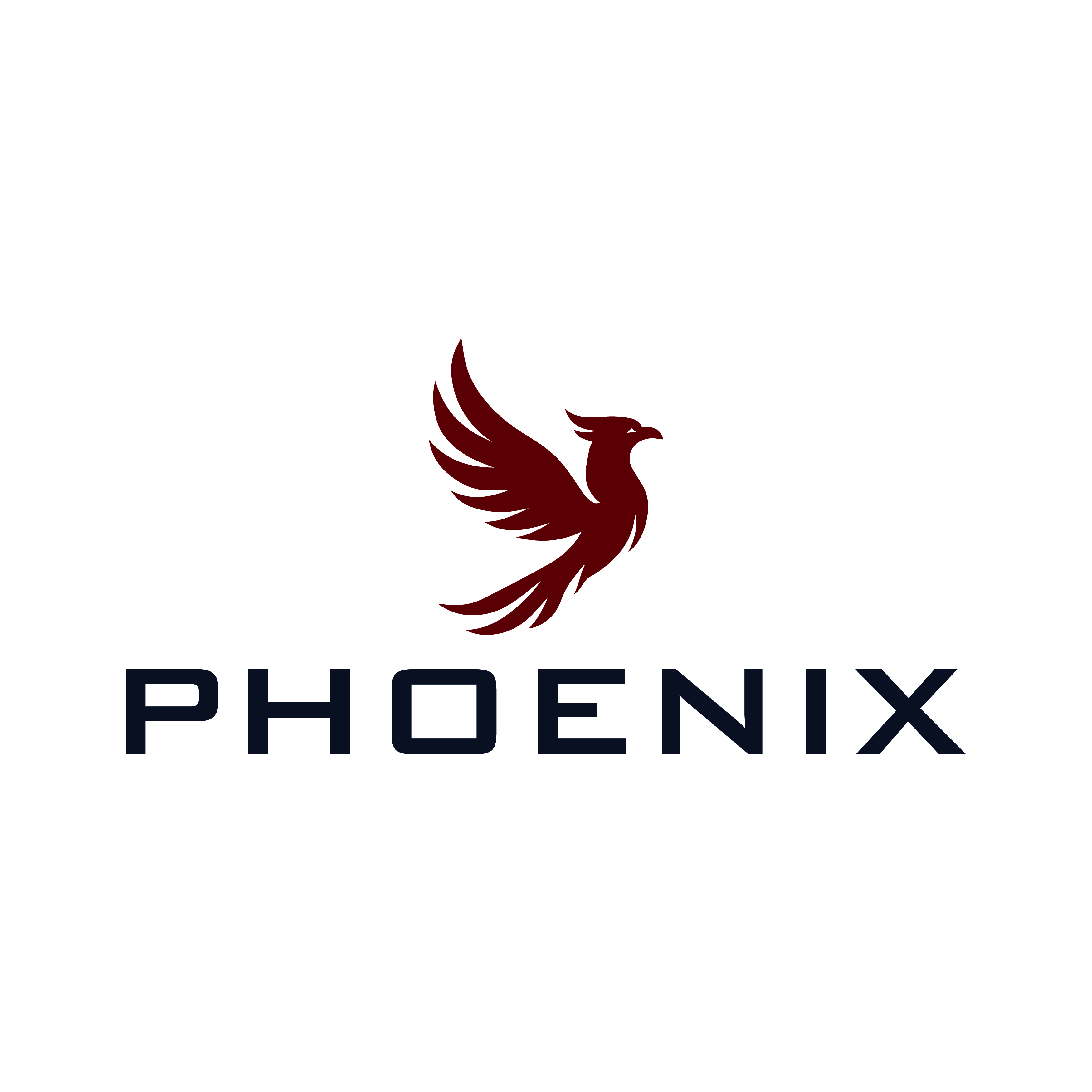
Sophisticated Logo for Phoenix: Healthcare Experts Rising from the Ashes
Gagnant
Vous souhaitez remporter un projet comme celui-ci ?
Ce client a reçu 282 designs de logo de la part de 96 designers. Il a choisi ce design de logo de Faisal Graphics comme design gagnant.
Inscrivez-vous Trouvez des Projets de Design-
 €190
€190
-
 282 designs
-
 96 designers
Brief de Design de Logo
Phoenix is a company that focuses on healthcare. We coach, advise, train and mediate personnel in healthcare.
We do not want to come across as a healthcare company, but we want to come across as experts. Businesslike, simple, high level.
Phoenix means that we have risen from the ashes, We are strong, one of its kind, and the tear has healing powers. Our company is not big, but no one can ignore us. That is what we want to radiate
Marché(s) Cible(s)
Healthcare
Secteur / Type d'entité
Health Care
Texte du logo
Phoenix
Styles de logo qui vous intéressent
Logo pictural
Un objet réel (texte facultatif)
Logo abstrait
Conceptuel / symbolique (texte facultatif)
Logo de figurine
Logo avec illustration ou personnage
Styles de police à utiliser
Sans Serif
Autres polices appréciées:
- Arial
Aspect
Chaque curseur illustre les caractéristiques de la marque client et le style que doit transmettre votre design de logo.
Élégant
Audacieux
Léger
Sérieux
Traditionnel
Moderne
Sympathique
Professionnelle
Féminin
Masculin
Coloré
Conservateur
Économique
Haut de gamme
Exigences
Doit avoir
- Th Phoenix
Bien d'avoir
- The Phoenix rises from the ashes. It would be nice if the tail rises from the fire and that this tail forms the O of the name Phoenix
Ne doit pas comporter
- It shouldn't get too busy
Paiements
1e place
€150
Primes de participation x 4
€10