

 Rafraîchir
EduBreakout for senior citizens
Vous souhaitez remporter un projet comme celui-ci ?
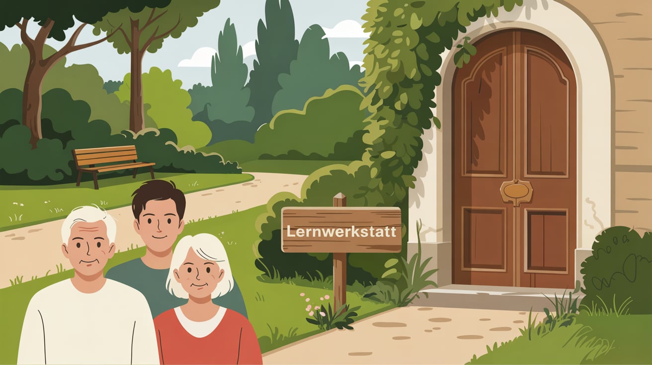
Ce client a reçu 22 designs graphiques de la part de 5 designers. Il a choisi ce design graphique de Designz Zone comme design gagnant.
Inscrivez-vous Trouvez des Projets de Design
- Garanti
-
 €180
€180
-
 22 designs
-
 5 designers
Brief de Design Graphique
I need some graphics for an online E Learning tool I am creating. I am looking for a set of illustrations with a minimalist and clean style. The graphics should have clear, well-defined lines—similar to black fineliner drawings—but with soft, muted colors instead of bright, flashy tones. A pastel or desaturated color palette would be ideal. The goal is to create a welcoming and approachable design for an older audience who may be skeptical of digital learning. The illustrations should feel modern yet warm, avoiding overly playful or cartoonish elements.
I need three to four background settings:
- a simple park scene (16:9 landscape format)
- an overgrown door (presumably in the park) with a prominent handle and a signpost in the front that says: "Lernwerkstatt". (16:9 landscape format)
- the actual breakout room scene: a rather old-fashioned office room with objects that I can use to "hide" elements for the puzzles and informations; two "must-haves" are an old-fashioned radio and (maybe in a corner) a bulletin board that can be zoomed in and contains a number of cards yet to be specified (probably 16). Other objects could be folders, decoration on the wall (framed picture), waste-paper basket, an old computer, a lamp... maybe even a typewriter? (16:9 landscape format)
- the park scene from the beginning, but with darkening light to illustrate the time that has passed (16:9 landscape format)
Also, I need three characters that should be illustrated from head to mid-thigh, ensuring they are well-defined and clearly visible without being full-body depictions.
- elderly man (in his 60s)
- elderly woman (in her 60s)
- young man in his 20s
The elderly people do not have to look overly fragile, it just has to be clear that there is an age difference as the older person is mentor to the young man.
On the opening page, I will need to insert our logo which has the colours #01478D and #F29400. Maybe the design would not clash too much with these. And the opening page needs enough room for the title and three additional buttons for information.

Mises à jour
Low designer entries
Marché(s) Cible(s)
Elderly people / senior citizens
Secteur / Type d'entité
Education, Mentoring of young people
Styles de police à utiliser

Aspect
Chaque curseur illustre les caractéristiques de la marque client et le style que doit transmettre votre design de logo.
Élégant
Audacieux
Léger
Sérieux
Traditionnel
Moderne
Sympathique
Professionnelle
Féminin
Masculin
Coloré
Conservateur
Économique
Haut de gamme
Exigences
Doit avoir
- clear, well-defined lines, soft, muted colors
Ne doit pas comporter
- Flashy and bright colours, too playful and/or cartool-like