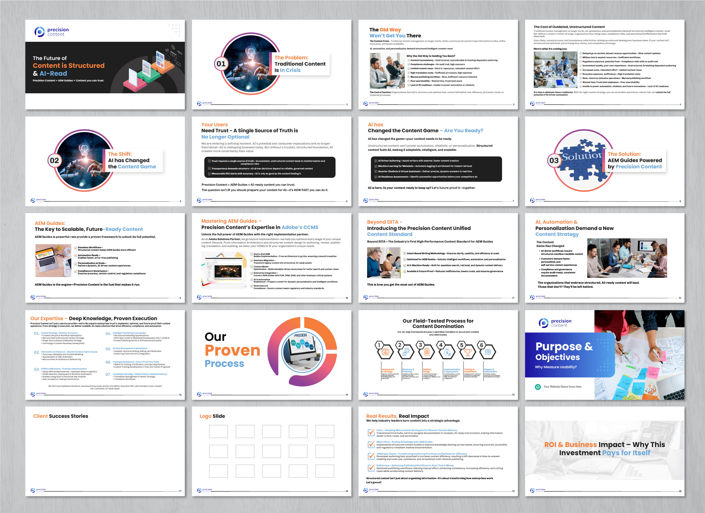
Pitch Deck for AEM Summit 2025

Vous souhaitez remporter un projet comme celui-ci ?
Ce client a reçu 11 designs de PowerPoint de la part de 2 designers. Il a choisi ce design de PowerPoint de artbitin comme design gagnant.
Inscrivez-vous Trouvez des Projets de Design- Garanti
Brief de Design de PowerPoint
Transform the current pitch deck into a visually compelling, modern, and highly engaging presentation that effectively communicates the value of Precision Content + AEM Guides. The deck should feel professional, polished, and easy to digest with clean visuals, icons, and structured layouts.
Marché(s) Cible(s)
Our audience includes enterprise decision-makers, content strategists, IT leaders, and digital transformation professionals who are considering Adobe Experience Manager (AEM) Guides and structured content solutions. They value efficiency, automation, AI-readiness, and compliance in content management. 👥 Who is the Target Market? Industries: Finance, Healthcare, Technology, Aerospace, and Large Enterprises. Roles: CIOs, Content Managers, Technical Writers, Digital Transformation Leads, Compliance Officers. Pain Points: Inefficient content workflows, compliance challenges, high translation costs, slow go-to-market content updates.
Secteur / Type d'entité
We operate in the structured content and AI-powered content management space, helping enterprises optimize content for automation, compliance, and personalization. Our work aligns with digital transformation strategies for large organizations needing scalable, AI-ready documentation solutions.
Styles de police à utiliser
Autres polices appréciées:
- Poppins for headings
Aspect
Chaque curseur illustre les caractéristiques de la marque client et le style que doit transmettre votre design de logo.
Élégant
Audacieux
Léger
Sérieux
Traditionnel
Moderne
Sympathique
Professionnelle
Féminin
Masculin
Coloré
Conservateur
Économique
Haut de gamme
Exigences
Doit avoir
- Must-Haves (My project must have…) Graphics from our existing banner: The pitch deck should incorporate the colours and visual elements from the banner we previously designed for consistency. A clean, modern design: White background with a balanced use of our brand colours. Icons & images: Use icons to represent key concepts instead of dense bullet points. Minimal text per slide: Key messages should be visual and concise. Strong visual hierarchy: Important points should be easy to scan and comprehend. Clear CTA on the final slide: A well-designed "Next Steps" section with contact information and a call-to-action.
Bien d'avoir
- Diagrams & workflows: Simple, easy-to-follow visual representations of our processes. Subtle textures or accents: Avoid flat, heavy colour blocks, but light background gradients or design accents could work. Dynamic transitions: Smooth but professional slide animations that help guide the viewer. Typography hierarchy: Headings that stand out, but with a clean and professional font choice. Real-world mockups: Screenshots or abstract representations of AEM Guides in action. Branded infographic elements: Visually engaging ways to present statistics and benefits.
Ne doit pas comporter
- Overly dark backgrounds: Most slides should remain white for readability and professionalism. Too much text per slide: We don’t want slides overloaded with text—focus on visuals. Generic stock images: Use purposeful, industry-relevant visuals that support the messaging. Excessive colours: Keep it consistent with the banner design—not too many competing colours. Complex animations: We want smooth, subtle transitions, but not over-the-top effects.