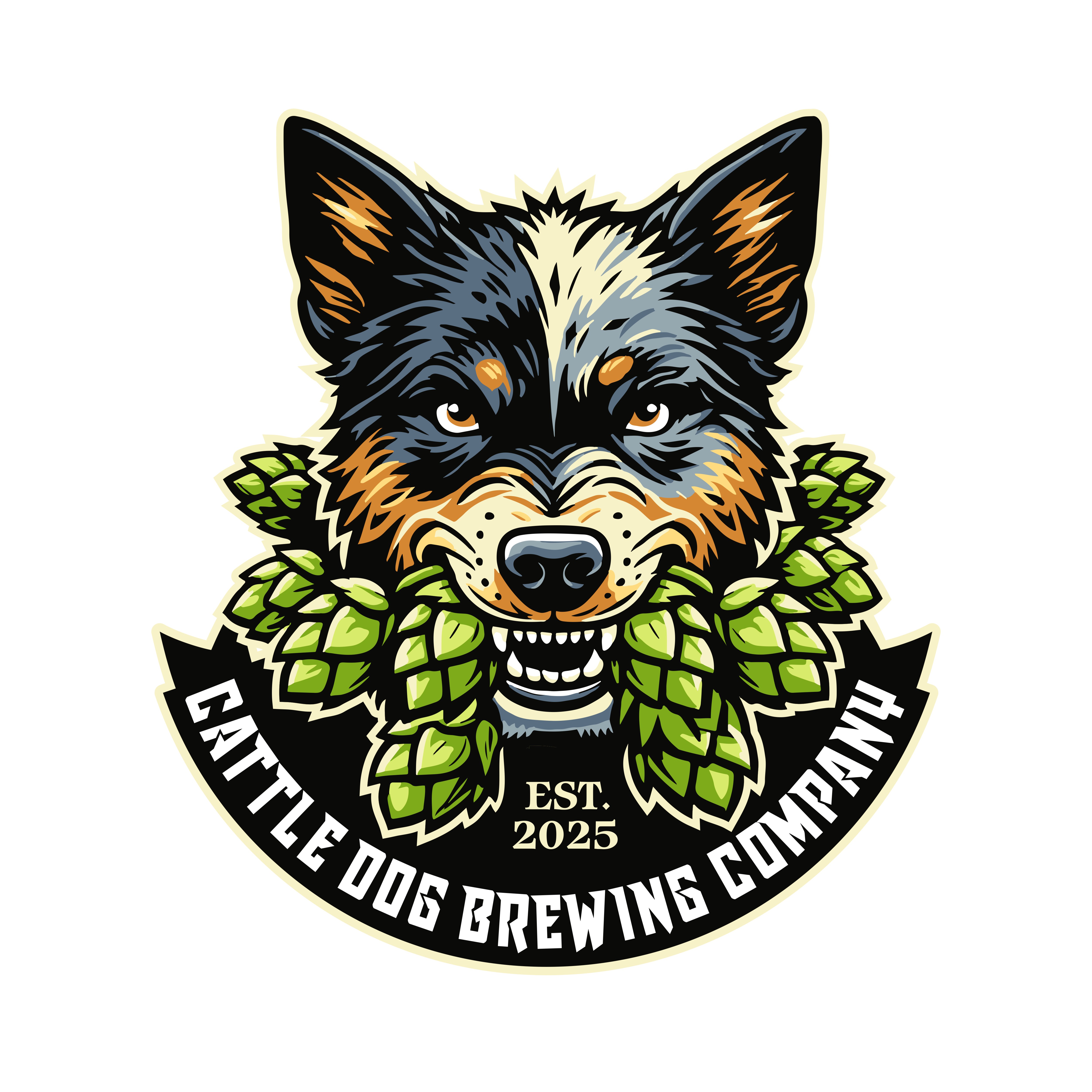
Refinement of Existing Cattle Dog Brewing Company Logo
Vous souhaitez remporter un projet comme celui-ci ?
Ce client a reçu 143 designs de logo de la part de 53 designers. Il a choisi ce design de logo de KilgoreT comme design gagnant.
Inscrivez-vous Trouvez des Projets de Design- Garanti
-
 US$150
-
 143 designs
-
 53 designers
Brief de Design de Logo
What We Need:
We already have a logo concept uploaded and want improvements/refinements, NOT a completely new design.
The core elements must remain: a fierce but not mean cattle dog with a black eye (similar to the photo), biting hops. I don't want it to look like the dog is throwing up hops!
We need stronger execution, cleaner details, and better typography while keeping the bold, rustic, and slightly grunge aesthetic.
What to Improve:
Sharpen the design: Make the dog and hop more detailed and refined without losing the rugged look.
Typography: Use bold, slightly distressed or grunge-style fonts that fit the brewery aesthetic.
Scalability: Ensure it works well in both color and black & white, for use on signage, merchandise, and packaging.
Avoid changing the concept too much—we just want a polished, professional version of what we already have.
What NOT to Submit:
Entirely new logo concepts
Cartoonish, minimalist, or ultra-modern designs
Generic beer symbols without incorporating the cattle dog & hop
We are looking for a bold, memorable, and unique logo for Cattle Dog Brewing Company, a craft brewery and taproom based in Tupelo, MS. Our brewery is dog-friendly, family-friendly, and community-focused, offering a mix of flagship and experimental beers in a rustic, welcoming atmosphere.
What We Need:
A versatile logo that can be used on signage, merchandise (hats, shirts, glasses), packaging, and digital branding.
A design that reflects our craft beer identity while incorporating the cattle dog theme in a way that feels authentic and not overly cartoonish.
Aesthetic should be rustic, timeless, and slightly edgy—nothing overly modern, generic, or corporate-looking.
The logo should work in both full color and black-and-white.
Style & Elements We Like:
A cattle dog or dog-inspired imagery (subtle or bold, as long as it fits the brand).
Typography: Bold, vintage, slightly distressed, or hand-crafted fonts.
Inspiration: Rustic breweries, adventure/outdoor brands, classic beer logos.
A symbol/icon that could work on its own for branding purposes.
We are open to creative interpretations but want the design to be instantly recognizable, clean, and professional. If possible, it should convey a sense of craftsmanship, adventure, and quality while feeling inviting to beer lovers and dog lovers alike.
Marché(s) Cible(s)
Our target market includes craft beer enthusiasts, local beer lovers, and social drinkers who appreciate high-quality, small-batch brews in a welcoming and relaxed atmosphere. Specifically, we cater to: Local Community & Beer Lovers – People who enjoy craft beer and want a casual, inviting space to gather with friends and family. Dog Owners – Since we are a dog-friendly brewery, we naturally attract pet owners looking for a place where they can bring their dogs while enjoying a great beer. Young Professionals (25-45) – Those who appreciate craft beer culture, quality ingredients, and unique flavors, often seeking breweries as a go-to social spot. Travelers & Beer Tourists – People visiting Tupelo who seek out local breweries and unique craft beer experiences. Families & Social Groups – We want to be a space where both parents and friends can hang out, with a family-friendly and community-driven vibe. Our brand should appeal to people looking for a laid-back, fun, and slightly rustic atmosphere, where they can relax, try unique beers, and feel part of a community.
Secteur / Type d'entité
Brewery
Texte du logo
Cattle Dog Brewing Company
Styles de logo qui vous intéressent
Logo d'Enseigne
Logo contenu dans une forme
Styles de police à utiliser
Autres polices appréciées:
- Bold, slightly distressed sans serif or a graffiti-inspired, rugged typeface that has a handcrafted feel but remains readable and versatile.
Couleurs
Couleurs choisies par le client et à utiliser dans le design de logo:
Aspect
Chaque curseur illustre les caractéristiques de la marque client et le style que doit transmettre votre design de logo.
Élégant
Audacieux
Léger
Sérieux
Traditionnel
Moderne
Sympathique
Professionnelle
Féminin
Masculin
Coloré
Conservateur
Économique
Haut de gamme
Exigences
Doit avoir
- Cattle Dog Imagery The dog should look fierce but not mean—strong, determined, and bold, but still inviting. It should have one black patch over one eye as a signature detail. The dog should be biting or holding a hop cone, reinforcing the brewery theme. Typography & Style The text should feature bold, vintage, slightly rustic, or distressed fonts to reflect a craft brewery aesthetic. The logo should feel hand-crafted, timeless, and strong, avoiding anything too modern, sleek, or corporate-looking. Versatility The design should work in full color and black-and-white. It should be scalable for use on merchandise, packaging, signage, and digital branding without losing detail. If possible, include an icon or simplified version that can work alone (e.g., just the dog and hop). Color Scheme While we are open to creative input on colors, we’d like a rustic, earthy palette—something that complements a craft brewery vibe (e.g., deep greens, warm browns, muted golds, or bold neutrals).
Ne doit pas comporter
- No Cartoonish or Playful Designs The cattle dog should look fierce but not mean—strong, determined, and bold, not goofy or exaggerated. Avoid anything that looks like a cartoon mascot or too animated. No Generic Brewery Icons Stay away from overused brewery symbols like generic pint glasses, barley/wheat wreaths, beer mugs, or hops alone without integrating the dog. The hops should be bitten/held by the dog, not just floating or randomly placed. No Ultra-Modern or Minimalist Styles The design should not be too sleek, minimalist, or corporate-looking—this isn’t a tech company or mass-market beer brand. We want bold, vintage, rustic vibes that feel handcrafted and authentic. No Overly Aggressive or Scary Dog Imagery The dog should be fierce and determined but NOT aggressive, snarling, or vicious-looking—we don’t want it to look like an attack dog. No red eyes, sharp fangs, or overly menacing expressions—we want strength and character, not intimidation. No Overly Complex or Busy Designs The logo needs to be versatile and scalable, so it should not be too detailed or intricate that it loses clarity when resized. Avoid designs that are too cluttered or hard to reproduce on merchandise (hats, glasses, shirts, etc.). No Bright Neon or Trendy Colors The color scheme should be rustic and earthy, avoiding overly bright, neon, or trendy pastel colors that don’t fit a craft brewery aesthetic. Avoid colors that would make the logo look out of place on a beer can, signage, or merchandise.