Marketing consultation logo design
Vous souhaitez remporter un projet comme celui-ci ?
Ce client a reçu 286 designs de logo de la part de 111 designers. Il a choisi ce design de logo de Mofuza comme design gagnant.
Inscrivez-vous Trouvez des Projets de Design- Garanti
-
 C$300
C$300
-
 286 designs
-
 111 designers
Brief de Design de Logo
Project overview:
We need a logo for our new business : SynUp
What is SynUp:
We help business owners and solopreneurs in Quebec by providing unparalleled marketing coaching and consultation. We also offer other advanced services such as turkey marketing solutions which include CRM integrations and strategy automations.
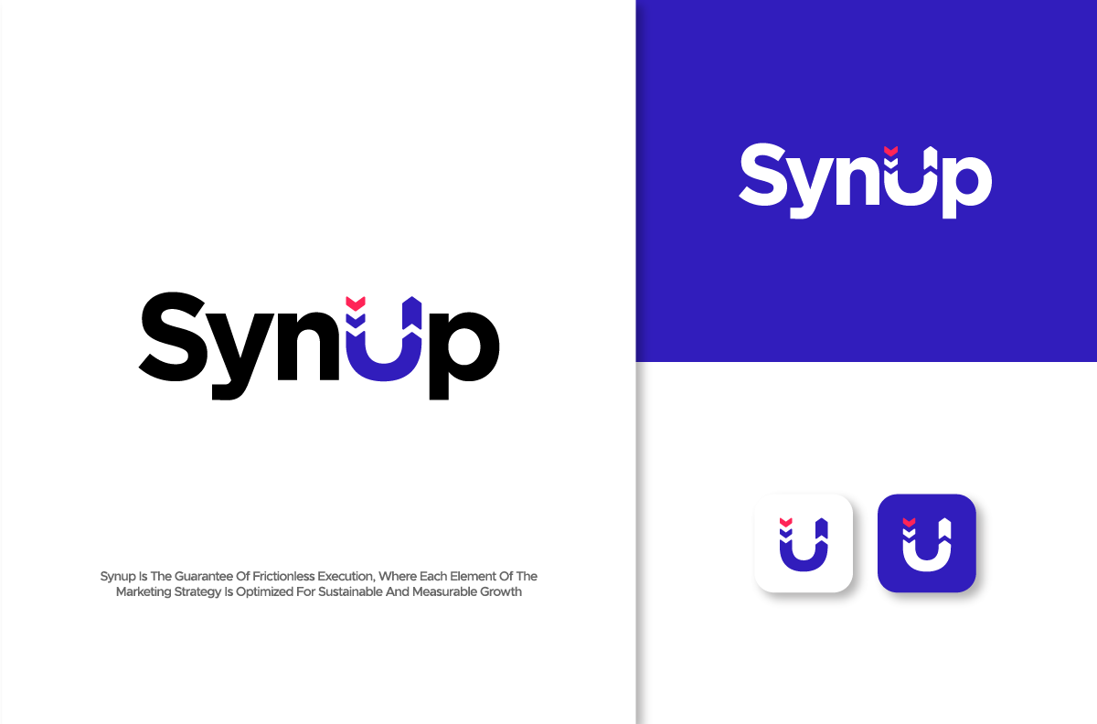
SynUp is the guarantee of frictionless execution, where each element of the marketing strategy is optimized for sustainable and measurable growth. 🚀
**PLEASE READ THE ENTIRE DESCRIPTION BEFORE SUBMITTING**
Below you will find the instructions on the style we are looking for. I have also included a resume of our brand identity because it is critical that the logo reflects our brand identity. I have also attached other logos to serve as inspiration but to be clear, they are only meant as inspiration for the style. I am not looking to reproduce these exact logos.
I have also included a few screenshots from the ClickUp website because we want to emulate a similar brand feel, just to give you an even more concrete idea of what we are aiming.
We look forward to seeing your ideas!
Logo style:
- Minimalist design, mainly font only with a subtle icon / visual effect.
- Must contain an icon/symbol component that be used for other branding material such as the website or social media content creatives.
- The format (ratio) must be landscape/horizontal. *NO SQUARE / 1:1 RATIO PLEASE*
- Do not include any tagline or slogan.
Color scheme:
We want blue to be our primary color, along with a very dark (or black) and white secondary colors. We will let you propose which kind of blue color scheme could look best.
Brand identity explained:
SynUp
The name SynUp combines two powerful elements that perfectly reflect the essence of a company specialized in marketing strategy and digital lead generation.
"Syn":
Refers to synchronization, synergy, and integration.
Evokes fluid connection between strategies, tools, and marketing actions.
Represents collaborative work between strategists, integrators, and salespeople to create an effective marketing ecosystem.
"Up":
Evokes ascension, growth, and optimization.
Symbolizes the ultimate goal: increasing leads, boosting conversion, and maximizing marketing campaign performance.
Represents the idea of continuous evolution, where each marketing action is designed to take the company to a higher level.
**How do "Syn" and "Up" create synergy?**
One doesn't work without the other. "Syn" brings organization, structuring, and optimization of strategies, while "Up" materializes the rise in results.
The SynUp company positions itself as a digital marketing conductor, offering turnkey solutions that synchronize all stages of the customer journey:
✅ Strategy (audit, targeting, branding, positioning)
✅ Integration (CRM, conversion funnels, marketing automation)
✅ Sales and leads (prospecting, acquisition, closing)
SynUp is the guarantee of frictionless execution, where each element of the marketing strategy is optimized for sustainable and measurable growth. 🚀
Secteur / Type d'entité
Marketing consultation. Lead generation, sales.
Texte du logo
SynUp
Styles de logo qui vous intéressent
Logo abstrait
Conceptuel / symbolique (texte facultatif)
Logo mot symbole
Logo (texte seulement)
Couleurs
Couleurs choisies par le client et à utiliser dans le design de logo:
Aspect
Chaque curseur illustre les caractéristiques de la marque client et le style que doit transmettre votre design de logo.
Élégant
Audacieux
Léger
Sérieux
Traditionnel
Moderne
Sympathique
Professionnelle
Féminin
Masculin
Coloré
Conservateur
Économique
Haut de gamme
Exigences
Doit avoir
- 1st must have: The ''U'' must be similar to the attached file ''UPDATED BRIEF LOGO IDEA". It must represent both a magnet (as in a lead magnet, in marketing terms) and increased sales, which is the upward momentum at the end of the letter. 2nd must have: The ''U'' must be able to be used an icon for other marketing material (website, social media)