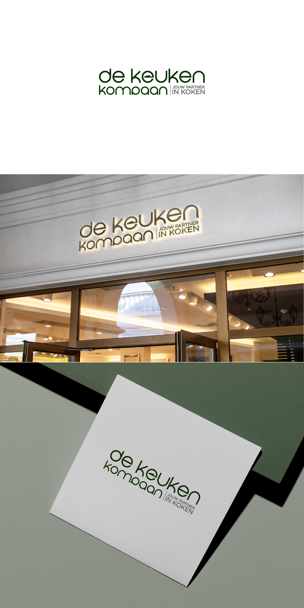
An Logo design for a new Kitchen appliance brand De Keuken Kompaan"
Vous souhaitez remporter un projet comme celui-ci ?
Ce client a reçu 149 designs de logo de la part de 33 designers. Il a choisi ce design de logo de Barish Design comme design gagnant.
Inscrivez-vous Trouvez des Projets de Design- Garanti
-
 €110
€110
-
 149 designs
-
 33 designers
Brief de Design de Logo
We are starting up a Dutch webshop where we are going to sell kitchen equipment. We want to build a platform in the end where we can sell products, review products communicate recepies all conected to eachother. We want to sell in the mid/high taget groups.
Briefing: Logo and Corporate Identity Design – DE KEUKEN KOMPAAN
Company Name:
DE KEUKEN KOMPAAN
URL: keukenkompaan.nl in English: Kitchencompanion.nl
Payoff: " Jouw partner in koken" In English "Your partner in cooking"
Company Description:
DE KEUKEN KOMPAAN is a newly founded company specializing in the online sale of kitchen appliances such as Quookers, ovens, gas stoves, refrigerators, and other kitchen essentials. Led by two young entrepreneurs in their early twenties, the company aims to differentiate itself with competitive pricing, excellent service, and a strong online presence through attractive and modern SEO and SEA campaigns.
Market Segment:
The primary focus is on the mid to upper-mid market segment, emphasizing quality, excellent customer service, and price-awareness.
Design Objectives:
We aim to develop a strong, recognizable, and contemporary logo and corporate identity. These elements will form the foundation for our webshop, advertising materials, marketing campaigns, and all further visual communications.
Design Preferences:
Powerful and clear design with a distinctive style.
Use of clean, bold typography.
Visual simplicity and clarity are crucial—minimal details with a strong, clear visual message.
Creative use of depth or subtle visual effects contributing to a modern appearance is encouraged.
Avoid overly detailed visual marks; preference is given to simple yet powerful statements.
Color Scheme:
The final choice of colors is still open. Blue is viewed as a safe and logical choice, but we are also open to surprising alternatives that reflect our modern and innovative character.
Note: Red and yellow are explicitly excluded as primary colors.
Important Core Values:
Young, fresh appearance
Reliability and high level of service
Distinctive and innovative in communication and presentation
Strong focus on recognizability and memorable visual identity
Next Steps:
After finalizing the logo and corporate identity, further communication materials will be developed, including:
Webshop design
Digital advertisements (SEO/SEA campaigns)
Social media content
Promotional materials and other advertising elements
This briefing serves as a guideline for creating a strong visual identity aligned with our vision and ambitions.
Marché(s) Cible(s)
People that buy kitchen appliances in mid to high segment
Secteur / Type d'entité
Kitchen apliancees
Texte du logo
De keuken kompaan of Keuken kompaan with the pay off: " Jouw partner in koken"
Styles de logo qui vous intéressent
Logo abstrait
Conceptuel / symbolique (texte facultatif)
Logo de figurine
Logo avec illustration ou personnage
Logo mot symbole
Logo (texte seulement)
Logo de Lettermark
Acronyme ou logo texte (texte seulement)
Couleurs
Le designer choisit les couleurs à utiliser dans le design.
Aspect
Chaque curseur illustre les caractéristiques de la marque client et le style que doit transmettre votre design de logo.
Élégant
Audacieux
Léger
Sérieux
Traditionnel
Moderne
Sympathique
Professionnelle
Féminin
Masculin
Coloré
Conservateur
Économique
Haut de gamme
Exigences
Doit avoir
- A very strong logo
Ne doit pas comporter
- Not To busy, powerfull, clean and professional