Cannabis brand (that doesn't take itself too seriously) needs product and corporate logo!
Vous souhaitez remporter un projet comme celui-ci ?
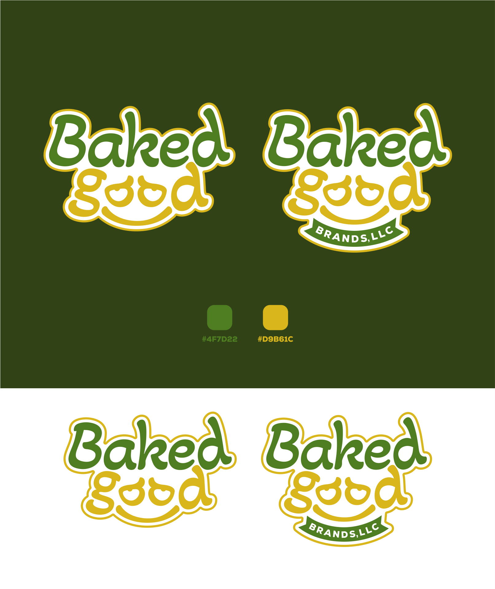
Ce client a reçu 73 designs de logo de la part de 29 designers. Il a choisi ce design de logo de LUTNG. comme design gagnant.
Inscrivez-vous Trouvez des Projets de Design- Garanti
-
 US$150
-
 73 designs
-
 29 designers
Brief de Design de Logo
We are Baked Good Brands, LLC. We create products that simplify the at-home cannabis (hemp) consumption experience for legal age consumers in legal jurisdictions. We cater to consumers who prefer freshly-made over pre-packaged, those who prefer their own personal touch, and those who just want to relax with an indulgent infused treat. We take our product quality seriously, but we don’t take ourselves seriously. We are relaxed, and look forward to offering our customers a new way to chill.
We have a foundational logo concept (attached), but recognize it needs a professional and artistic touch to take us to the next level.
One feature we would like to keep and feel will be central to the brand is the smile formed by using the “oo” in “good” as eyes. As a cannabis/intoxicating hemp product, we would like to play into the “oo” forming very contented eyes. That is, imagine the relaxed eyes of a “high” but coherent person - that is what we’re going for. We do want to be careful not to lean in too much - we are aiming for content and relaxed, not overplayed and potentially insulting stoner stereotype. Further, we don’t want the logo to feature specific foods or product images as we do not want to limit our product line prematurely. Critically (and regretfully) the logo CANNOT feature the cannabis leaf due to legal reasons. As such, the concept logo has relied heavily on the contented smile in an otherwise text-centric logo. While the logo will primarily feature text (and a contented smile), we don’t want it to be cold - we would envision a relaxed font like Akaya Kanadaka, which was used for ‘good’ in the concept, as that would help the logo feel inviting, cheerful, and non-judgmental.
In terms of deliverables, we would be elated to receive a package of SVG files for different ‘flavors’ of this logo. These ‘flavors’ include a corporate logo containing the full legal company name (“Baked Good Brands, LLC”) in addition to a logo we can put on our packaging (just the words “Baked Good”, like in the concept). The two can use the same components for the “baked good” portion - in fact, I’d prefer that as it maintains consistency, for example we envision the “smile” formed in “good” to be the Favicon. Lastly, we would need hex numbers for a color palette - we are looking to your expertise to suggest a color palette that complements the logo, if possible. If not possible, could we please have hex numbers for the colors used in the logo? A note on color - we chose green and yellow in the concept as they seemed to vibe with the brand without clashing with it being an edible product, but are open to suggestions on colors as well. Critically, we want the color palette and logo colors to be as welcoming and cheerful as possible without clashing with the product’s intended use for relaxation and some “me” time.
Marché(s) Cible(s)
Inclusive, but targeting Millennial and Gen X cannabis consumers. The market leans female.
Secteur / Type d'entité
Cannabis, Hemp, CPG
Texte du logo
2 versions: product logo "Baked Good", corporate logo "Baked Good Brands, LLC"
Styles de police à utiliser
Autres polices appréciées:
- Akaya Kanadaka
Aspect
Chaque curseur illustre les caractéristiques de la marque client et le style que doit transmettre votre design de logo.
Élégant
Audacieux
Léger
Sérieux
Traditionnel
Moderne
Sympathique
Professionnelle
Féminin
Masculin
Coloré
Conservateur
Économique
Haut de gamme
Exigences
Doit avoir
- Corporate logo ("Baked Good Brands, LLC" for email/business card), product logo ("Baked Good" for product packaging)
Bien d'avoir
- Would love to have color palette suggestion as well. Please see other detail in project description.
Ne doit pas comporter
- Unfortunately, there can be no cannabis leaf imagery, and the product should not suggest intoxication (relaxation is fine, intoxication is not)