

 Rafraîchir
Bold, Modern, Curated and Creative AF Logo seeking incredible designer to create it!
Vous souhaitez remporter un projet comme celui-ci ?
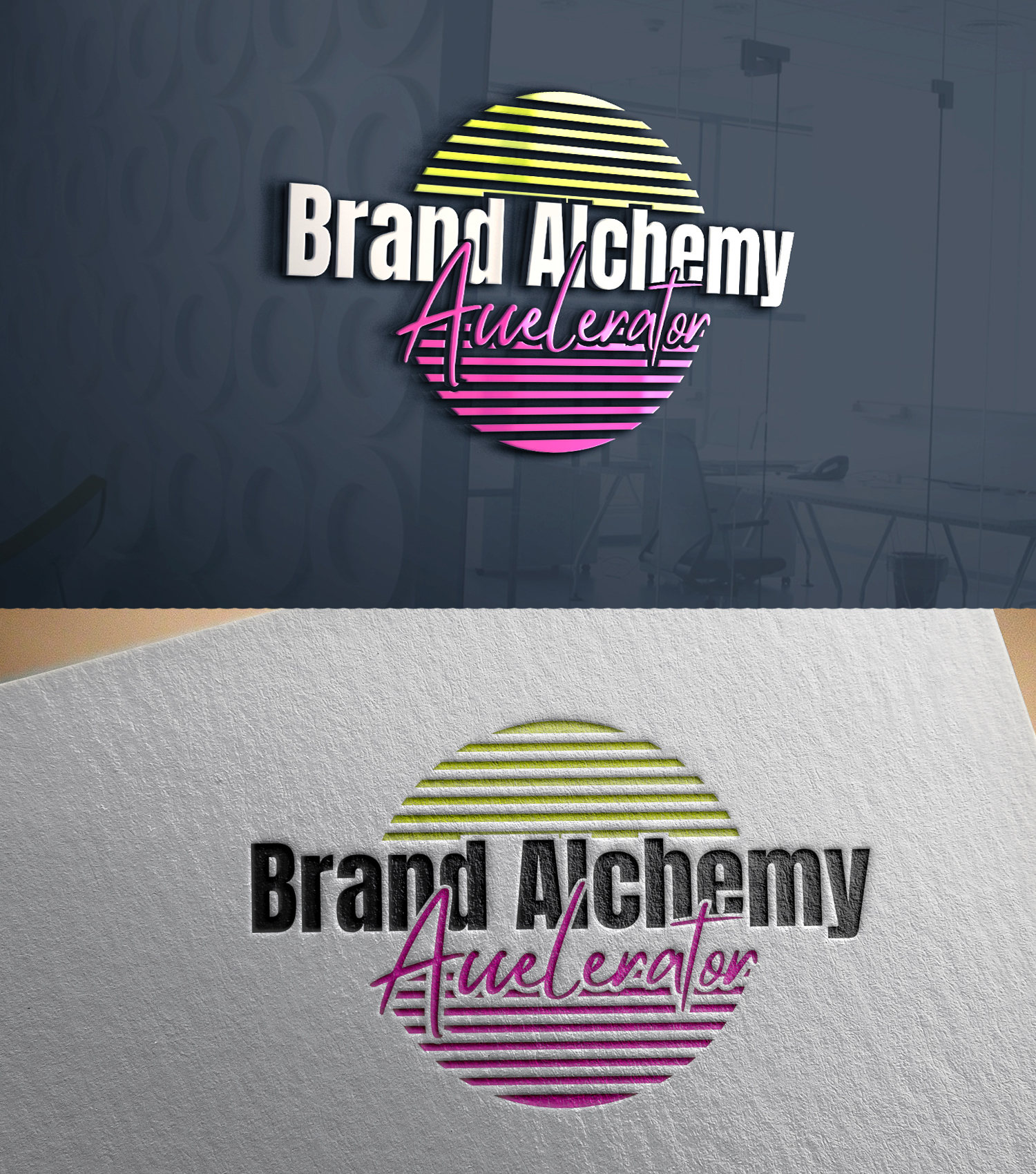
Ce client a reçu 79 designs de logo de la part de 55 designers. Il a choisi ce design de logo de 24ksunny comme design gagnant.
Inscrivez-vous Trouvez des Projets de Design
- Garanti
-
 US$150
-
 79 designs
-
 55 designers
Brief de Design de Logo
I run a personal branding program and, ironically, our logo is starting to feel really out of date! I want to refresh it with something bolder.
The design challenge here is that the program is VERY BRIGHT, VERY BOLD, but also HIGH END and CURATED. I find that when designing with bold, bright colors if not done properly the design can start to pull messy/cheap/low end very fast.
The words I want someone to FEEL when they see the logo are: dynamic, bold, bright, fun, creative, colorful, curated
The program this logo will be used for is all about self expression, helping each person tap into their creativity and build personal brands online-- we help them with everything from the design of their Zoom space to their wardrobe, to their own fonts and colors. Many people describe the space as "a Harvard MBA meets art class" as well as "the playground of business building." People have tons of FUN in our space and I want the logo to express that, but we also do tons of high level business strategy work so it's this balance of powerful structure and boundless creativity.
Here is what is SOLID with our visual identity:
Fonts: Anton (header) and Mistrully (script)
Main color of program: bold pink (possible color codes: Hollywood Cerise #F6049B or #fd34bf or a shade SIMILAR to those two)
Colors I have been *playing with* and are definitely in range of colors I like (the trick seems to be blending bright NEONs with more traditional colors that GROUND the neon:
Pink: #f9029c
Orange: #ef8044
Acid Green: #dbfc6b
Teal: #04c4ce
Purple: #7a1bcb
Pinterest mood board: https://www.pinterest.com/kathrynmorrison/brand-alchemy-accelerator/
I've just playing around on Canva this morning, mostly to play with possible color palette, but don't feel like I'm quite nailing it. I'm not sure if the colors I have right now are slightly off... or if the tweak could be just adding a really cool texture to the colors to give them more depth.
In the uploads you will find:
--2 super amateur logos that were my attempt at a first pass and they definitely need a glow up lol
--An Okuda art piece that feels like a central inspiration for the logo-- he is using bold pink and merging it with other colors in a way that feels really dynamic and alive but also very curated
--2 branding graphics I use in my business for other programs, so the AESTHETIC/look/feel of these are very much in the same vein of what I am looking for, and am mostly looking for help with solidifying color palette (using all neon makes it stop feeling as luxe/high end as I want, but then using standard rainbow colors feels too old/flat)
--3 AI Generated logos where the font is wrong but I *really* like the direction they were going (2 with the colorful spiky sunburst, 1 with colorful bold brushstrokes of colors in the background)
Secteur / Type d'entité
Business Consulting and Coaching
Texte du logo
Brand Alchemy Accelerator
Styles de police à utiliser
Autres polices appréciées:
- Anton for Header, Mistrully for Script font
Aspect
Chaque curseur illustre les caractéristiques de la marque client et le style que doit transmettre votre design de logo.
Élégant
Audacieux
Léger
Sérieux
Traditionnel
Moderne
Sympathique
Professionnelle
Féminin
Masculin
Coloré
Conservateur
Économique
Haut de gamme
Exigences
Doit avoir
- Fonts: Anton (header) and Mistrully (script) Main color of program: bold pink (possible color codes: Hollywood Cerise #F6049B or #fd34bf or a shade SIMILAR to those two)
Bien d'avoir
- I also *really* like a sort of neon acid green color (possible color codes: Golden Fizz #EBFB49 or Chartreuse Yellow #ECFB04 or Sunglare #edff00 or a shade SIMILAR to those) but when it's ONLY the neon pink and this color it doesn't pull as luxe and high end as I want, so it could be just balancing out the color palette with some other shades that ground the neon a bit?


