Revamp PowerPoint deck to match our new website's visual identity and effectively tell our story
Vous souhaitez remporter un projet comme celui-ci ?
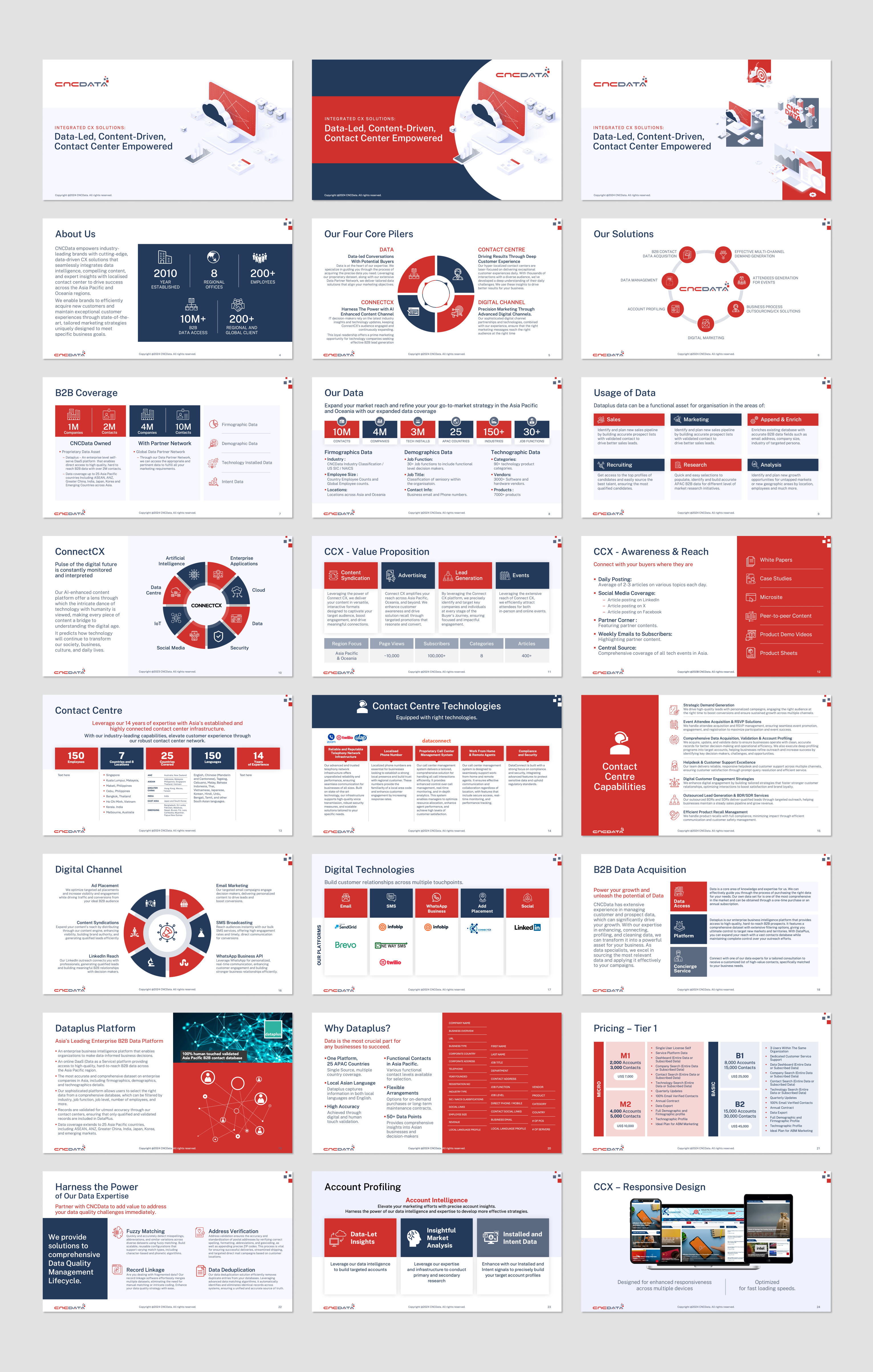
Ce client a reçu 17 designs de PowerPoint de la part de 6 designers. Il a choisi ce design de PowerPoint de Flatmilter comme design gagnant.
Inscrivez-vous Trouvez des Projets de Design- Garanti
-
 A$150
A$150
-
 17 designs
-
 6 designers
Brief de Design de PowerPoint
Revamp PowerPoint Deck to Match New Corporate Website Theme @ https://rajmohanv1.sg-host.com/.
(Note: The content on the new theme is placeholder text. The current live website is www.cncdata.com )
Key Request: Slide Master SHOULD NOT include any specific contents. It should contain only essential elements such master layout, the logo, header, footer, and any repeating text elements and it should be limited to a maximum of 5 pages.
We need to redesign our existing PowerPoint deck to align with the visual identity of our new corporate website while ensuring it effectively tells our story. The revamped deck should focus on:
1. Visual Storytelling: Each slide should guide the audience through a clear and compelling narrative. Build on each slide to ensure the story flows seamlessly.
2. Minimal Text, More Visuals: Avoid text-heavy slides. Where text is necessary, keep it concise. Focus on strong visuals, icons, and imagery that reinforce key points. Ensure the visuals are impactful and align with our brand identity. Use bold icons and high-quality images that match the tone of the new website to emphasize key messages.
3. Design Consistency: Ensure the presentation reflects the color palette, typography, and imagery from the new website. This includes maintaining consistency in the style of headings, subheadings, and body text to reinforce our brand identity.
4. Modern & Clean Design: Embrace a minimalist design aesthetic inspired by the new website. Use the same color schemes, fonts, and clean layouts to ensure the slides are visually engaging and easy to digest.
5. Professional, Minimalist Look: Keep the design professional and minimalist, with a focus on clarity. Ensure each slide conveys its message clearly without unnecessary distractions.
Our goal is to create a visually engaging and interactive presentation that clearly communicates our message while keeping the audience engaged.
Ensure our corporate color scheme is maintained as per the current website: www.cncdata.com
Marché(s) Cible(s)
B2B Clients in Asia Pacific and Australia
Secteur / Type d'entité
Across all industries, but more specific to IT
Aspect
Chaque curseur illustre les caractéristiques de la marque client et le style que doit transmettre votre design de logo.
Élégant
Audacieux
Léger
Sérieux
Traditionnel
Moderne
Sympathique
Professionnelle
Féminin
Masculin
Coloré
Conservateur
Économique
Haut de gamme
Exigences
Doit avoir
- nsure our corporate color scheme is maintained as per the current website: www.cncdata.com
Bien d'avoir
- More graphics and illustrations than text. Icon representations.
Ne doit pas comporter
- Slide Master SHOULD NOT include any specific contents. It should contain only essential elements such master layout, the logo, header, footer, and any repeating text elements and it should be limited to a maximum of 5 pages