

 Rafraîchir
Skin Care Package Design
Vous souhaitez remporter un projet comme celui-ci ?
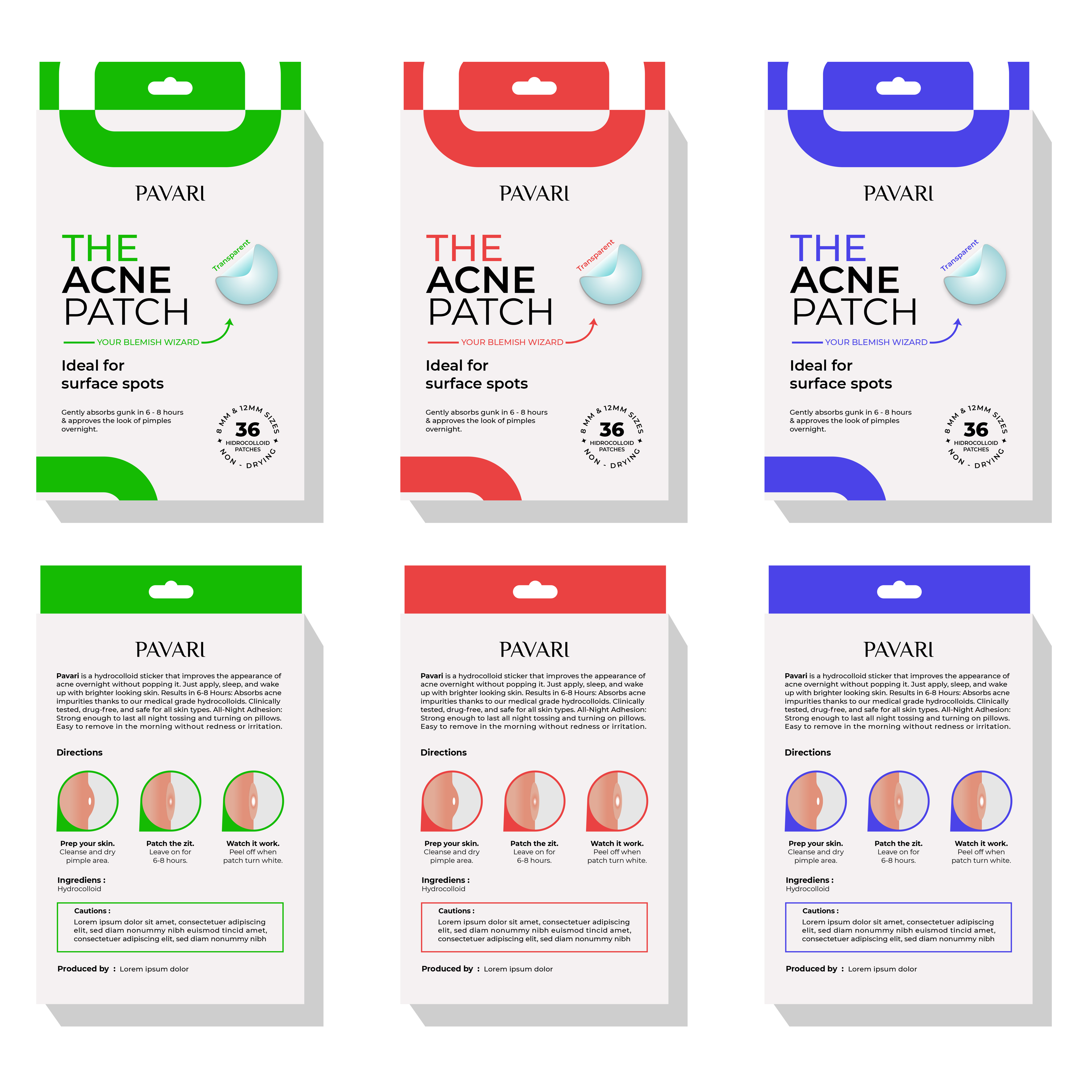
Ce client a reçu 62 designs emballage de la part de 24 designers. Il a choisi ce design emballage de tamtama comme design gagnant.
Inscrivez-vous Trouvez des Projets de Design
-
 US$300
-
 62 designs
-
 24 designers
Brief de Design Emballage
Hello,
I have a unique situation at hand. I already posted a project for this and we chose a winner but we ended up having trademark concerns so we need to modify the designs on the package.
We do not blame the designer in any way and we think that they did an incredible job. We have also chosen him as the winner and paid him so we have full right to share this and have 100% ownership of the design.
Our biggest competitor is Hero Mighty Patch. We need to be careful not to have a design that is too close to theirs. I think the color red is fine in general, but we need to stay away from any shapes/designs that would be considered similar. They have a partial circle design on the corner and ours is to similar in our opinion - our mistake.
Our name is no longer Clean Skin Co. It is now PAVARI or Pavari.
We need:
1. Clean Skin Co removed and "PAVARI" or "Pavari" put in it's place. You do NOT have to leave the rectangle border. We do not have a design file or the logo yet. We like modern fonts.
2. Please remove the circular designs in the corners. It too closely resembles our competitors package. A square or some other unique concept would work. Feel free to use your imagination. We loved our current design because it's clean and simple but looks good.
3. Please don't mess with the text. We like it and the layout. Our focus is on the color/s and unique design that is going to replace the circle in the corners.
4. Please change "144" in the bottom right to "36".
5. The color red is still fine but we would be curious to see other colors like the green or blue that Cerave has or maybe a taupe. Use your imagination. We really want colors that pop and grab your attention. Feel free to use more than one color.
I have uploaded two images.
1. Hero - Is our competitor's package.
2. Clean Skin Co is our previous/current package design.
Package deminsions: 5”x3.4”x0.47”
Thanks! Good luck!
Marché(s) Cible(s)
Male & female. We don't want the package design to be too masculine or too feminine.
Secteur / Type d'entité
Skin care, health & cosmetics.
Styles de police à utiliser

Aspect
Chaque curseur illustre les caractéristiques de la marque client et le style que doit transmettre votre design de logo.
Élégant
Audacieux
Léger
Sérieux
Traditionnel
Moderne
Sympathique
Professionnelle
Féminin
Masculin
Coloré
Conservateur
Économique
Haut de gamme
Exigences
Doit avoir
- You can search acne patch brands on Amazon and see our competitors. We want ours to look better than Hero Mighty Patch. They are the top seller. They have a simple and clean design but the red really grabs your eye. There are a ton of brands on the Amazon page so it's important that the package looks good and the color/s catch your eye.


