Re-design Consulting Web Site (B2B Sales Consultancy for Early Stage SaaS/tech firms)
Vous souhaitez remporter un projet comme celui-ci ?
Ce client a reçu 56 web designs de la part de 20 designers. Il a choisi ce web design de Design KB comme design gagnant.
Inscrivez-vous Trouvez des Projets de Design- Garanti
-
 £120
£120
-
 56 designs
-
 20 designers
Brief de Web Design
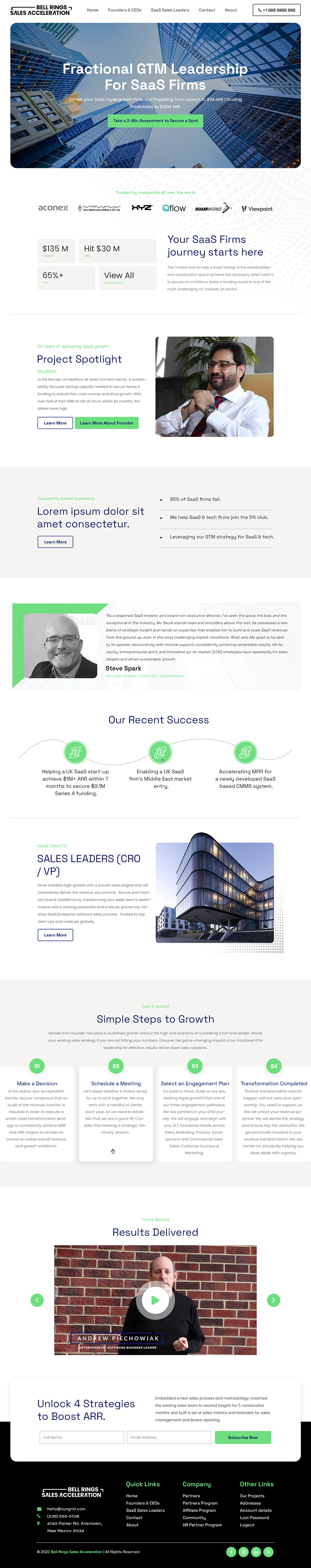
I have just built a web site in WordPress.
Here is the link:- https://moccasin-ferret-972421.hostingersite.com/
(ALL PAGES AND SITE CONTENT IS FOUND ON THE LINK)
It's not a bad site. It's just a bit messy in terms of consistency and styling - font usage, spacing between sections etc. I want it to be slick, stylish and professional.
My audience is CEOs/Founders of B2B Tech / SaaS firms.
One of the issues is font choice and inconsistent font sizing maybe.
The site is currently in WordPress but I don't mind it being built outside of WordPress provided it will be easy to manage and update.
Some designs I kind of like (although do not just copy these - I want original designs).
https://themes.muffingroup.com/be/business6/
https://outgrid.uicore.co/financial-consulting/
OTHER NOTES:
I don't to use too many photos on the new design. We can keep the photos where I am shown.
I would like to use more custom graphics and abstract graphics.
NOTE: One designer started a design in Figma but she had a family emergency and had to cancel the project. She what she did. It's ok - https://www.figma.com/design/r0Qoh0KDnGKp6raoIjiDEc/Untitled?node-id=0-1
Marché(s) Cible(s)
CEOs / Founders of B2B SaaS firms in the UK and US
Secteur / Type d'entité
SaaS, Tech, Consulting, Coaching, IT, Management Consulting.
Nombre de Pages Demandé
5+ page
Styles de police à utiliser
Autres polices appréciées:
- Poppins or something similar/better.
Couleurs
Le designer choisit les couleurs à utiliser dans le design.
Aspect
Chaque curseur illustre les caractéristiques de la marque client et le style que doit transmettre votre design de logo.
Élégant
Audacieux
Léger
Sérieux
Traditionnel
Moderne
Sympathique
Professionnelle
Féminin
Masculin
Coloré
Conservateur
Économique
Haut de gamme
Exigences
Doit avoir
- Impactful headlines. Reorganise the information presented on my current side much better. Spacings and alignments must be spot on. Use Poppins as the font (or something similar). Abstract/custom graphics. A nice colour palette with 3-4 colors. the 'Engagement Plans' section on the homepage needs to be redesigned completely so the information is presented almost in accordian style or someting.
Bien d'avoir
- Try graph paper style as the header background. See this Figma design one designer started - https://www.figma.com/design/r0Qoh0KDnGKp6raoIjiDEc/Untitled?node-id=0-1
Ne doit pas comporter
- Do not use Merriweather, Roboto or Aria fonts. No not use red. Please do NOT simply present the existing UI, design and Information Architecture in the same or similar form as the current site. This defeats the purpose. I want to see NEW designs and a better way of organising and presenting the existing site content.