

 Rafraîchir
Design a logo for a new non-profit company.
Vous souhaitez remporter un projet comme celui-ci ?
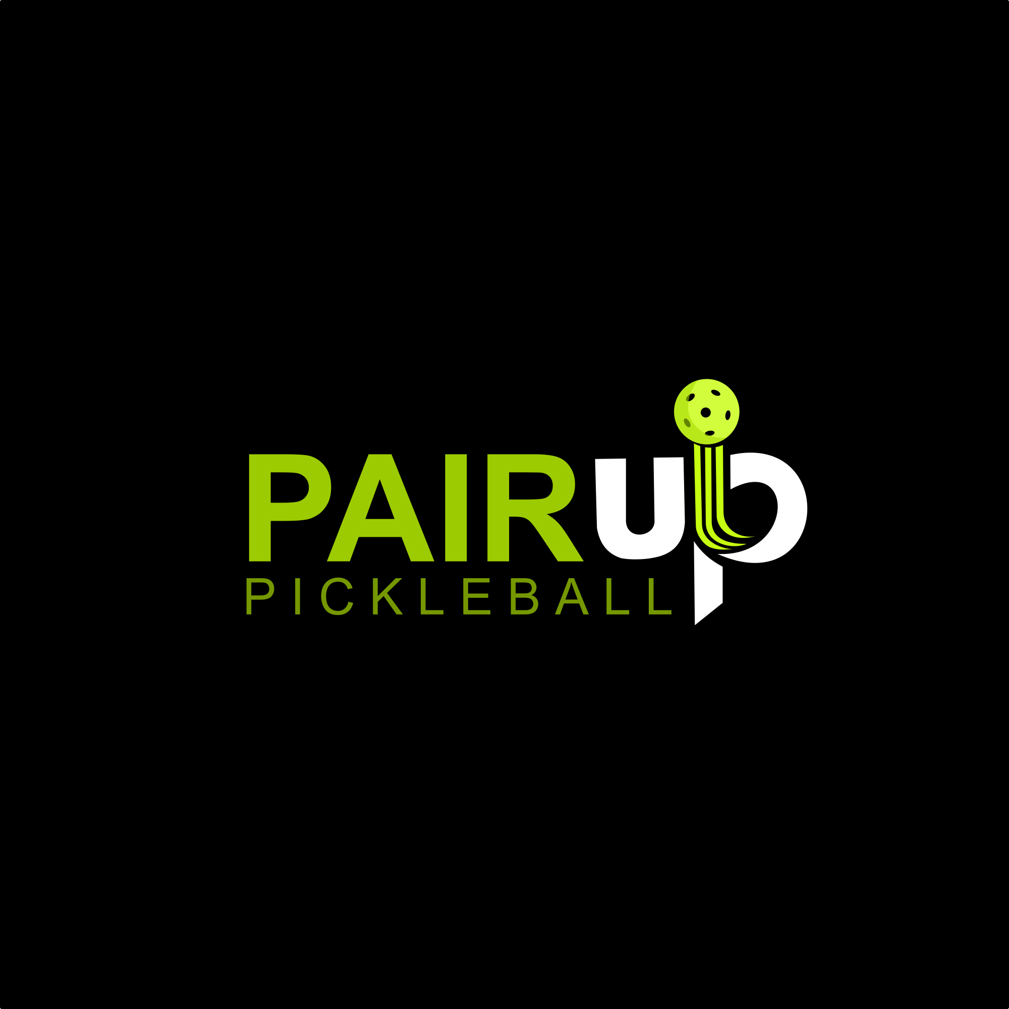
Ce client a reçu 161 designs de logo de la part de 68 designers. Il a choisi ce design de logo de alitjuara comme design gagnant.
Inscrivez-vous Trouvez des Projets de Design
- Garanti
-
 US$150
-
 161 designs
-
 68 designers
Brief de Design de Logo
We need a logo design for a new non-profit company based in Dallas called PAIRup Pickleball. We're focused on using pickleball to create life experiences and skills for people with intellectual disabilities and learning challenges.
Our acronym is: Pickleball of America Instruction & Recreation
There's a bit of nostalgia and familiar resonance to the name PAIRup. It evokes the old phrase "Everybody Pair Up Now", from our school days. It was something we were told during team activities or during recess or whatever. Seems like we're STILL told to do this in pickleball drills. It conveys community, cooperation, and inclusivity. The word "inclusivity" is important because it suggests that everyone is included and no one is left behind. As one of our values, it highlights our commitment to ensuring that every one of our athletes has a partner, a mentor and a friend to support them and UPLIFT them. It also implies a spirit of teamwork and support between instructors, participants, and their peers.
We love the branding possibilities of utilizing the word "up". We like it because the word "up" in PAIRup conveys a sense of upward movement, growth, and progress. Going back to our goal of UPLIFTING young athletes, helping them reach new heights both on and off the court.
Marché(s) Cible(s)
Educators (,especially in special education), Community Activists, Pickleball Players, Young People
Secteur / Type d'entité
Sports, Education
Texte du logo
PAIRup Pickleball
Styles de logo qui vous intéressent
Logo abstrait
Conceptuel / symbolique (texte facultatif)



Logo de figurine
Logo avec illustration ou personnage

Logo de Lettermark
Acronyme ou logo texte (texte seulement)



Styles de police à utiliser


Couleurs
Couleurs choisies par le client et à utiliser dans le design de logo:
Aspect
Chaque curseur illustre les caractéristiques de la marque client et le style que doit transmettre votre design de logo.
Élégant
Audacieux
Léger
Sérieux
Traditionnel
Moderne
Sympathique
Professionnelle
Féminin
Masculin
Coloré
Conservateur
Économique
Haut de gamme
Exigences
Doit avoir
- We like the idea of incorporating a graphic or image of a pickleball
Bien d'avoir
- We love the branding possibilities of utilizing the word "up". We like it because the word "up" in PAIRup conveys a sense of upward movement, growth, and progress. Going back to our goal of UPLIFTING young athletes, helping them reach new heights both on and off the court. We also like the idea of putting our acronym in small type below the logo somewhere, but it's not mandatory. As far as the word "up" goes, it would be nice to do something abstract with the shape of a pickleball paddle and see if there's a way to incorporate a "u" or an "up" as part of it. Maybe even a paddle that's positioned sideways without the top drawn on it (abstract) to make a "u". I don't know.
Ne doit pas comporter
- we don't much like crazy neon colors, unless it's the neon color of a pickleball


