Logo design for a professional copy-trading service on the financial markets
Vous souhaitez remporter un projet comme celui-ci ?
Ce client a reçu 346 designs de logo de la part de 103 designers. Il a choisi ce design de logo de AM ds9n™ comme design gagnant.
Inscrivez-vous Trouvez des Projets de Design- Garanti
-
 €110
€110
-
 346 designs
-
 103 designers
Brief de Design de Logo
This pertains to a service called "SmartCopy.trade" (possibly only "SmartCopy" could be used, but the .trade addition frames the context nicely) operating on the Forex currency market. It will initially be offered online through various market places for copy-trading services as well as through a few Forex brokers' own add-on services portals. We will be offering several different signals of choice which clients are able copy in order to gain profits from the financial markets without really knowing how to trade on their own.
In the not-so-distant future, the service might also be marketed through broader channels such as social media posts and online advertising in e.g. social media, YouTube, Google ads and so forth.
Initially it's the logo that is most important (maybe a standalone logo and also a joint logo+brand name option). It might also be of interest later to add additional design options along the same theme, e.g. with the purpose of usability in online advertising, social media pages, email broadcasts / support emails etc.
We want to convey a few key aspects with the logo and color scheme/palette:
* Success
* Growth
* Trust
* Professionalism
* (Optional: Automation / copying)
Have a feeling that blue/green palette is desirable, maybe with touch of gold or silver to add a touch of "premium". Open to suggestions on this.
Interest also in adding a tagline that can be added to the logo in certain use cases. Tagline has not yet been finally decided, but it is likely to be something along the lines of "Trade Smarter" / "Trade Smart" / "Smarter Trading" / "Easy. Smart. Automated" / "Do less. Win more." / "Do less. Earn more." / "Trading made easy" / ...
Maybe at this initial stage a tagline option could be added to some logo version using one of the above ideas as a placeholder?
Mises à jour
General update half-way through the competition.
First of all, thank you to all of you who have participated in my logo design contest for SmartCopy.trade so far.
I have received a huge amount of proposals which I am very happy about. There are some proposals which I really like and, as expected, some which would need improvement. By studying the proposals received so far, I have identified a few key properties that I want my logo to have and which I have summarized below.
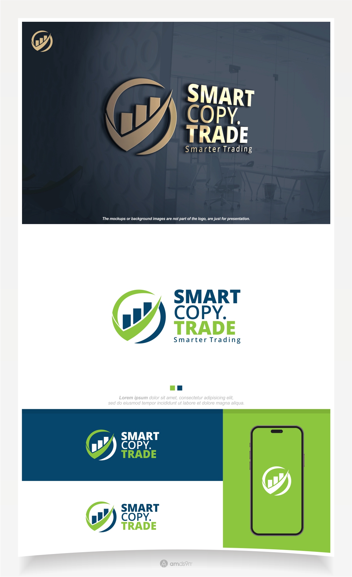
* The base setup for my logo needs to have BOTH a graphical element (”logo image”) and the brand name ”SmartCopy.trade” combined.
* Thus, the ’.trade’ part of the brand name should be visible in the logo as well, so it should not say only ”SmartCopy”. The ’.trade’ part should preferably be less, or much less, prominent / dominant than ’SmartCopy’, but it needs to be there.
* Note that ’SmartCopy.trade’ is not only a brand name, but a URL, a web address too, so it needs to be stated exactly like that. There are some submissions which don’t have the dot, some that put the dot at the end and some who put ‘trading’ instead of ‘trade’ for example. None of those options will work.
* I would like to see this base setup in two versions: One WITHOUT a tagline and one WITH a tagline.
* The tagline should be ”Smarter Trading”
* The graphical element of the logo can be either made as a standalone element (”placed next to the brandname words”) or integrated within the brandname words. In either case, I’d like to be able to use this graphical element as a standalone element without the full brandname in certain situations, such as for an App Icon, or as a small symbol / marker.
* I have seen several really smart examples of the graphical element; clean, easy to remember, signaling things in line with my brief. There are also quite a few ideas which may be skillfully designed but come across as too complex or which send a confusing message. Simple, smart and clever is more important to me than ”advanced”.
* I do NOT want any ”money signs”, like $, € or £ etc in the logo. I’d like a more subtle touch of the trust & growth idea and/or the copy & ’SC’/’’SCT’ theme.
* Color schemes: I have seen several variants of color schemes I like. In general, I don’t want too many very distinct colors involved in the same , but a smaller or more harmonic color set with a clear palette theme feels best. I also would like to see color variations so that the logo can be used in different settings or on different types of backgrounds. At least being able to have both light/white and dark/black background settings is needed. Also some gold or silver or metallic (”luxury”) version, which I have seen some examples of, would be nice.
Thank you for considering my wishes, and good luck!
/M
Added Thursday, 13 June 2024
Marché(s) Cible(s)
Small businesses and Private Individuals looking for good return on capital or savings. Probably already active within, or curious about, the trading space.
Secteur / Type d'entité
Finance, Trading & Savings
Texte du logo
SmartCopy.trade
Styles de logo qui vous intéressent
Logo pictural
Un objet réel (texte facultatif)
Logo mot symbole
Logo (texte seulement)
Styles de police à utiliser
Autres polices appréciées:
- Open Sans, Lato, Helvetica
Aspect
Chaque curseur illustre les caractéristiques de la marque client et le style que doit transmettre votre design de logo.
Élégant
Audacieux
Léger
Sérieux
Traditionnel
Moderne
Sympathique
Professionnelle
Féminin
Masculin
Coloré
Conservateur
Économique
Haut de gamme
Exigences
Doit avoir
- Easily recognizable. Professional look.
Bien d'avoir
- Color scheme that conveys professionalism, trust and growth
Ne doit pas comporter
- Overly complex logo or color scheme