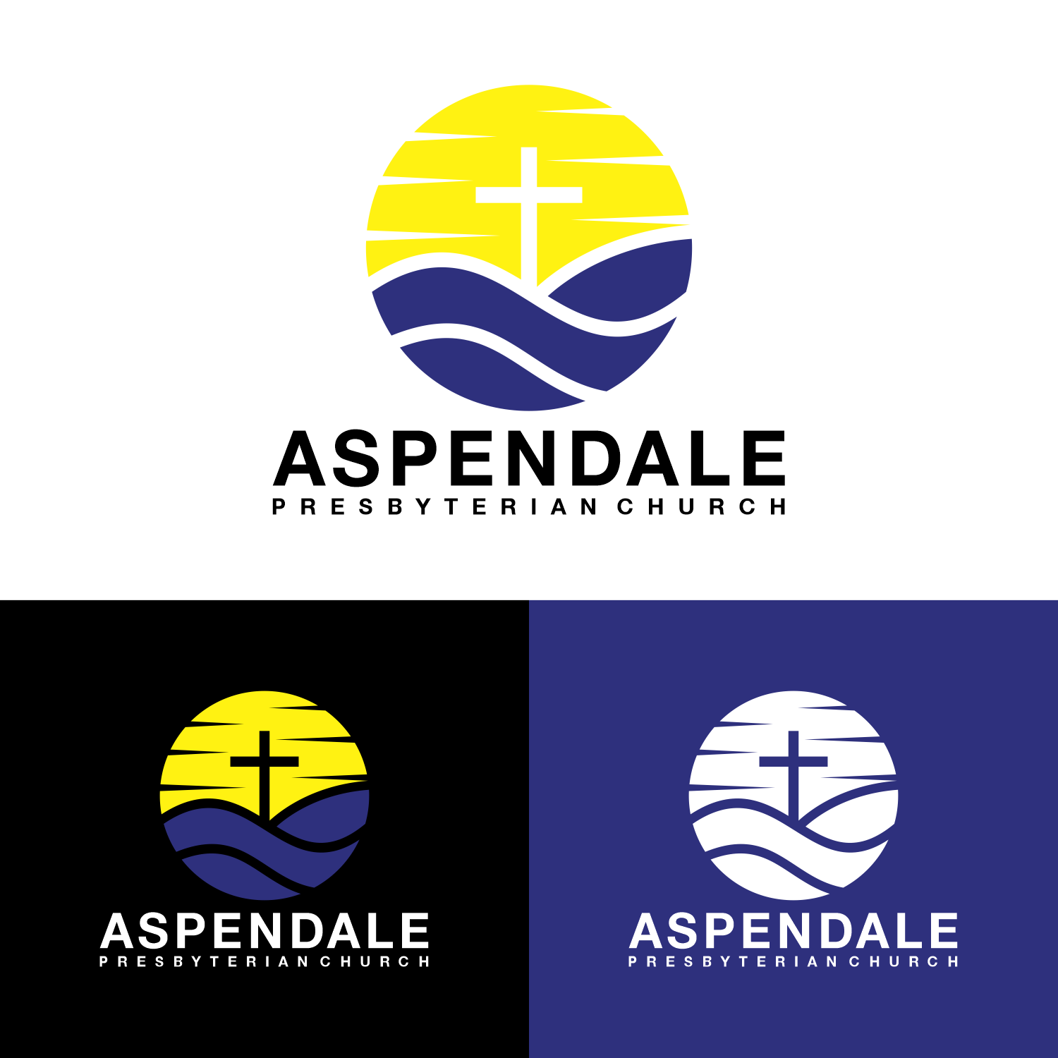
Aspendale Presbyterian Church Logo

Vous souhaitez remporter un projet comme celui-ci ?
Ce client a reçu 143 designs de logo de la part de 75 designers. Il a choisi ce design de logo de 16surya comme design gagnant.
Inscrivez-vous Trouvez des Projets de Design- Garanti
Brief de Design de Logo
We are looking to get a logo to use across our signage, documents and socials that is simple and clear. We are a Christ-centered, Biblically based, community focused church in suburban Melbourne. We are keen to make it clear that our church is all about following Jesus and so something like an empty cross as a feature would be appropriate. Our current tagline is 'Jesus Creates Community.'
We are very close to the bay and the beach and that is a big feature of the Aspendale community. We have been active locally for 97 years and have always been locally focused. Previously we have used the logo of the Presbyterian Church of Australia with our church name (attached). In terms of colours Blue is traditionally presbyterian and Aspendale has light coloured sand.
Most local people don't know what 'Presbyterian' is, so I am happy for this text to be smaller with the emphasis on Aspendale and Church.
You can get an idea of the shape of the church through: https://www.facebook.com/aspendalepc
https://aspendalepc.org.au/
Texte du logo
Aspendale Presbyterian Church