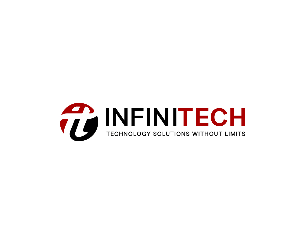
Improve a rough draft for an IT Company

Vous souhaitez remporter un projet comme celui-ci ?
Ce client a reçu 56 designs de logo de la part de 26 designers. Il a choisi ce design de logo de Janna Design comme design gagnant.
Inscrivez-vous Trouvez des Projets de DesignBrief de Design de Logo
Our company provides a wide range of in the field IT solutions such as structured cabling, network infrastructure and design and hardware integrations.
I have designed a rough draft of the concept I am going for and attached the photoshop file and PNG.
For the lettermark logo, it is important to note I will only be utilizing one color (red, blue, lime green) and black for simplicity and branding. A white background is preferred but I am open to alternating between black and the other 3 colors. Gradients and drop shadows will not be useful as I need a logo that transfers to multiple mediums.
It is important to note that the name InfiniTech, was chosen as purposely as the I and T are easy to use as acronyms and for my employees and techs I want a logo that shows IT so that when they are on jobsites their job function is easily understood.
I prefer a circular cutout as this works better online, similar to the one provided but will entertain other shapes, font styles and designs regarding the logo. The logo must say iT.
As for the Company name, please use the font LT Superior and LT Superior Bold and fully capitalize the Name and Slogan.
This should be a simple auction as I am looking for an improvement on the current design from more creative minds as well as some color variations.
Texte du logo
INFINITECH