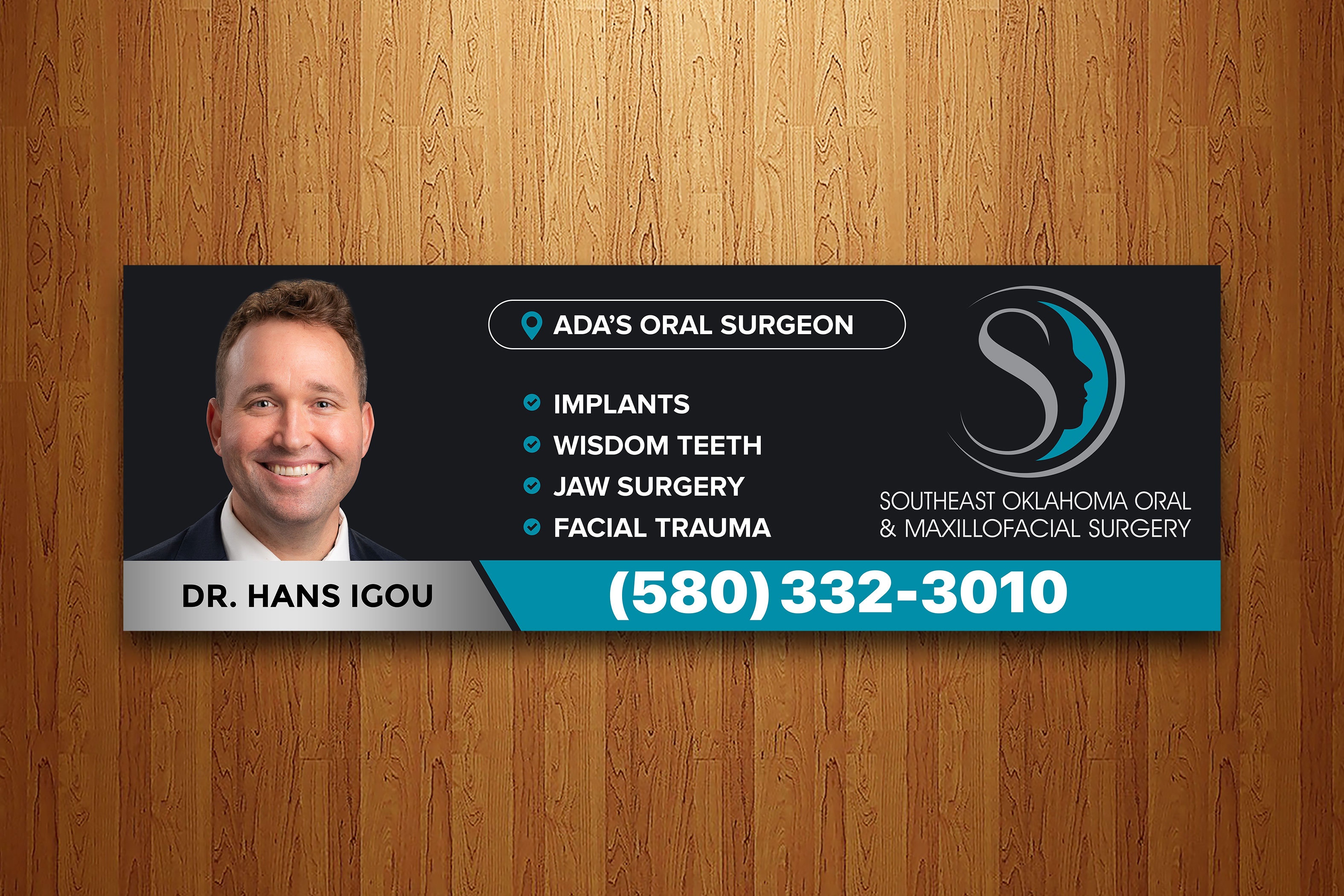
Billboard design for a small town Oral Surgeon
Vous souhaitez remporter un projet comme celui-ci ?
Ce client a reçu 109 designs de panneau de la part de 26 designers. Il a choisi ce design de panneau de Firoze049 comme design gagnant.
Inscrivez-vous Trouvez des Projets de Design- Garanti
-
 US$280
-
 109 designs
-
 26 designers
Brief de Design de Panneau
We are getting several billboards and need a design that highlights the doctors photo, and bullet points of what he does. Our business name is extremely long, so it’s a challenge to figure out how to do this. Maybe just use our logo? Open to ideas.
The logo can be shortened as designer sees fit, meaning we can drop the tag line. Important info to include:
Doctors name is Hans Igou
The highlighted bullet points are:
•Implants
•wisdom teeth
•Jaw Surgery
•facial trauma
The goal of this billboard is to let our community know that they have an option here in Ada, our town. Many still drive to the city a couple hours away not knowing they now have an option here at home. Having a hard time finding examples of what I have in mind, so hoping this will get us going. I want it as “non-busy” as possible, so no unnecessary lines or anything that competes with the information we are trying to get across.
Marché(s) Cible(s)
Everyone in town, just trying to spread the word that we are here
Secteur / Type d'entité
Medical/surgical (oral surgery)
Styles de police à utiliser
Couleurs
Couleurs choisies par le client et à utiliser dans le design de logo:
Aspect
Chaque curseur illustre les caractéristiques de la marque client et le style que doit transmettre votre design de logo.
Élégant
Audacieux
Léger
Sérieux
Traditionnel
Moderne
Sympathique
Professionnelle
Féminin
Masculin
Coloré
Conservateur
Économique
Haut de gamme
Exigences
Doit avoir
- *New note** Due to location of billboard, I prefer the photo of doctor to be on the left side. Must look neat and professional. Must highlight what we do.
Bien d'avoir
- Our colors are a blue-green with silver, against black or white, but I’m flexible on this, I don’t necessarily need the colors highlighted. I’m also flexible on font style, just needs to be easy to read.
Ne doit pas comporter
- Distracting graphics, should not look like a dental office. That’s an issue we have is people thinking we are another dental office, we do not do any general dentistry, it’s surgery only.