C2A Name and Positioning Statement Branding Design
Vous souhaitez remporter un projet comme celui-ci ?
Ce client a reçu 47 designs de logo de la part de 36 designers. Il a choisi ce design de logo de syad666 comme design gagnant.
Inscrivez-vous Trouvez des Projets de Design- Garanti
-
 A$150
A$150
-
 47 designs
-
 36 designers
Brief de Design de Logo
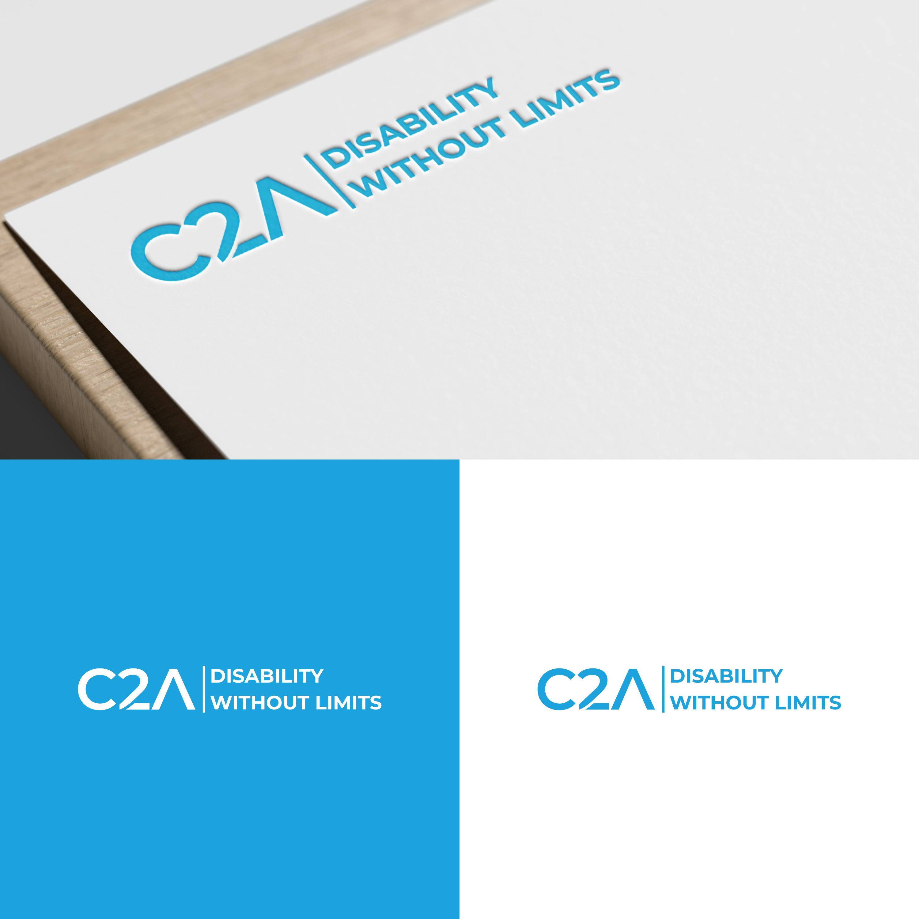
Connecting2Australia is evolving its brand name to C2A. C2A supports people living with disability. C2A's positioning statement is 'Disability without limits'. There are many engineered names in the disability sector that don't say disability - Scope, EACH, Aruma, Wallara,. Their positioning say things like- Respect. Care. Wellbeing. But none say disability. These generic statements could be a kindergarten for instance. C2A means nothing by itself. But, together C2A, Disability without limits, tells the story. The two need to stand together. Because there are no limits for people with disability, that's what makes C2A different, that's our USP, that means no matter who you are, or from any category or consumer, you know who we are and what we stand for. C2A must 'speak and sound' phonetically. Just like you say KFC. Sorry I'm not trying to compare to the KFC brand but the brand name cant be so clever and stylised you can't read it. It's almost a typographical exercise. C2A cannot overpower Disability without limits. Attached is the current logo which has been inherited. It used to be multi colour. NOTE: Blue PMS299c has been used to simplify the logo. There are many reasons, so please do not move away from this colour.
Texte du logo
C2A Disability without limits