Human Engineered - Business Logo Design
Vous souhaitez remporter un projet comme celui-ci ?
Ce client a reçu 178 designs de logo de la part de 67 designers. Il a choisi ce design de logo de AliArts comme design gagnant.
Inscrivez-vous Trouvez des Projets de Design-
 A$400
A$400
-
 178 designs
-
 67 designers
Brief de Design de Logo
I need a logo designed for my new business - Human Engineered.
We are Human Factors specialists. Human Factors looks at Psychological, Physical and Organisational ergonomics - basically how an end users mind and body fits with a system.
We work across Aersopace, Defence, Rail and Health Care.
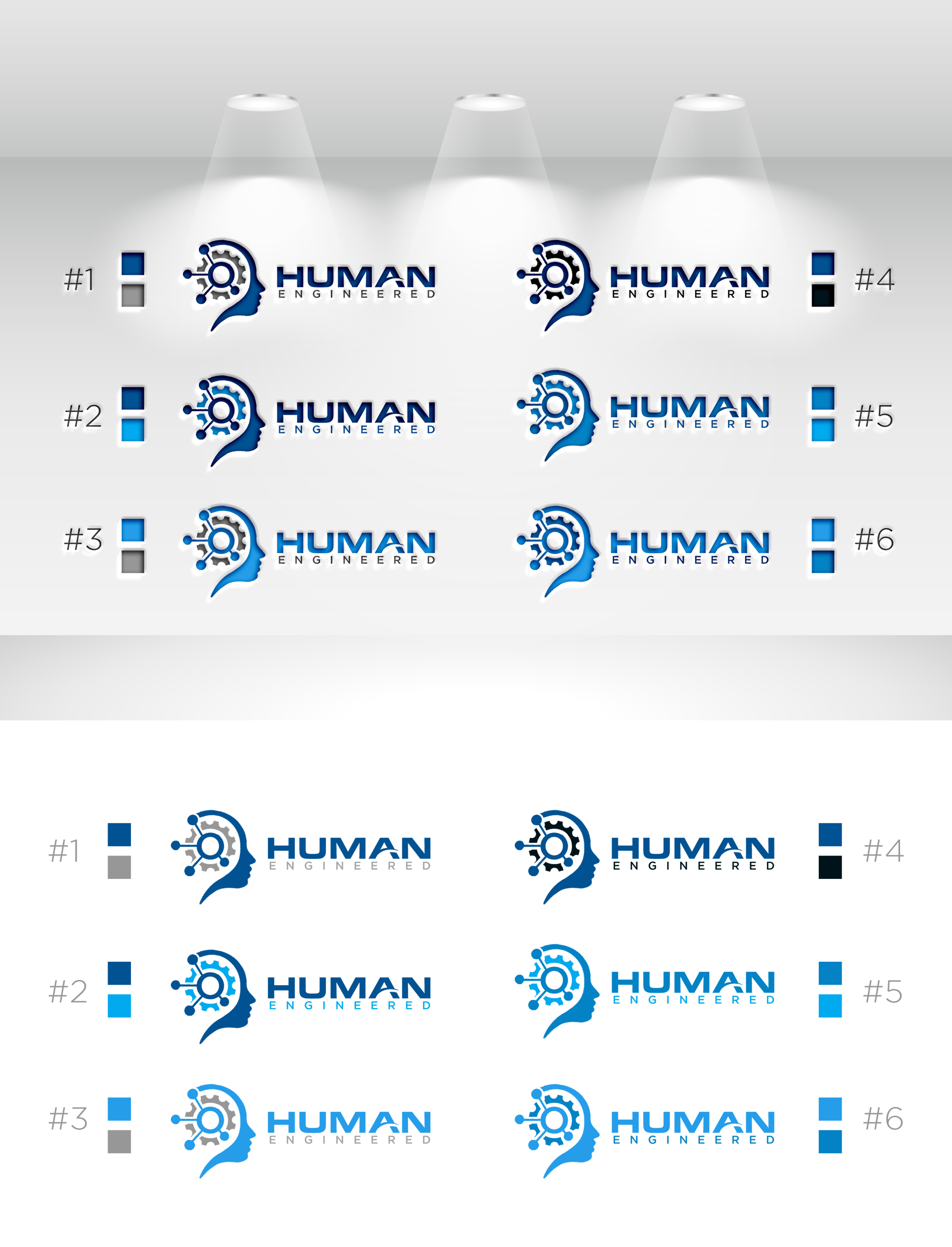
EDIT: Just a Brief update. We have found we are liking Icons that showed a human head, incorporated together with a cog (for engineering) and a bit of a network diagram (For Organisational - see attached image). For us, this showed the 3 areas of Human Factors.
As for the Fonts, we are liking the Bold "HUMAN" in dark colours, with centralised "ENGINEERED" underneath.
Icons that sit to the left or right of the text are preferred, but open to creative inputs.
Open to other potential designs. If a smidge of "Digital" could be added in, that would be great (as we also do Digital Based HF (Mocap and VR) - but that is only a section of our business...so not a major part.
Mises à jour
Design Brief has been updated with what we have started to decide on we are liking.
Added Saturday, 17 February 2024
Secteur / Type d'entité
Engineering, Defence, Aerospace, Rail, HealthCare
Texte du logo
Human Engineered
Styles de police à utiliser
Aspect
Chaque curseur illustre les caractéristiques de la marque client et le style que doit transmettre votre design de logo.
Élégant
Audacieux
Léger
Sérieux
Traditionnel
Moderne
Sympathique
Professionnelle
Féminin
Masculin
Coloré
Conservateur
Économique
Haut de gamme
Exigences
Doit avoir
- Must have words "Human Engineered" and an associated Icon indicative of our services.
Bien d'avoir
- Iconography Preferences: We're inclined towards icons that meld a human head, a cog (symbolizing engineering), and elements of a network diagram (representing organizational structure). This combination should visually narrate the essence of Human Factors' three core areas. Font and Color Palette: We favor a bold, dark-colored "HUMAN" accompanied underneath by a centrally aligned "ENGINEERED" in a lighter shade or contrasting color to emphasize the brand name's significance. It would also be nice if the Icon and Text did not look like complete seperate elements.