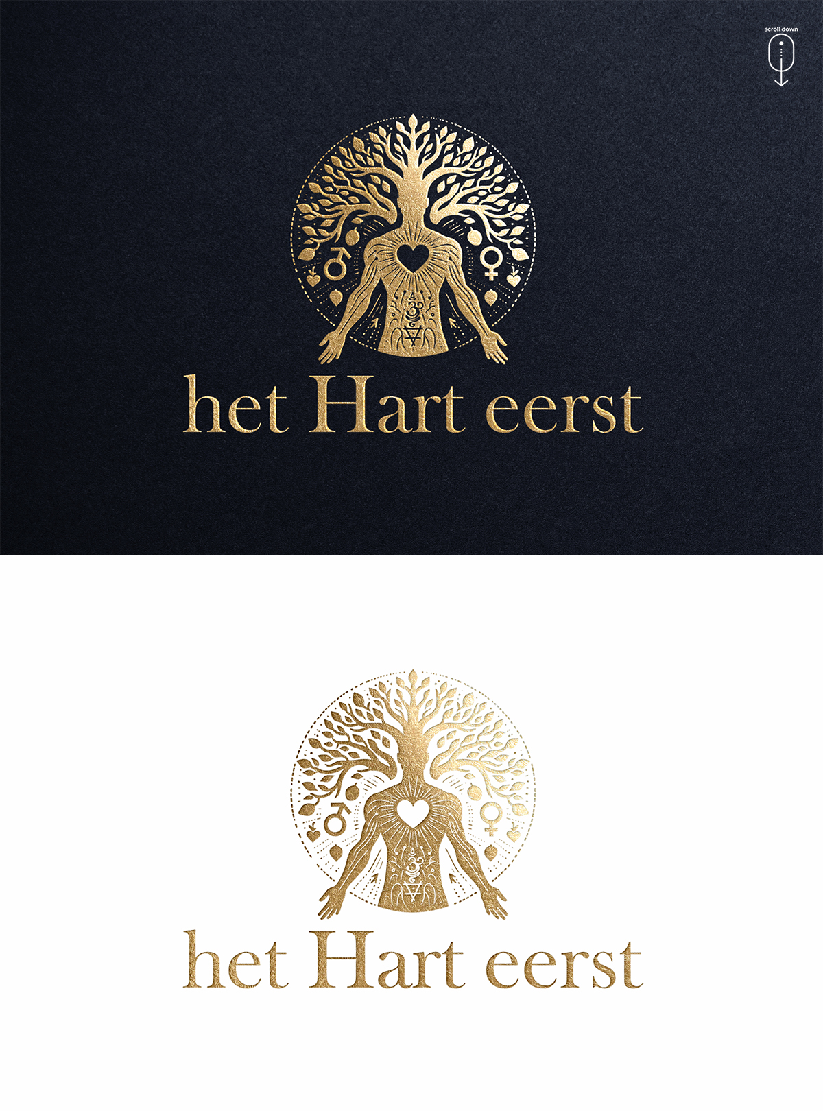
Logo for Body Psychotherapy Practice "Our Hearts First"
Vous souhaitez remporter un projet comme celui-ci ?
Ce client a reçu 117 designs de logo de la part de 58 designers. Il a choisi ce design de logo de Zonda Studio comme design gagnant.
Inscrivez-vous Trouvez des Projets de Design- Garanti
-
 €190
€190
-
 117 designs
-
 58 designers
Brief de Design de Logo
I need a logo design for my Body Psychotherapy Practice.
The name in Dutch is "Het Hart eerst", which translates directly to "The Heart first", but in Dutch has a more personal feeling of "your heart first" ring to it. The name of my company is a daily reminder for myself as well as a promis about my way of working: in true connection, with empathy, love and authenticity. I need the logo to reflect that.
I am a man in my late thirties and work a lot with male clients (80% of my business). I need the logo to appeal to men, without scaring away potential female clients.
What sets my type of therapy apart from most other psychologists/psychotherapists/therapists is that it is body oriented, I would like to see this in the logo as well.
Some key words that the logo should reflect are: Wisdom, growth, heart, body, trust, manly (but not too much), expression
The colours I am not so sure of. The logo is going to be used on my website, as well as on paper (invoices, etc) so it will be put on a white background as well as other colours. I would like to see some designs with just one colour, but also some designs with many colours, as it reflects the many colours of our inner emotional world.
I have added a screenshot of the website I am building, so you get a sense of the colours I use there. The logo you see there is not the right colour of "gold" yet and just one of the logos I found (it's a different colour than the button for example).
I have also added some logo designs that I found on these standard logo generator websites, which are a step in the right direction. You see that I am appealed to logos with the combination of heart, tree of life, body and circle as the combination of these symbols all reflect so nicely what my practice stands for. They are all a touch too feminine though to use, and not quite yet what I'm looking for. The first logo idea (with the circle) resonates the most.
I am looking forward to your designs! Thanks for your effort
Texte du logo
Het Hart eerst