

 Rafraîchir
Flywise Logo
Vous souhaitez remporter un projet comme celui-ci ?
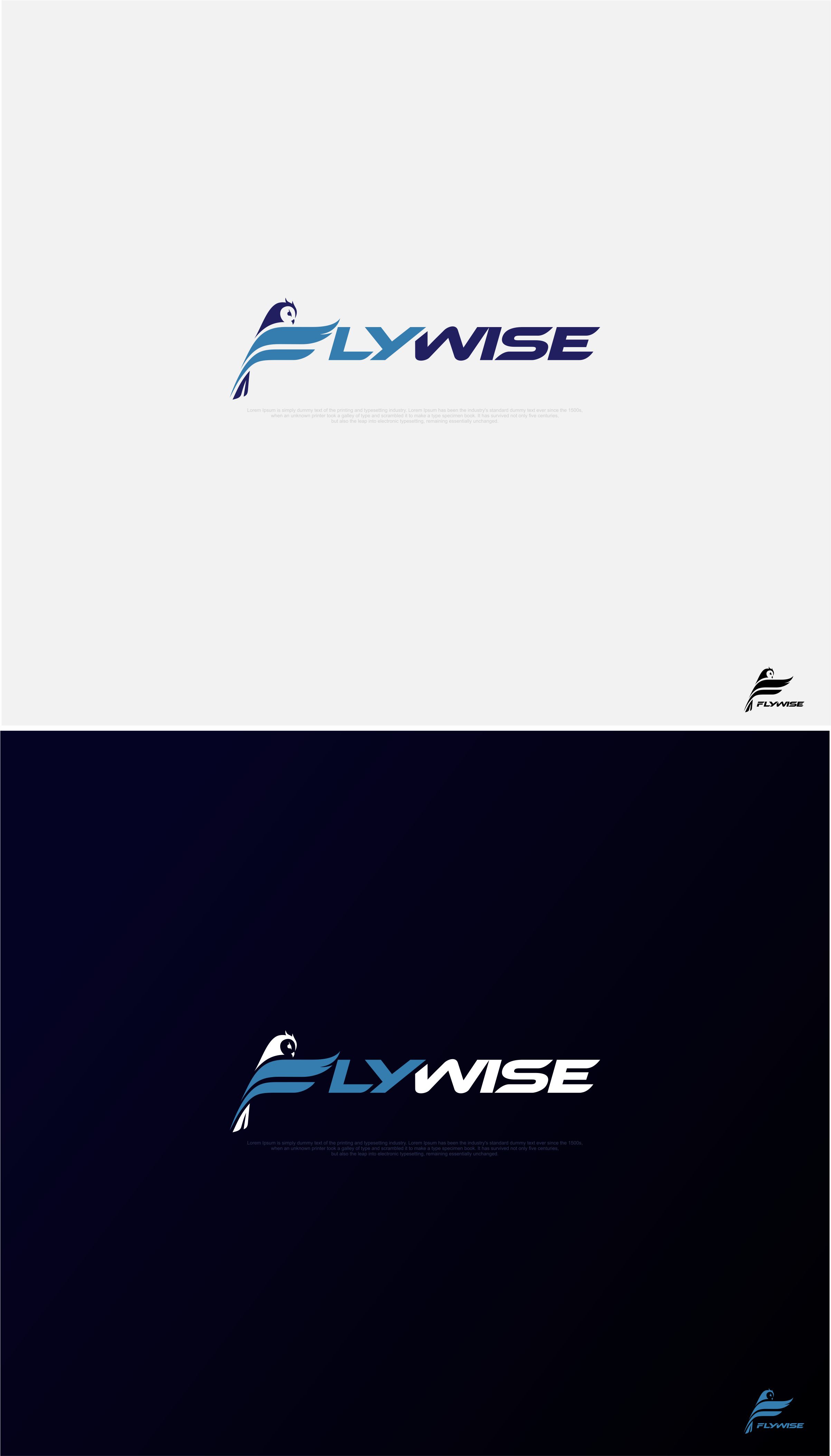
Ce client a reçu 55 designs de logo de la part de 26 designers. Il a choisi ce design de logo de ace_art™ comme design gagnant.
Inscrivez-vous Trouvez des Projets de Design
-
 US$150
-
 55 designs
-
 26 designers
Brief de Design de Logo
Logo Design Brief for Flywise
Brand Name: Flywise
Industry: Aviation Education / Professional Aviator Program
Logo Concept:
The logo should feature a wise owl, symbolizing wisdom and aviation expertise. The owl is to be depicted in a profile view, embodying strength and professionalism.
Design Elements:
The owl's wings are in a downbeat position, forming the horizontal bars of the letter 'F' in 'Flywise'. The vertical part of the 'F' is represented by the owl's body. The owl's head, including its ears, rests atop the 'F', slightly tilted to the right to convey a sense of forward movement.
Color Palette:
Two-tone color scheme.
Primary Colors: Blue (#367daf, #211f60) and Grey (#9fa5c8).
Typography:
The rest of the brand name ('lywise') should be in a font that complements the owl-shaped 'F'. The font should harmonize with the overall minimalist and professional aesthetic.
Style:
Minimalist design, focusing on clean lines and a professional appearance.
The logo should convey a sense of strength, wisdom, and forward-thinking.
Intended Use:
The logo will be used across various mediums including digital platforms, print materials, and silkscreened/embroidered on merchandise.
Texte du logo
Company name Flywise with the F being in the shape of an owl as described in the task description