New Company Launch- Logo Needed
Vous souhaitez remporter un projet comme celui-ci ?
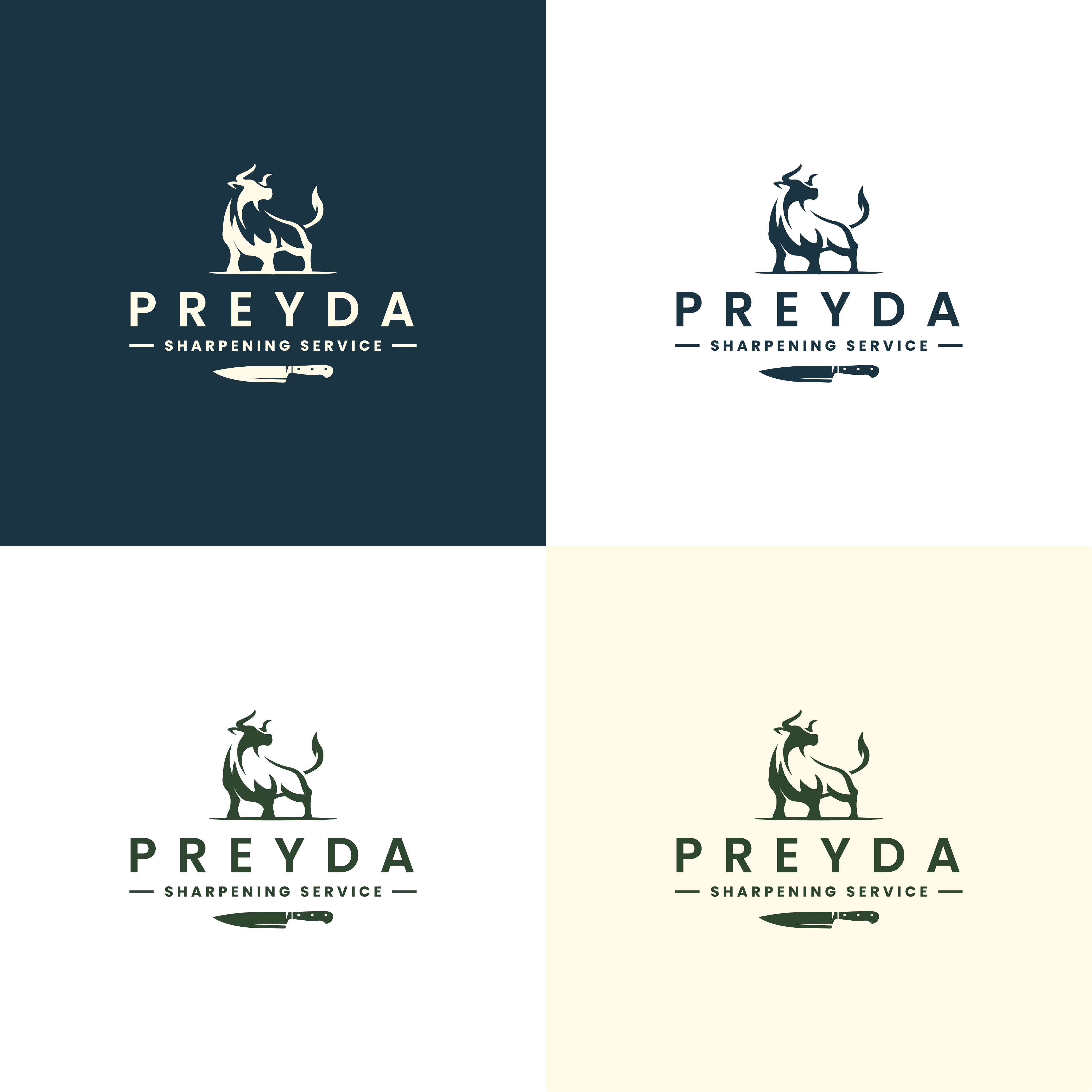
Ce client a reçu 125 designs de logo de la part de 40 designers. Il a choisi ce design de logo de Sandii Hardianto comme design gagnant.
Inscrivez-vous Trouvez des Projets de Design- Garanti
-
 US$110
-
 125 designs
-
 40 designers
Brief de Design de Logo
We need a logo design for our new company based in Chicago. The name of the company is Preyda Sharpening Service. We sharpen knives and blades for the restaurant/culinary/hospitality industry. There are a number of logos on your site that we do already like, and were hoping that they could be "adjusted" to combine features of all of them? We do need to incorporate a knife somewhere in the logo, but don't want it to be too literal. Here are some notes pertaining to the attached logos that we have liked that were auto generated by Brand Crowd...
Files PS1 and PS2- We want to incorporate a bull in our main brand logo. We like the general look of both of these bulls, but need to find a way to kind of combine their aesthetic and make everything look cohesive. We'd like the bull to not look as simple as PS1, but not necessarily as aggressive as PS2. The hump on the back of the bull in PS1 is reminiscent of a special breed of bull native to our family's ancestral history in Italy. The breed is Chianina (if the designer wants to look it up), so keeping a shape of bull that is in line with that breed would be great.
File P4- We like the old school feel and design of this logo. While we need to incorporate the bull, we also need to incorporate some knives. We don't want the feel to be too "knife heavy" or literal. If you Google 'knife sharpening service' you will see that most brands use a knife in their logo and all kind of have the same look, slogan, feel. We want to stay away from being lumped into that look, but we also think it's important to have a knife or 2 incorporated so that people know what our service is.
File P7- We like the vintage throwback feel of this logo/design
Fonts- We like the style of fonts used in P7 and P4
Colors- we like all of the colors used in the example images here, so maybe we keep them all, or most of them for our overall brand scheme? They work nicely together. They don't need to be the exact shades if that's not possible, we are ok with adjusting them as needed.
Marché(s) Cible(s)
Restaurant/Culinary/Food Service
Secteur / Type d'entité
Restaurant/Culinary/Food Service
Texte du logo
Preyda (main) Sharpening Service (sub)
Styles de logo qui vous intéressent
Logo pictural
Un objet réel (texte facultatif)
Logo de figurine
Logo avec illustration ou personnage
Styles de police à utiliser
Autres polices appréciées:
- We are open to font options, but do like the style of fonts noted in the project description.
Couleurs
Le designer choisit les couleurs à utiliser dans le design.
Aspect
Chaque curseur illustre les caractéristiques de la marque client et le style que doit transmettre votre design de logo.
Élégant
Audacieux
Léger
Sérieux
Traditionnel
Moderne
Sympathique
Professionnelle
Féminin
Masculin
Coloré
Conservateur
Économique
Haut de gamme
Exigences
Doit avoir
- Must use the "bull" character, and a "knife".
Bien d'avoir
- An overall modern spin on vintage would be great. The color palette shown in the design attachments would be nice to incorporate.
Ne doit pas comporter
- Nothing that looks aggressive, harsh or too bold.