Nifeislife.com Wants You For Rebranding
Vous souhaitez remporter un projet comme celui-ci ?
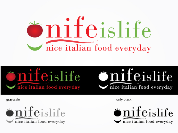
Ce client a reçu 119 designs de logo de la part de 46 designers. Il a choisi ce design de logo de OUT of BOX.d comme design gagnant.
Inscrivez-vous Trouvez des Projets de Design- Garanti
-
 £300
£300
-
 119 designs
-
 46 designers
Brief de Design de Logo
Nifeislife.com is an online Italian deli based in the UK offering more than 1000 luxury products. Ranging from the best packaged brands (Barilla pasta, Mulino Bianco biscuits, etc.) to the most premium fresh produces (cheese, cured meat, fresh fruit and vegetables), our products are sourced from the finest producers in Italy.
The brand name “Nifeislife" is a legacy of the business created in 2002 and carried on all the marketing material (consumer facing and not).
We intend to refresh our brand and give it a new look & feel so that Nifeislife can stand out in the crowd and consumers can truly appreciate the value of our business and service we are able to offer.
We would like NIFE to become the new “brand name” thus reducing the emphasis on “islife”.
THE NEW LOGO WILL HAVE THE FUNCTION OF EXPLAINING/ REVEALING THE MEANING OF NIFE, that will stand for “Nice Italian food everyday”.
We are looking for an innovative logo that will express the Italian values to the customer. The logo should be simple (not messy) and classy so that people can easily identify it.
We want to stand for being:
Highest quality and service
Affordable
Credible, Efficient, Professional
Enjoyable
Friendly, personal, approachable
Other attributes:
Good taste, leisure, self-indulgence
Warmth, variety, curiosity, sunlight, happiness
Family, tradition, legacy, values, togetherness, continuity
We want to be known and seen as: a first class online deli providing high quality fresh Italian food at unbeatable prices.
Target Market
• Professionals (male and female) with medium high income (50K+)
• 25-45 years old
• Equally split between single and married with children
• Living in affluent area
• Traveling extensively both for work and for leisure
Our typical user is an affluent, family oriented West London (52% orders) woman, who likes to treat herself but not over-indulge. She is likely to be Italian or have Italian connections.
We will provide some initial ideas, but the basic concept could be
nife islife / with subtitle "nice italian food everyday
of course artistic variations on this are welcome eg nice italian food everyday around nife is life as a smile or a stamp, creative use of a (small) Italian flag/ smile, etc.
The logo CANNOT use BLACK as a colour. We would like to have "nife" and "nice italian food everyday" in red, "islife" in green.
PLEASE DO NOT USE CAPITAL LETTERS.
nife and islife should be on the same line, since the website name is nifeislife.com. however the new logo will have to emphasize that nife is the brand name, and it means "nice italian food everyday", islife is a separate message
("we love bringing you nife/nice italian food everyday - it's our life!")
Mises à jour
Hi!
Added Saturday, April 28, 2012
Project Deadline Extended
Reason: Now we need to decide...
Added Thursday, May 03, 2012
Project Deadline Extended
Reason: Final designs due by Sat morning. Final decision on Sat afternoon. Thanks to all who participated!
Added Friday, May 04, 2012
Marché(s) Cible(s)
see above: west london professionals, 50% italian origins
Secteur / Type d'entité
Marketing
Texte du logo
nife islife/ nice italian food everyday
Styles de logo qui vous intéressent
Logo de figurine
Logo avec illustration ou personnage
Logo mot symbole
Logo (texte seulement)
Logo de Lettermark
Acronyme ou logo texte (texte seulement)
Aspect
Chaque curseur illustre les caractéristiques de la marque client et le style que doit transmettre votre design de logo.
Élégant
Audacieux
Léger
Sérieux
Traditionnel
Moderne
Sympathique
Professionnelle
Féminin
Masculin
Coloré
Conservateur
Économique
Haut de gamme
Exigences
Doit avoir
- Must have all text elements described above. the current "tomato with a smile" is an old legacy, we wouldn't mind changing it to something more 2012 or losing it altogether
Bien d'avoir
- We like the "innocent" logo because it's simple, but then it's too similar to the current logo. We would like to break with the old legacy as much as we can without being too creative: this must be about "simple food online that works, you understand, and doesn't cost an eye" not about "creative upmarket stuff that you don't understand and will break the bank"
Ne doit pas comporter
- NO BLACK TYPE LETTERS
NO CAPITAL LETTERS
NO WEIRD SHAPES THAT WOULDN'T BE SUITED TO A WEBSITE / must be possible to broadly enclose the logo in a rectangle, square or circle shape although a bit of variation is allowed. can't be shaped like a wave, snake or other weird stuff