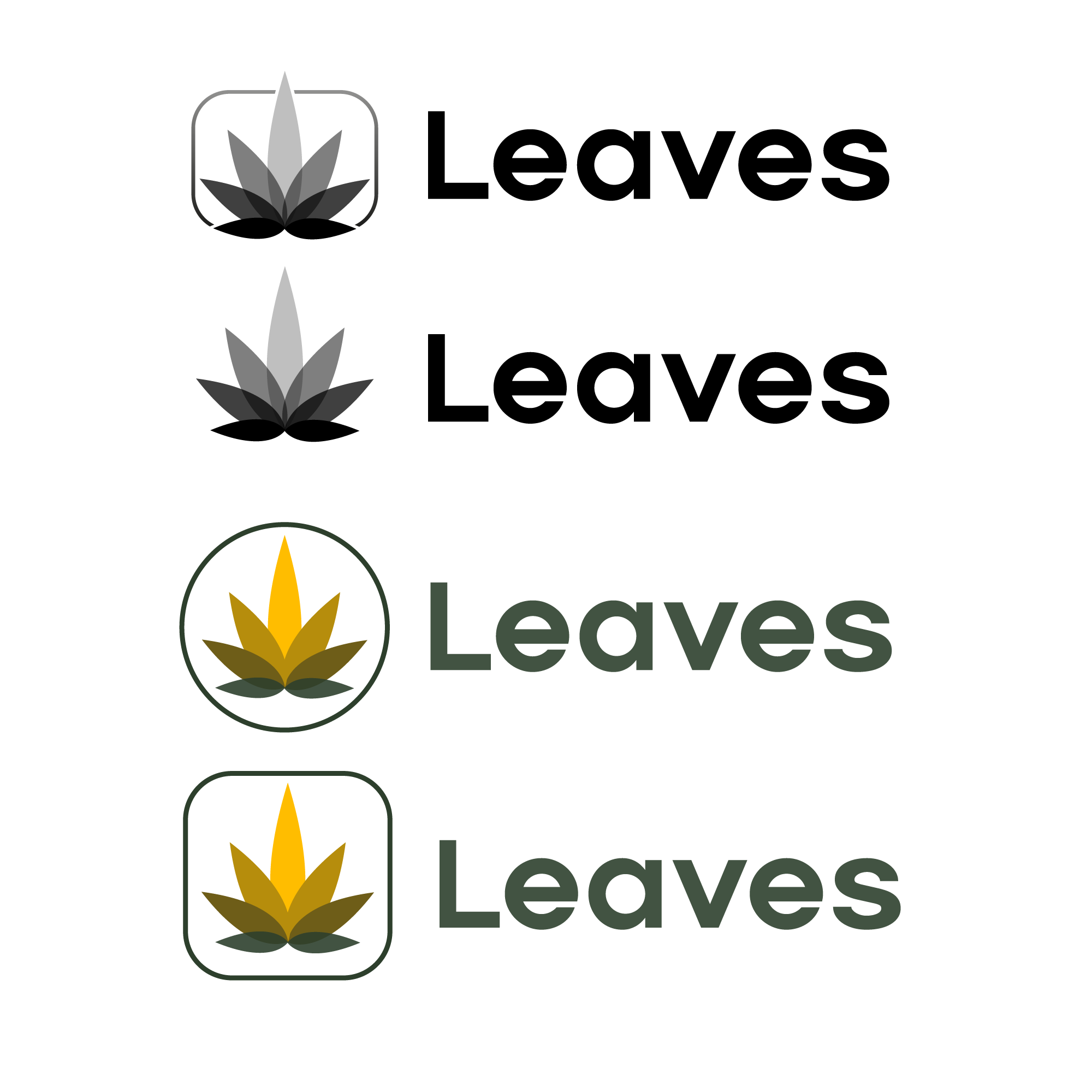
Logo for Leaves, a cannabis addiction recovery non-profit
Vous souhaitez remporter un projet comme celui-ci ?
Ce client a reçu 137 designs de logo de la part de 62 designers. Il a choisi ce design de logo de Brewyart Creative comme design gagnant.
Inscrivez-vous Trouvez des Projets de Design-
 US$400
-
 137 designs
-
 62 designers
Brief de Design de Logo
Hello! I run a nonprofit called "Leaves," which offers addiction recovery programs, meetings, and resources focusing on cannabis abuse. We are not a 12-step program, but you can think of us like AA for weed smokers who want to quit and are having trouble.
We now have 280,000 members on reddit and 10,000 people on Discord, and although I can't prove it, it's likely we are the largest cannabis-focused recovery organization in the world. We're currently about 75 percent North America, 6 percent Great Britain, and the rest scattered all over the globe.
This brief will put some significant limitations on the design, so please follow them to not spend time creating something we can't use. :-)
We are taking our starting inspiration from the Supernatural logo I've uploaded. In basic form, like the Supernatural logo, it should be the name "Leaves" in mixed case with a graphical device next to it.
You should use Kamerik 105 Bold as the font. If you don't have that then use something as similar as you have for these comps, but I will provide the font to the winner to put it in.
Here's the hard and designy part: The graphical device should include a stereotypical pot leaf, or enough of a pot leaf to be recognizable, but also need to communicate leaving smoking behind. People should be able to look at it and know that we are an addiction recovery organization and not a dispensary.
Some ideas that can contribute to your approach are friendly, positive, optimistic, and the idea of some sort of rebirth. I don't want to look like a medical organization, but there is a chance that this could be used with rehab programs or centers so it shouldn't be too cartoony. Since we're going to use it in a variety of media I would need to see examples of square, wide, and some kind of square icon we can use when just a symbol is enough.
That said, although I like the overall Supernatural logo, I don't think that the Supernatural graphic device is particularly good -- I think it's out of proportion and doesn't communicate what they do (a VR exercise game) well enough, so don't be limited to that style.
I look forward to seeing your work!
Texte du logo
Leaves
Styles de police à utiliser
Aspect
Chaque curseur illustre les caractéristiques de la marque client et le style que doit transmettre votre design de logo.
Élégant
Audacieux
Léger
Sérieux
Traditionnel
Moderne
Sympathique
Professionnelle
Féminin
Masculin
Coloré
Conservateur
Économique
Haut de gamme
Exigences
Doit avoir
- Font: Kamerik 105 Bold -- if you don't own it use something as similar as you can and I will provide it to the selected designer..